Neutral Sans Workhorse

Giggle Bop + Noar
Lets Giggle Bop own the focal silhouette while handling secondary copy, sizing and subheads cleanly.
Inspect Noar specimenDisclosure: MakerFileHub may earn a commission from qualifying purchases via paid links on this page. How our links work.
Clean rounded storybook & toddler toy-box sans
Giggle Bop is a clean, plump rounded display sans with bouncy textbook-clear lowercase and sunny children's-book readability.
Paid link
Get this fontProject & layout blueprintsAt-a-glance maker compatibility
Sturdy stroke walls and open counters weed cleanly on adhesive vinyl, HTV apparel film, and cut cardstock.
Visual anatomy & craft review
Giggle Bop is a plump rounded display sans with textbook-clear lowercase, a wide circular G and crisp, cluttered-free edges, so a word reads as a children's book cover rather than a cartoon sticker. The generous bowls stay legible at 18 mm, and the even weight prints cleanly in one colour, which makes it a workhorse for young-reader material. It needs roughly 18 mm for the round bowls to read, and it is best in jet black on white or in one bright ink on a pale ground.
Storybook-neat · Rounded-sans · Cheerful
Two-font hierarchy recipes
Tested contrast partners — pairing Giggle Bop with grounded secondary typography.
Giggle Bop + Noar
Lets Giggle Bop own the focal silhouette while handling secondary copy, sizing and subheads cleanly.
Inspect Noar specimen
Giggle Bop + Majestic Letters
Grounds bold display lettering with classic typographic authority on posters, badges and apparel.
Inspect Majestic Letters specimenPractical applications
Concrete hierarchy, scale and production guidance tailored to Giggle Bop’s stroke geometry.
Clear rounded letterforms are what an early reader needs, which is what a children's publisher prints on a cover. The lowercase stays legible at 14 pt, and the wide bowls keep short words unmistakable for a beginner.
Hierarchy & layout recipe
Cover 210 x 210 mm, title 60 mm, author 14 pt, 18 mm margins and 10 mm trim. Page 148 x 210 mm, body 14/20 pt in a 90 mm column. Poster A2, word 240 mm, details 22/28 pt, 30 mm margins.
Pre-production check
A 14 pt body in a rounded face on cream paper looks friendly but a 90 mm column at 14/20 runs to long lines for a beginner. Set the column at 70 mm, and check one printed page before the run.
Clear plump lettering reads as a party a small child can recognise, which is what a family birthday sends. The heavy forms cut cleanly at 45 mm, and one ink prints the whole set.
Hierarchy & layout recipe
Invite A6, word 40 mm, details 8/11 pt, 12 mm margins. Topper 130 x 110 mm, word 45 mm with an 8 mm slot and 10 mm clear. Banner 900 x 300 mm, word 130 mm, 40 mm margins.
Pre-production check
A 45 mm topper cuts the wide counter of the G as a loose island that drops on the cake. Bridge each closed counter at 1.5 mm, and cut one prototype before the batch.
A sunny rounded face reads as an event for small children, which is what a playgroup spring fair prints. The bowls hold at 120 mm on a banner in one colour, and the face stays legible on a 9 mm card.
Hierarchy & layout recipe
Banner 1500 x 400 mm, word 250 mm, 100 mm margins with eyelets every 500 mm. Sign 600 x 400 mm, word 110 mm, 40 mm margins. Card 105 x 148 mm, heading 16 mm, details 8/11 pt.
Pre-production check
A banner hung in a hall takes side light and a pastel word on white loses contrast by the afternoon. Use a dark ink on a pale ground, and check one mounted sign in the hall before the fair.
Technical & licence verification
Confirm included OTF/TTF/WOFF formats, full glyph tables and licence coverage on the live store page before batch production.
Closest visual alternatives
Matched across letterform anatomy, stroke behaviour and craft applications.
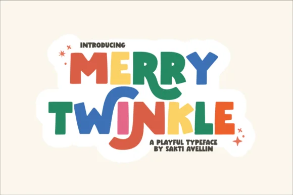
Playful cutout-star storybook block
Merry Twinkle bounces cheerful uneven paper-cut block capitals: the forms stay solid and chunky with no fragile hairlines, and the baseline shifts so a short title reads as if cut from coloured paper.
Ideas for this font
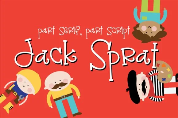
Quirky mixed-rule storybook font (part serif, part script)
Jack Sprat is a charmingly eccentric hand-drawn storybook font mixing slab-serif hooks, print bowls, and playful cursive links in one alphabet.
Ideas for this font
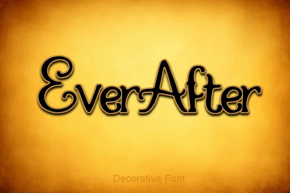
Storybook curled-swash fairytale serif
Ever After is an enchanting fairytale display serif curling classic 'Once Upon a Time' storybook loops onto capitals ('E', 'A') and lowercase stems.
Ideas for this font
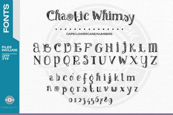
Zentangle-doodle inlaid storybook serif (OTF & TTF + 0–9)
Chaotic Whimsy is an intricate hand-doodled storybook serif packing tiny spirals, dots, and line-art flourishes inside uppercase, lowercase & 0–9 numerals (OTF & TTF)!
Ideas for this font
Same independent foundry
Allow optional Google Analytics to measure visits and catalogue actions. Your search words and notes are not included. Privacy & storage