Neutral Sans Workhorse

Crookthorn + Cenura
Lets Crookthorn own the focal silhouette while handling secondary copy, sizing and subheads cleanly.
Inspect Cenura specimenDisclosure: MakerFileHub may earn a commission from qualifying purchases via paid links on this page. How our links work.
Jagged thorn-carved whimsical gothic woodcut serif (Upper + Lower)
Crookthorn is a hand-carved whimsical gothic display serif bristling with jagged briar-thorn notches across bold uppercase & lowercase letters!
Paid link
Get this fontProject & layout blueprintsAt-a-glance maker compatibility
Sturdy stroke walls and open counters weed cleanly on adhesive vinyl, HTV apparel film, and cut cardstock.
Visual anatomy & craft review
Crookthorn is a hand-carved whimsical gothic display in upper and lower case, with jagged briar-thorn notches cut into the shoulders and terminals so the letters look whittled rather than printed. The weight is bold, counters stay open, and the notches are structural rather than a texture overlay, which means they survive a vinyl cut and a small screen print. It needs roughly 20 mm for the thorns to read as carving rather than as damage, and it is at its best in one dark colour on parchment or a deep ground.
Briar-thorn · Woodcut-gothic · Folk-horror
Two-font hierarchy recipes
Tested contrast partners — pairing Crookthorn with grounded secondary typography.
Crookthorn + Cenura
Lets Crookthorn own the focal silhouette while handling secondary copy, sizing and subheads cleanly.
Inspect Cenura specimen
Crookthorn + Resquel
Grounds bold display lettering with classic typographic authority on posters, badges and apparel.
Inspect Resquel specimenPractical applications
Concrete hierarchy, scale and production guidance tailored to Crookthorn’s stroke geometry.
Carved thorns read as a sign whittled from a branch, which is the friendly-spooky register a family haunt wants. Open counters keep a word legible at 20 mm on a bag label.
Hierarchy & layout recipe
Sign 400 x 600 mm, word 90 mm, 40 mm margins and 20 mm clear of any fixing hole. Bag label 120 x 80 mm, word 26 mm, 8 mm border. Scroll 148 x 420 mm, heading 26 mm, body 12/18 pt, 18 mm margins.
Pre-production check
A carved sign printed on foamex is often routed, and thorn notches under 3 mm chip at the edge. If the panel is routed, thicken the notches or print the panel flat and skip the cut.
Thorned contours read as a woodcut rather than a modern fantasy face, which suits folklore and story collections. Bold weight survives printing on uncoated text stock.
Hierarchy & layout recipe
Cover 129 x 198 mm, title 40 pt, author 14 pt, 15 mm margins, spine 8.5 pt. Zine A5, header 40 mm, body 9/13 pt. Collection 152 x 229 mm, chapter openers 26 pt.
Pre-production check
Uncoated paper draws ink and a carved notch at 40 pt can fill into a straight edge. Request a proof on the final stock, and if the notches close, increase the title size rather than the weight.
Whittled contours suit a fair where everything is timber and rope, and the thorn notches read at a distance without illustration. A single dark ink works on kraft.
Hierarchy & layout recipe
Sign 900 x 600 mm, word 160 mm, 60 mm margins with 30 mm clear of the frame. Label 70 x 50 mm, word 12 mm, 4 mm die margin. Tag 45 x 90 mm, word 10 mm, hole 5 mm clear, 3 mm from the trim edge.
Pre-production check
Kraft board plus a dark brown ink gives weak contrast at dusk, when a fair is busiest. Check one sign in the last hour of daylight, and lighten the ground or darken the ink if the word disappears.
Technical & licence verification
Confirm included OTF/TTF/WOFF formats, full glyph tables and licence coverage on the live store page before batch production.
Closest visual alternatives
Matched across letterform anatomy, stroke behaviour and craft applications.
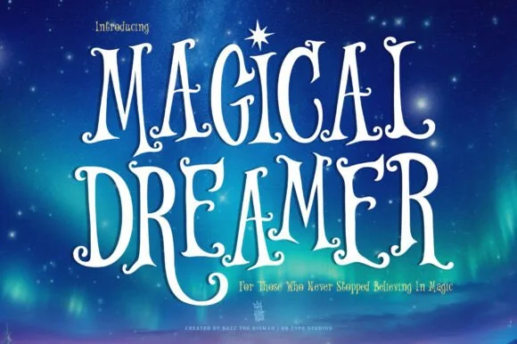
Starlight-curled celestial & whimsical fairytale serif (Alternates & Swashes)
Magical Dreamer is a tall, dreamy fairytale display serif curling spiral hooks and twinkling aurora magic into storybook capitals (with alternates & swashes)!
Ideas for this font
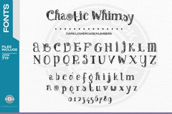
Zentangle-doodle inlaid storybook serif (OTF & TTF + 0–9)
Chaotic Whimsy is an intricate hand-doodled storybook serif packing tiny spirals, dots, and line-art flourishes inside uppercase, lowercase & 0–9 numerals (OTF & TTF)!
Ideas for this font
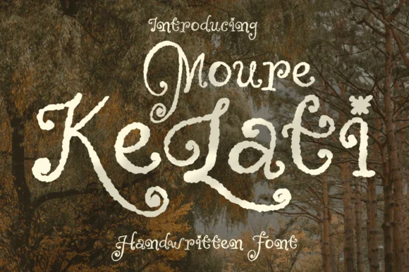
Weathered woodland-fairytale curled storybook display
Moure Kelati is a whimsical, rough-edged fairytale display font (disconnected, NOT a smooth script!) with spiral capitals and star/flower 'i' dots!
Ideas for this font
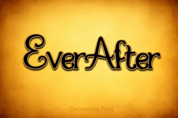
Storybook curled-swash fairytale serif
Ever After is an enchanting fairytale display serif curling classic 'Once Upon a Time' storybook loops onto capitals ('E', 'A') and lowercase stems.
Ideas for this font
Same independent foundry
Allow optional Google Analytics to measure visits and catalogue actions. Your search words and notes are not included. Privacy & storage