Neutral Sans Workhorse

Squadron + Bareum
Lets Squadron own the focal silhouette while handling secondary copy, sizing and subheads cleanly.
Inspect Bareum specimenDisclosure: MakerFileHub may earn a commission from qualifying purchases via paid links on this page. How our links work.
Heavy groovy display with wavy contours
Squadron is a heavy groovy display in red on white: fat letters with wavy contours, pinched waists and curled terminals, shown as a headline with the full alphabet, lower case, figures and punctuation beneath it.
Paid link
Get this fontProject & layout blueprintsAt-a-glance maker compatibility
Sturdy stroke walls and open counters weed cleanly on adhesive vinyl, HTV apparel film, and cut cardstock.
Visual anatomy & craft review
The sheet opens with one large word and then shows the whole character set, which is the useful part: a buyer can see that the face carries lowercase, figures and punctuation, not just a headline word. The letterforms are heavy with a wavy contour, the stems pinch in the middle, the terminals curl into small hooks, the bowls are wide and the counters are narrow, so a word reads as a carved, retro shape rather than a modern block. Because the same treatment is applied to the figures and the punctuation, a price or a date can be set in the same voice as the headline, which matters for signage. The palette is a single red on white with a red frame around the specimen, and a small logotype sits in the corner. Squadron is a display face for posters, signage, packaging and apparel with a seventies feel, and it needs short words at a large size and a plain ground.
Groovy, heavy, funky
Two-font hierarchy recipes
Tested contrast partners — pairing Squadron with grounded secondary typography.
Squadron + Bareum
Lets Squadron own the focal silhouette while handling secondary copy, sizing and subheads cleanly.
Inspect Bareum specimen
Squadron + Majestic Letters
Grounds bold display lettering with classic typographic authority on posters, badges and apparel.
Inspect Majestic Letters specimenPractical applications
Concrete hierarchy, scale and production guidance tailored to Squadron’s stroke geometry.
A groovy headline sets a period tone, and the full character set means the coverlines can stay in the same voice as the title.
Hierarchy & layout recipe
Print a 210 by 297 mm cover: set the title at 90 pt over two lines, keep 24 mm of clear ground beneath before the coverlines at 11 pt, and hold 16 mm of margin on all four sides.
Pre-production check
A wavy contour at ninety points can look lumpy; proof one cover at the final size and check the outline.
A funky display reads from a pavement and suits a shop that trades on a period look, and the figures let the price board match the fascia.
Hierarchy & layout recipe
Print a 900 by 300 mm panel: set the name at 160 pt on one line, keep 40 mm of clear ground beneath before the hours at 30 pt, and hold 30 mm of margin on all four sides.
Pre-production check
Vinyl cutting a wavy contour can leave jagged edges; ask for one cut sample before the panel is made.
A groovy face signals the era of the stock, and the punctuation and figures cover the practical details of a fair on one sheet.
Hierarchy & layout recipe
Print an A2 poster at 420 by 594 mm: set the title at 140 pt over two lines, keep 34 mm of clear ground beneath before the times at 24 pt, and hold 26 mm of margin on all four sides.
Pre-production check
A dense red on white can look flat; proof one sheet and check the counters of the smallest text.
Technical & licence verification
Confirm included OTF/TTF/WOFF formats, full glyph tables and licence coverage on the live store page before batch production.
Closest visual alternatives
Matched across letterform anatomy, stroke behaviour and craft applications.
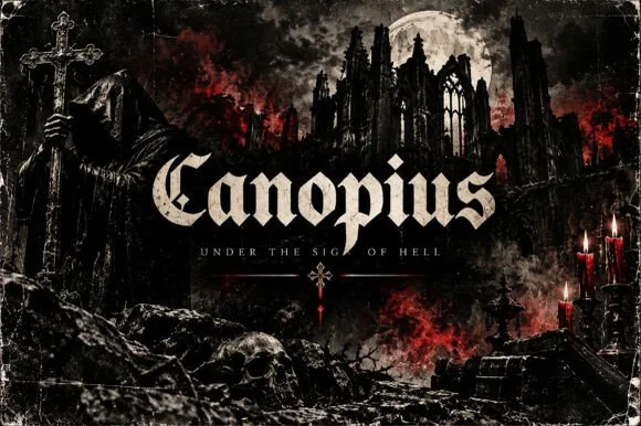
Classic broad-nib medieval Textura blackletter
Canopius is a bold, disciplined modern Textura blackletter featuring stout vertical pillars, diamond feet, and scrolled capital interiors.
Ideas for this font
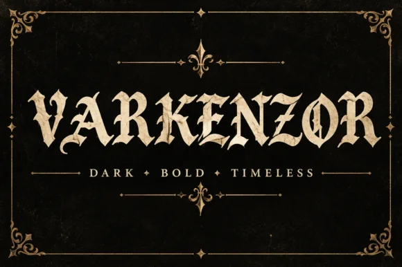
Condensed blackletter with sharp spurs
Varkenzor is a condensed blackletter in ochre on black inside an ornamental frame: tall narrow strokes, sharp spurs on the capitals, tight spacing that fuses the word into a band, and small diamond ornaments separating the motto words.
Ideas for this font
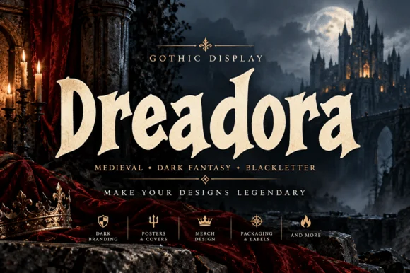
Stately broad-nib medieval manuscript blackletter
Dreadora is a stately medieval blackletter pairing classic broad-nib manuscript rhythm with smooth, highly legible lowercase bowls.
Ideas for this font
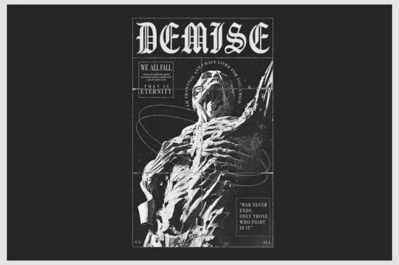
Sharp inline-highlighted underground metal blackletter
Demise is a razor-chiseled underground gothic blackletter featuring crisp vertical facets and grimdark poster presence.
Ideas for this font
Same independent foundry
Allow optional Google Analytics to measure visits and catalogue actions. Your search words and notes are not included. Privacy & storage