Neutral Sans Workhorse

My Game + Homies
Lets My Game own the focal silhouette while handling secondary copy, sizing and subheads cleanly.
Inspect Homies specimenDisclosure: MakerFileHub may earn a commission from qualifying purchases via paid links on this page. How our links work.
Pixel-block display
My Game is a squared pixel-like display shown on a brown ground: mixed case built from stepped blocks with a long blocky y descender, set as one large line, with a small logo above, a pink wordmark in the corner and a full character set in orange beneath.
Paid link
Get this fontProject & layout blueprintsAt-a-glance maker compatibility
Sturdy stroke walls and open counters weed cleanly on adhesive vinyl, HTV apparel film, and cut cardstock.
Visual anatomy & craft review
The plate does what a pixel face needs, which is to show the whole character set: the large line demonstrates the construction, and the rows beneath prove that the alphabet, numerals and symbols are all present, which is the first thing a buyer checks on a display face for interactive work. The drawing is a squared pixel display with stepped corners and a long y descender, so it reads as arcade lettering rather than as a monospace, and the blocky construction sets a size floor, because the steps merge below a certain size. The brown ground and the pink wordmark are staging. It suits a game screen, a poster and a shirt for a retro audience.
Display, pixel, arcade, retro
Two-font hierarchy recipes
Tested contrast partners — pairing My Game with grounded secondary typography.
My Game + Homies
Lets My Game own the focal silhouette while handling secondary copy, sizing and subheads cleanly.
Inspect Homies specimen
My Game + Aureline
Grounds bold display lettering with classic typographic authority on posters, badges and apparel.
Inspect Aureline specimenPractical applications
Concrete hierarchy, scale and production guidance tailored to My Game’s stroke geometry.
A pixel display names the event in the lettering, and the steps read on a screen as well as in print. The blocks read as pixels.
Hierarchy & layout recipe
A2 poster: the event at 100 mm cap height, the times in a 22 mm pixel face, and the venue at 12 mm. Keep 28 mm margins and print three colours on a dark stock.
Pre-production check
Check the A2 at five metres, where a step can merge into a tone; keep the blocks above 4 mm. Confirm the 12 mm venue reads at two metres and that the poster sits at eye height.
A pixel face sets a party with a period reference, and the block construction prints cleanly at home without fine detail.
Hierarchy & layout recipe
A6 card: the greeting at 26 pt, the details in a 10 pt sans, and the date at 9 pt. Keep 15 mm margins and print three colours on a dark card. Leave 12 mm at the foot for the address and the time of day.
Pre-production check
Check the 26 pt greeting at home-print resolution, where a step can fill; keep the blocks above 1.2 mm. Confirm the 10 pt details keep a 4.5:1 contrast and that the card folds flat.
A pixel display signals a technical class, and the block letters read on a corridor board seen from an angle. The blocks read from an angle.
Hierarchy & layout recipe
A3 poster: the class at 70 mm cap height, the times in a 20 mm sans, and the room at 12 mm. Keep 25 mm margins and print two colours on a light stock.
Pre-production check
Check the A3 at three metres, where the blocks can merge; keep 3 mm between letters. Confirm the 12 mm room reads at two metres and that the poster sits at eye height.
Technical & licence verification
Confirm included OTF/TTF/WOFF formats, full glyph tables and licence coverage on the live store page before batch production.
Closest visual alternatives
Matched across letterform anatomy, stroke behaviour and craft applications.
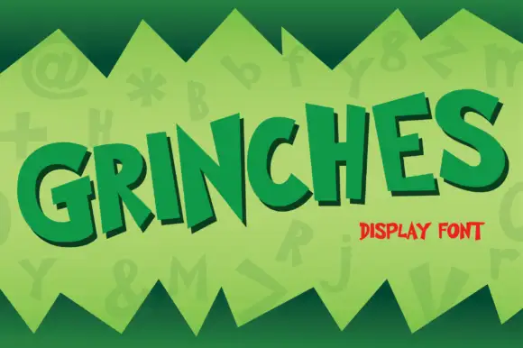
Uneven angled cartoon capitals
Grinches shows separate heavy capitals tilted at different angles along a rising word, where the N carries sharp diagonal points while the G and S use broad curves with blunt open ends and each letter sits at its own angle above the baseline.
Ideas for this font
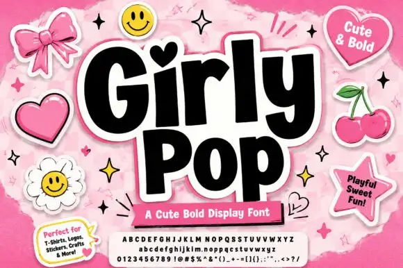
Heavy playful sans with a heart dot and slightly tilted letter bodies
Girly Pop is a heavy playful sans in which the letters stand at slightly different tilts, the i carries a heart dot and the weight stays maximal from first letter to last.
Ideas for this font
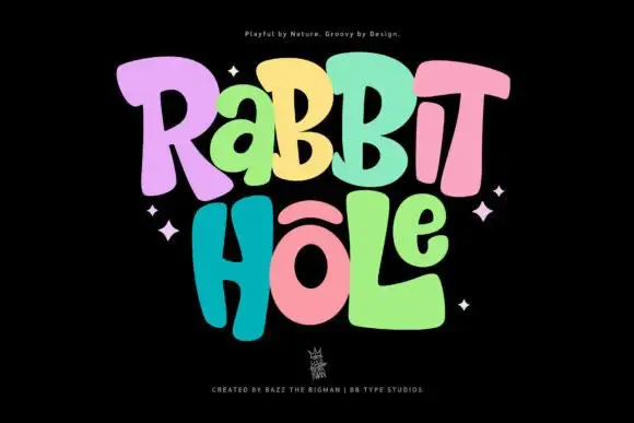
Groovy multicolour display
Rabbit Hole is a groovy multicolour display in pastel tones on a black ground: chunky rounded letters with soft corners and uneven widths, a bounce across both lines, four-point sparkles at the sides and a small crest at the foot.
Ideas for this font
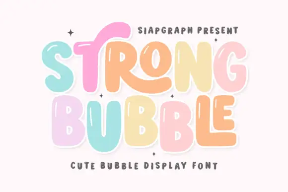
Pastel bubble display with shine
Strong Bubble is a pastel bubble display in mint, pink, peach and butter on white: fat rounded letters of uneven size, small white shine marks inside the strokes, a heavy outline and a bouncing baseline, so the pair reads as a hand-drawn sticker set rather than a typographic family.
Ideas for this font
Same independent foundry
Allow optional Google Analytics to measure visits and catalogue actions. Your search words and notes are not included. Privacy & storage