Editorial Serif Anchor

Senorita + Auretha
Anchors Senorita's fluid strokes with crisp Roman proportions on wedding suites, headers and packaging.
Inspect Auretha specimenDisclosure: MakerFileHub may earn a commission from qualifying purchases via paid links on this page. How our links work.
Tall heavy mixed-case loops
Senorita is a tall heavy handwriting in plum on pink: narrow letters in mixed case, big loops on the capitals and the descenders, a high x-height and a hand-drawn tilt across the line.
Paid link
Get this fontProject & layout blueprintsAt-a-glance maker compatibility
Weld or Unite overlapping script joins into one continuous vector path before sending to the blade.
Visual anatomy & craft review
The word is set in a mix of capital and lower-case forms, and the face is a heavy monoline hand: the S and the R are tall capitals with small loops, the e and the n are narrow lower-case forms with a high waist, the i is a stem with a round dot and the final a closes into a loop with a tail, which is what gives the word its sway. The stroke is thick and even, the ascenders reach well above the x-height and the descenders drop into narrow loops, and the letters lean a little more on the right of the word than the left. Small hearts float around the block and the caption sits in a pink bar beneath. Senorita is a display handwriting for packaging, cards, stickers and party goods, and it needs a short word and a large size to show its proportions.
A tall narrow hand in mixed case
Two-font hierarchy recipes
Tested contrast partners — pairing Senorita with grounded secondary typography.
Senorita + Auretha
Anchors Senorita's fluid strokes with crisp Roman proportions on wedding suites, headers and packaging.
Inspect Auretha specimen
Senorita + Bielchon
Keeps small-scale dates, URLs, nutrition facts and care instructions crisp and legible below script titles.
Inspect Bielchon specimenPractical applications
Concrete hierarchy, scale and production guidance tailored to Senorita’s stroke geometry.
A tall narrow hand with a tilt suits a party that wants personality rather than polish, and the heavy stroke reads across a room.
Hierarchy & layout recipe
Print a 400 by 250 mm board: set the name at 90 pt on one line, keep 20 mm of clear ground beneath before the greeting at 22 pt, and hold 18 mm of border on all four sides.
Pre-production check
A hand-drawn tilt can look like a crooked print; print one board at the final size and check the baseline reads as intended before the set.
A tall narrow hand gives a small jar a fashion voice, and the high waist keeps a long product name inside the round die of the label.
Hierarchy & layout recipe
Print a 55 mm round label: set the product at 14 pt on one line, keep 6 mm of clear ground to the die line, and leave 7 mm beneath for the weight at 4.5 pt.
Pre-production check
Tall letters clip on a round die; print one at the real size and check the capitals before the order.
A mixed-case hand gives a card the informality of a note, and the narrow forms let a long line fit a small format without shrinking.
Hierarchy & layout recipe
Print a 105 by 148 mm card: set the heading at 28 pt on one line, keep 14 mm of clear ground beneath before the details at 9.5 pt, and hold 13 mm of margin on all four sides.
Pre-production check
Mixed case in one line can look like a typo at a glance; print one card and read it as a stranger would before the batch.
Technical & licence verification
Confirm included OTF/TTF/WOFF formats, full glyph tables and licence coverage on the live store page before batch production.
Closest visual alternatives
Matched across letterform anatomy, stroke behaviour and craft applications.
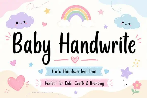
Friendly upright handwriting with a tall x-height
Baby Handwrite is a friendly handwriting face in which the letters stand upright, the x-height stays tall and the strokes round off, so a two-word title reads as something written on a nursery card with a marker.
Ideas for this font
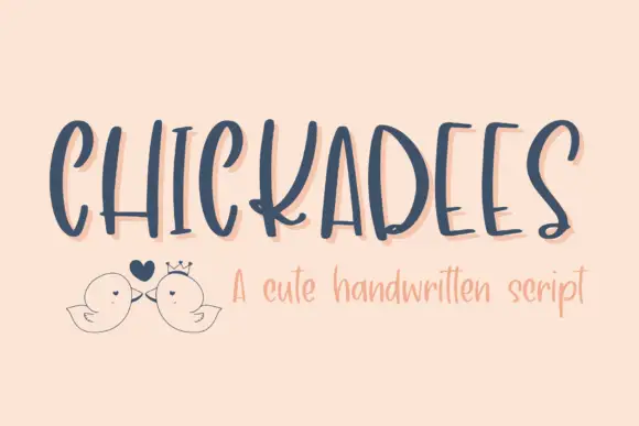
Thin separate display capitals with tall frames and uneven spacing
Chickadees is a set of thin separate capitals in which the frames run tall, the letters stand apart and the spacing shifts as the word goes on, so a heading reads as something written slowly on a card.
Ideas for this font
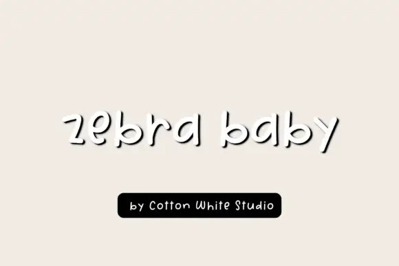
Low rounded letters left standing apart
Zebra Baby is a handwritten face in black on a warm cream page: short rounded letters left unjoined, drawn with a bouncy baseline and a soft offset shadow that lifts the word off the ground.
Ideas for this font
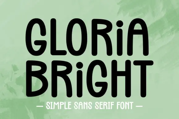
Rounded upright capitals with dotted i forms and softly arched A tops
Gloria Bright is a rounded upright hand in which the capitals stand tall, the A arches softly at its apex, the i keeps a dot at capital height and the strokes stay even but slightly uneven, so a line reads as hand-lettered capitals.
Same independent foundry
Allow optional Google Analytics to measure visits and catalogue actions. Your search words and notes are not included. Privacy & storage