Editorial Serif Anchor

Chickadees + Worldstar
Anchors Chickadees's fluid strokes with crisp Roman proportions on wedding suites, headers and packaging.
Inspect Worldstar specimenDisclosure: MakerFileHub may earn a commission from qualifying purchases via paid links on this page. How our links work.
Thin separate display capitals with tall frames and uneven spacing
Chickadees is a set of thin separate capitals in which the frames run tall, the letters stand apart and the spacing shifts as the word goes on, so a heading reads as something written slowly on a card.
Paid link
Get this fontProject & layout blueprintsAt-a-glance maker compatibility
Weld or Unite overlapping script joins into one continuous vector path before sending to the blade.
Visual anatomy & craft review
The C opens as a narrow crescent and the H keeps two thin stems with a low bar, while the K splays from a single junction, the A carries a low crossbar and the S reverses through two long curves, all at a light weight with rounded ends. Nothing connects and nothing is uniform: the fit loosens toward the end of the word, which is what gives the face its drawn quality at 40 pt and above. Because the strokes are thin, the face wants a smooth stock, and below 20 pt the separate letters start to read as a sans rather than as handwriting. The peach ground, the blue ink, the two birds and the small script caption are presentation; the lettering is the word shown.
Thin · Tall · Separate
Two-font hierarchy recipes
Tested contrast partners — pairing Chickadees with grounded secondary typography.
Chickadees + Worldstar
Anchors Chickadees's fluid strokes with crisp Roman proportions on wedding suites, headers and packaging.
Inspect Worldstar specimen
Chickadees + Borsen
Keeps small-scale dates, URLs, nutrition facts and care instructions crisp and legible below script titles.
Inspect Borsen specimenPractical applications
Concrete hierarchy, scale and production guidance tailored to Chickadees’s stroke geometry.
The thin separate letters give a first-birthday card a drawn voice, and the tall frames fill the front at 40 pt without extra artwork.
Hierarchy & layout recipe
Print a 120 by 120 mm square card: set the name at 40 pt across the upper half, set the date in a 9 pt sans beneath, and keep 15 mm of margin so the tall frames and their loose fit stay inside the trim.
Pre-production check
A light thin face printed on a textured card loses the stroke ends; check the proof on the chosen stock and move to its smoother side.
The uneven rhythm reads as hand lettering in a picture book, and the thin strokes keep the heading from competing with the illustration at 30 pt.
Hierarchy & layout recipe
Print a 210 by 210 mm page: set the heading at 30 pt in the upper third, set the body in a 11 pt serif at 16 pt leading, and hold 12 mm between the heading and the first line so the loose fit does not crowd the text.
Pre-production check
A loose letterfit can leave an awkward gap at a line end; check the typeset page and adjust the spacing by hand rather than tracking the whole heading.
The thin capitals keep a bakery label light and personal at 13 pt, which is what a home studio wants rather than a corporate mark.
Hierarchy & layout recipe
Print a 55 by 40 mm label: set the studio name at 13 pt, set the order line in a 5 pt sans beneath, and keep 4 mm of margin so the light stroke ends are not cut by the rounded corner of the die.
Pre-production check
Thin stroke ends under 0.25 mm cut badly on a small die; check the printed label and shorten the word rather than thinning it further.
Technical & licence verification
Confirm included OTF/TTF/WOFF formats, full glyph tables and licence coverage on the live store page before batch production.
Closest visual alternatives
Matched across letterform anatomy, stroke behaviour and craft applications.
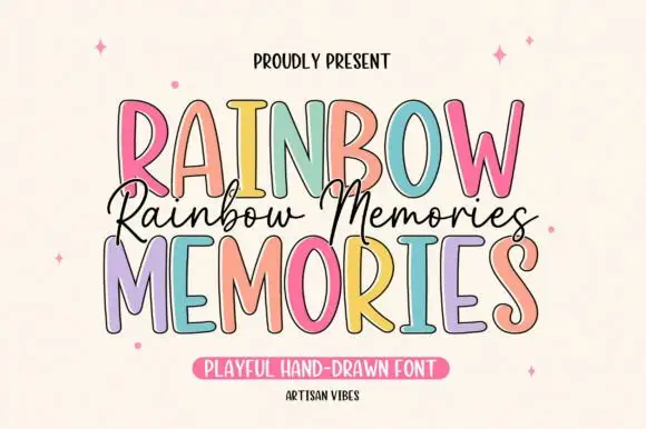
Tall irregular display capitals
Rainbow Memories is a tall irregular display capital hand in mixed pastels with a dark outline: letters of different widths and heights, a light monoline stroke and a small connected script that runs between the two capital lines.
Ideas for this font
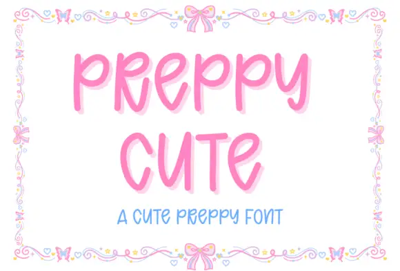
Tall rounded playful capitals
Preppy Cute is a tall rounded capital hand in candy pink with a soft glow: fat even strokes, open counters and a light bounce, framed by a drawn border of bows, hearts and tiny flowers.
Ideas for this font
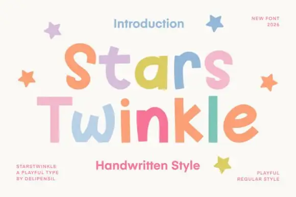
Uneven rounded separate display letters
Stars Twinkle is a playful separate-letter display in pastels on cream: fat rounded letters, no joins, uneven weights, and a different candy colour on every letter, with drawn stars at the edges.
Ideas for this font
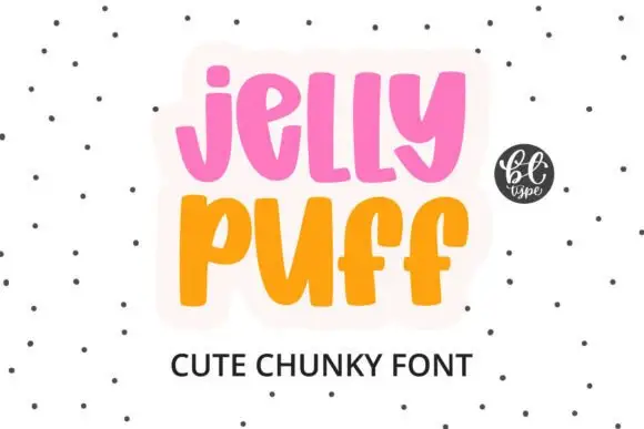
Chunky upright letters with curved lower ends and open counters
Jelly Puff is chunky upright lettering in which the strokes stay thick and even, the lower ends curl to one side and the counters stay open, so a word reads as something drawn with a fat marker.
Ideas for this font
Same independent foundry
Allow optional Google Analytics to measure visits and catalogue actions. Your search words and notes are not included. Privacy & storage