Editorial Serif Anchor

Zebra Baby + Cervelique
Anchors Zebra Baby's fluid strokes with crisp Roman proportions on wedding suites, headers and packaging.
Inspect Cervelique specimenDisclosure: MakerFileHub may earn a commission from qualifying purchases via paid links on this page. How our links work.
Low rounded letters left standing apart
Zebra Baby is a handwritten face in black on a warm cream page: short rounded letters left unjoined, drawn with a bouncy baseline and a soft offset shadow that lifts the word off the ground.
Paid link
Get this fontProject & layout blueprintsAt-a-glance maker compatibility
Weld or Unite overlapping script joins into one continuous vector path before sending to the blade.
Visual anatomy & craft review
The word is set on a single line in the middle of a plain page, and the face is a handwritten one: the letters are short and wide with rounded bowls, the z and the r keep their strokes separate, the b and the y drop soft curves, and nothing joins, so the word reads as a row of friendly shapes rather than a written line. The stroke is monoline with rounded ends and a slight wobble from letter to letter, and the baseline rises and falls a little, which is what gives the line its bounce. A pale second impression sits behind the black word, offset down and right, so the letters look printed rather than laid flat, and a small hand-drawn box at the foot carries the studio name in the same hand at a smaller size. The ground is a flat cream. Zebra Baby is a handwritten face for children's products, cards, packaging and social graphics, and it wants short phrases at a generous size.
Low, rounded, separate
Two-font hierarchy recipes
Tested contrast partners — pairing Zebra Baby with grounded secondary typography.
Zebra Baby + Cervelique
Anchors Zebra Baby's fluid strokes with crisp Roman proportions on wedding suites, headers and packaging.
Inspect Cervelique specimen
Zebra Baby + Miniplate
Keeps small-scale dates, URLs, nutrition facts and care instructions crisp and legible below script titles.
Inspect Miniplate specimenPractical applications
Concrete hierarchy, scale and production guidance tailored to Zebra Baby’s stroke geometry.
A low rounded hand looks like a caption written on the page, and the unjoined letters keep a young reader from working through joins before the words.
Hierarchy & layout recipe
Print a 210 by 210 mm picture-book page: set the heading at 36 pt on one line, keep 12 mm of clear ground beneath before the text at 13 pt, and hold 16 mm of margin on all four sides.
Pre-production check
A bouncy baseline can collide with an illustration above it; proof the spread with the artwork in place and check the clearance.
A soft unjoined hand suits a card that should look made at home, and the low wide letters read easily at the size of a small card held in the hand.
Hierarchy & layout recipe
Print a 120 by 120 mm card: set the greeting at 28 pt over two lines, keep 14 mm of clear ground beneath before the details at 9 pt, and hold 12 mm of margin on all four sides.
Pre-production check
An offset shadow printed on textured card can look like a printing fault; print one card on the stock you intend to use before the run.
A rounded unjoined hand matches the softness of the product, and short words stay legible on a woven label where a script would break down.
Hierarchy & layout recipe
Print a 45 by 30 mm woven label: set the name at 11 pt on one line, keep 5 mm of clear ground beneath before the size at 5 pt, and hold 4 mm of margin on all four sides.
Pre-production check
Woven labels lose thin strokes and offset shadows; order one sample in the real weave and check the letters before the batch.
Technical & licence verification
Confirm included OTF/TTF/WOFF formats, full glyph tables and licence coverage on the live store page before batch production.
Closest visual alternatives
Matched across letterform anatomy, stroke behaviour and craft applications.
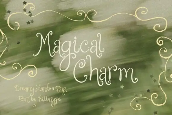
Dreamy thin curled handwriting
Magical Charm is a dreamy handwriting in cream on sage green: very thin monoline strokes, tall curled ascenders, decorative curls on the capitals and small drawn stars scattered through the background.
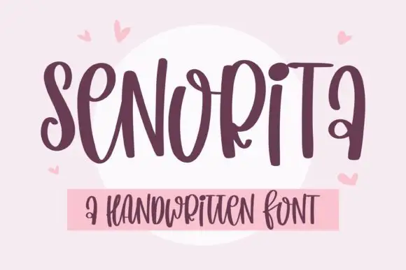
Tall heavy mixed-case loops
Senorita is a tall heavy handwriting in plum on pink: narrow letters in mixed case, big loops on the capitals and the descenders, a high x-height and a hand-drawn tilt across the line.
Ideas for this font
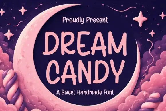
Soft irregular separate capitals with rounded uneven strokes
Dream Candy is a soft handwritten capital alphabet, drawn separate, with slightly uneven strokes and rounded ends, so a two-line phrase reads as a hand painted on paper rather than set in type.
Ideas for this font
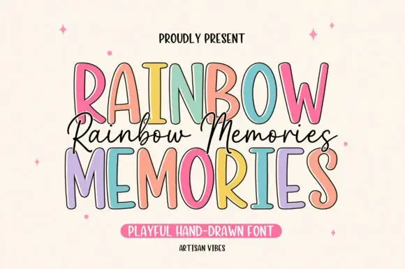
Tall irregular display capitals
Rainbow Memories is a tall irregular display capital hand in mixed pastels with a dark outline: letters of different widths and heights, a light monoline stroke and a small connected script that runs between the two capital lines.
Ideas for this font
Same independent foundry
Allow optional Google Analytics to measure visits and catalogue actions. Your search words and notes are not included. Privacy & storage