Neutral Sans Workhorse

Scotgrave + Mansory
Lets Scotgrave own the focal silhouette while handling secondary copy, sizing and subheads cleanly.
Inspect Mansory specimenDisclosure: MakerFileHub may earn a commission from qualifying purchases via paid links on this page. How our links work.
Uneven distressed blackletter
Scotgrave is an uneven blackletter in distressed white on a black ground: angular shoulders, a broad g tail, small gaps and rough edges in the strokes, set as one word with a plain descriptor and three style words beneath, tracked wide in small caps.
Paid link
Get this fontProject & layout blueprintsAt-a-glance maker compatibility
Weld or Unite overlapping script joins into one continuous vector path before sending to the blade.
Visual anatomy & craft review
The plate is a dark specimen with a plain hierarchy: the word, a descriptor and three tracked style words, all in white on black. The drawing is a blackletter with angular shoulders and a broad g tail, and the distressed edges are cut into the strokes rather than applied as a texture, so the letters read as printed from worn wood rather than as a font with a filter. That construction sets a moderate size floor, because the gaps fill in first, and the tracked style words beneath are product copy that do the naming work. It suits a cover, a poster and a label for a dark or historical subject, and it is honest about its usage: display sizes only, where the rough edge can be seen.
Decorative, blackletter, distressed, medieval
Two-font hierarchy recipes
Tested contrast partners — pairing Scotgrave with grounded secondary typography.
Scotgrave + Mansory
Lets Scotgrave own the focal silhouette while handling secondary copy, sizing and subheads cleanly.
Inspect Mansory specimen
Scotgrave + Lumera Editorial
Grounds bold display lettering with classic typographic authority on posters, badges and apparel.
Inspect Lumera Editorial specimenPractical applications
Concrete hierarchy, scale and production guidance tailored to Scotgrave’s stroke geometry.
An uneven blackletter frames a period cover, and the distressed edge gives the title the look of a worn print block. It suits a period cover.
Hierarchy & layout recipe
Set the title at 80 mm cap height across 175 mm, the author in a 12 pt serif, and the imprint at 8 pt. Print two colours on a textured stock and keep 22 mm margins.
Pre-production check
Check the title at 80 mm, where a gap can fill; keep the gaps above 0.3 mm. Confirm the 8 pt imprint survives lamination and that the g tail clears the trim.
A distressed blackletter reads as an old bill, and the white holds on a dark poster seen from across a street. It reads from across a street.
Hierarchy & layout recipe
A2 poster: the event at 100 mm cap height, the details in a 22 mm serif, and the venue at 11 mm. Keep 28 mm margins, print one colour on a dark stock and keep the gaps above 2.5 mm.
Pre-production check
Check the A2 at five metres, where a gap can vanish; widen it. Confirm the 11 mm venue reads at two metres and that the tracking under the title clears the frame.
A distressed label reads as a house with age, and the heavy strokes survive a small die where a fine gothic would disappear.
Hierarchy & layout recipe
Print a 55 by 85 mm label: the house at 12 pt, the product at 8 pt, and the weight at 7 pt. Keep 5 mm inside the die, keep the gaps above 0.35 mm and leave 10 mm at the foot for a batch note.
Pre-production check
Check the 12 pt house on a small die, where the distress fills in; use the smooth cut there. Confirm the 7 pt weight reads in hand and that the label takes a fold.
Technical & licence verification
Confirm included OTF/TTF/WOFF formats, full glyph tables and licence coverage on the live store page before batch production.
Closest visual alternatives
Matched across letterform anatomy, stroke behaviour and craft applications.
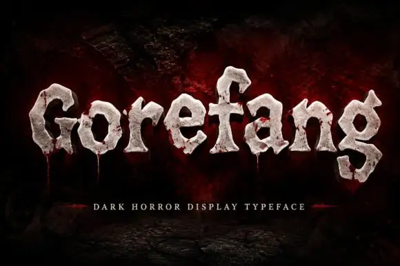
Chunky uneven letters with rough pale faces and low red trails
Gorefang is a dark horror display face in which each letter looks carved from a cracked white stone, with chipped edges, a textured surface and thin trails of red running down from the baseline.
Ideas for this font
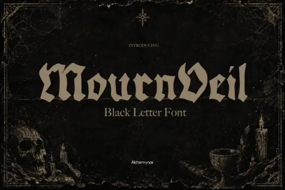
Low broad blackletter
Mournveil is a low broad blackletter in bone on a near-black textured ground: wide letters with irregular peaked tops, an angular V and short descenders, set as one word with a plain descriptor beneath, framed by a fine rule, a skull and candles at the lower corners.
Ideas for this font
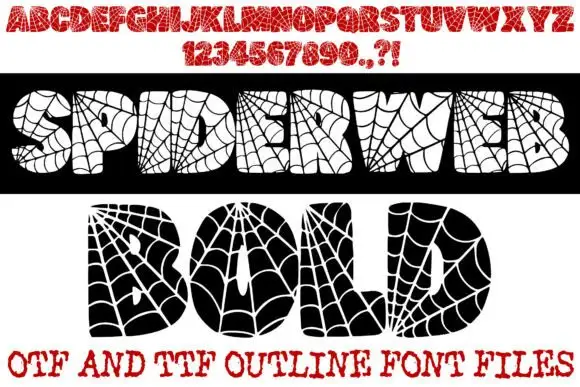
Spiderweb-filled display
Spiderweb Bold is a novelty display shown in two opposite treatments on white: a black bar carrying cream letters and a white panel carrying black letters, both filled with radial spiderweb lines and small spiders, with a red alphabet row and numeral row above and a format line at the foot.
Ideas for this font
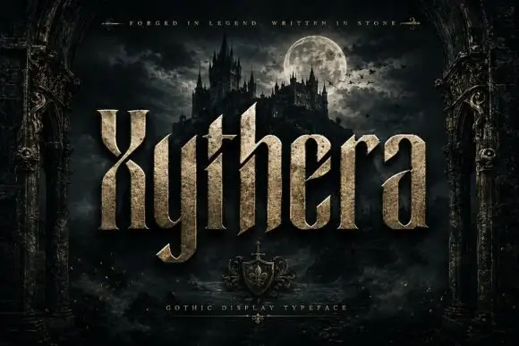
Textured gothic display
Xythera is a textured gothic display in gold on a dark scene: tall capitals with sharp spurs, a carved surface, and a stone-like speckle inside the strokes, framed by an arched stone border with a moonlit castle behind, so the plate reads as a fantasy title rather than a blackletter.
Ideas for this font
Same independent foundry
Allow optional Google Analytics to measure visits and catalogue actions. Your search words and notes are not included. Privacy & storage



