Neutral Sans Workhorse

Red + Headline
Lets Red own the focal silhouette while handling secondary copy, sizing and subheads cleanly.
Inspect Headline specimenDisclosure: MakerFileHub may earn a commission from qualifying purchases via paid links on this page. How our links work.
Ornate Victorian capitals with filigree
Red is an ornate Victorian display face in gold on a dark red damask ground: capitals built from heavy stems wrapped in filigree scrollwork, with small leaves and curls growing out of every curve, and a drop shadow that lifts them off the leather.
Paid link
Get this fontProject & layout blueprintsAt-a-glance maker compatibility
Cut solid base, outline, and shadow layers in separate vinyl colors and align on registration marks.
Visual anatomy & craft review
The word is set in three capitals and each one is a small drawing: a heavy gold stem carries the structure, but the counters and the joins are filled with curling filigree, the serifs break into leaf shapes, the R and the D sprout curls outside the letter, and the E is held together by a spine of scrolls. Nothing about the letterforms is plain, so the word reads as ornament first and as letters second, which is what a Victorian display face is for. A dark shadow sits under each letter, and the ground is a deep red damask leather with the same scrollwork pressed into it, so the type and the background belong to one object. A wax-seal badge in the lower corner names the file formats and a serif line beneath the word names the style. Red is a decorative face for certificates, packaging, labels and editorial covers with a Victorian mood, and it needs one short word at a large size and a dark ground.
Filigree, ornate, gilded
Two-font hierarchy recipes
Tested contrast partners — pairing Red with grounded secondary typography.
Red + Headline
Lets Red own the focal silhouette while handling secondary copy, sizing and subheads cleanly.
Inspect Headline specimen
Red + The Lumina Awesome
Grounds bold display lettering with classic typographic authority on posters, badges and apparel.
Inspect The Lumina Awesome specimenPractical applications
Concrete hierarchy, scale and production guidance tailored to Red’s stroke geometry.
A filigree face makes a bottle look like a period apothecary, and the gold on dark reads at shelf distance where a lighter face would turn to noise.
Hierarchy & layout recipe
Print a 55 by 90 mm label: set the word at 20 pt on one line, keep 6 mm of clear ground beneath before the volume at 4.5 pt, and hold 4 mm of margin on all four sides.
Pre-production check
Fine curls fill in on a small label; print one on the real stock and inspect the filigree before the order.
An ornate capital sets the period of a collection, and a single word at cover size carries the whole mood without an illustration.
Hierarchy & layout recipe
Print a 135 by 205 mm cover: set the title at 50 pt on one line, keep 22 mm of clear ground beneath before the editor at 11 pt, and hold 14 mm of margin on all four sides.
Pre-production check
A dark ground with gold type loses contrast in cheap print; proof one cover under shop lighting before the run.
Filigree initials on a seal tie a formal suite together, and the ornament does the work a monogram frame would otherwise need.
Hierarchy & layout recipe
Print a 40 mm round seal: set the initials at 20 pt inside the disc, keep 4 mm of clear ground from the disc edge, and hold the disc 10 mm from the card edge.
Pre-production check
Filigree in a wax stamp will bridge; order one seal in the real material and press it before the full set.
Technical & licence verification
Confirm included OTF/TTF/WOFF formats, full glyph tables and licence coverage on the live store page before batch production.
Closest visual alternatives
Matched across letterform anatomy, stroke behaviour and craft applications.
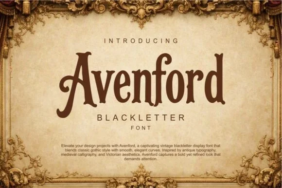
Smooth vintage Victorian blackletter
Avenford softens traditional gothic blackletter with smooth Victorian curves and open counters, presented for heritage labels, coffee roasters and book covers, where rounded arch transitions and a graceful sweeping crossbar on the A replace the spiked angles of a stricter gothic.
Ideas for this font

Broad capitals containing small guitar, campfire, sign, tree and caravan-like motifs
Camping sets heavy block capitals and fills their counters and gaps with small camping icons: a guitar, a campfire, a signpost, a caravan and a pine, so the word reads as a set of badges.
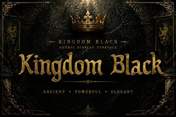
Weighty serif-like Gothic with rounded bowls and tapered sharp tips
Kingdom Black is a gothic display face filled with a textured gold, presented as a royal title plate with a crown above, lion banners at the sides and an ornamental frame.
Ideas for this font
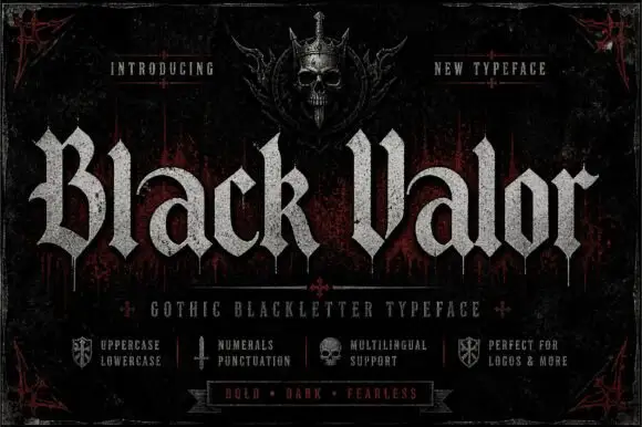
Broad blackletter with curved a shoulders and hooked capitals
Black Valor sets a gothic blackletter in distressed white on a black ground, with broad strokes, curled lowercase shoulders and hooked capitals whose ends finish in fine diamond points.
Ideas for this font
Same independent foundry
Allow optional Google Analytics to measure visits and catalogue actions. Your search words and notes are not included. Privacy & storage