Neutral Sans Workhorse

Sandy Wink Sea + Bielchon
Lets Sandy Wink Sea own the focal silhouette while handling secondary copy, sizing and subheads cleanly.
Inspect Bielchon specimenDisclosure: MakerFileHub may earn a commission from qualifying purchases via paid links on this page. How our links work.
Marine-embellished rounded display
Sandy Wink Sea is a rounded display in charcoal on a soft grey wash: mixed case whose letters carry marine figures — a dolphin, an octopus, bubbles, shells, a starfish — with shell-topped strokes and a tracked line beneath that names five styles.
Paid link
Get this fontProject & layout blueprintsAt-a-glance maker compatibility
Cut solid base, outline, and shadow layers in separate vinyl colors and align on registration marks.
Visual anatomy & craft review
The plate sets the face large and lets the embellishments carry the character: the S is a shell, the a holds an octopus, the y rises into a dolphin, and bubbles are scattered between the letters, so the word reads as an illustrated scene rather than as typesetting. That construction sets a large size floor, because the figures close when the letters shrink, and the plate sets the words large enough that each animal is recognisable. The grey wash behind is staging that keeps the charcoal crisp, and the tracked line beneath is product copy naming the styles. Because the letters are rounded and even, the plain cuts can be used alone, which the line beneath implies, and the embellished cut is for a card, a shirt and a party sign.
Decorative, marine, rounded, playful
Two-font hierarchy recipes
Tested contrast partners — pairing Sandy Wink Sea with grounded secondary typography.
Sandy Wink Sea + Bielchon
Lets Sandy Wink Sea own the focal silhouette while handling secondary copy, sizing and subheads cleanly.
Inspect Bielchon specimen
Sandy Wink Sea + Bulgary
Grounds bold display lettering with classic typographic authority on posters, badges and apparel.
Inspect Bulgary specimenPractical applications
Concrete hierarchy, scale and production guidance tailored to Sandy Wink Sea’s stroke geometry.
A marine display sets a swimming theme in the lettering, and the plain cut prints at home without losing the character. It reads on a card at arm's length.
Hierarchy & layout recipe
A6 card: the greeting at 28 pt, the details in a 9.5 pt sans, and the time at 8.5 pt. Keep 15 mm margins and print two colours on a white card. Leave 14 mm at the foot for the time.
Pre-production check
Check the 28 pt greeting at home-print resolution, where a bubble can close; keep the smallest detail above 1.2 mm. Confirm the 9.5 pt details keep a 4.5:1 contrast and that the card folds flat.
A marine face prints as a costume piece, and the figures read from across a beach where a plain script would blur. The figures sell the theme.
Hierarchy & layout recipe
Print a 240 mm chest graphic: the slogan at 55 mm cap height, the year at 26 mm, and two inks on a light shirt. Keep the smallest figure at 5 mm and place the graphic 80 mm below the collar.
Pre-production check
Check the screen at actual mesh, where a 5 mm figure can fill; enlarge it. Wash-test one shirt and confirm the shapes stay distinct after five cycles.
A marine label names the trade at a glance, and the plain cut stays readable on a small die. A plain cut keeps a small label readable where the figures would close.
Hierarchy & layout recipe
Print a 55 by 55 mm label: the school at 12 pt in the plain cut, the line at 7.5 pt, and two colours on a white stock. Keep 4 mm inside the die and keep the bubbles above 1.5 mm.
Pre-production check
Check the 12 pt name on a small die, where a bubble can close; use the plain cut there. Confirm the 7.5 pt line reads at arm's length and that the label survives a splash.
Technical & licence verification
Confirm included OTF/TTF/WOFF formats, full glyph tables and licence coverage on the live store page before batch production.
Closest visual alternatives
Matched across letterform anatomy, stroke behaviour and craft applications.
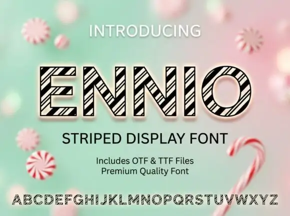
Geometric outlined capitals filled with tightly grouped diagonal black stripes
Ennio draws squat slab capitals with a heavy outline and a diagonal stripe running through each letter, so a word looks cut from a barber's pole or a fairground awning.
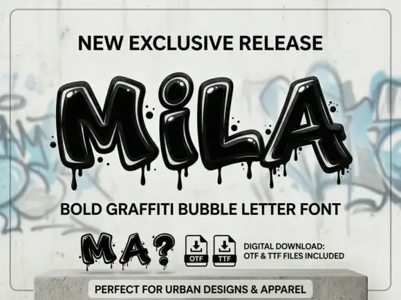
Glossy graffiti bubble letters
Mila is a bold graffiti bubble display in black gloss on a concrete plinth against a graffitied wall: fat inflated letters with a heavy highlight, drips falling from the baselines, dots and specks around the block, with tracked captions above and below and file badges at the foot.
Ideas for this font
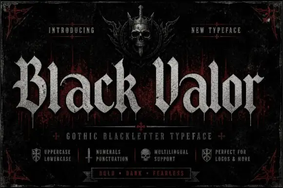
Broad blackletter with curved a shoulders and hooked capitals
Black Valor sets a gothic blackletter in distressed white on a black ground, with broad strokes, curled lowercase shoulders and hooked capitals whose ends finish in fine diamond points.
Ideas for this font
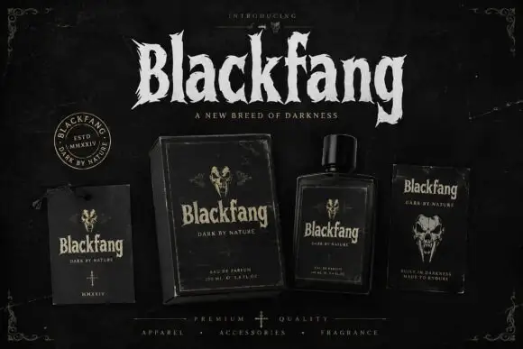
Ragged Gothic lettering with torn points and uneven bowls
Blackfang is a gothic display face with sharp spiked terminals and a smooth filled contour, shown here across a hang tag, a box, a bottle and a folded card.
Ideas for this font
Same independent foundry
Allow optional Google Analytics to measure visits and catalogue actions. Your search words and notes are not included. Privacy & storage