Neutral Sans Workhorse

Blackfang + Lemon Milk Pro FTR
Lets Blackfang own the focal silhouette while handling secondary copy, sizing and subheads cleanly.
Inspect Lemon Milk Pro FTR specimenDisclosure: MakerFileHub may earn a commission from qualifying purchases via paid links on this page. How our links work.
Ragged Gothic lettering with torn points and uneven bowls
Blackfang is a gothic display face with sharp spiked terminals and a smooth filled contour, shown here across a hang tag, a box, a bottle and a folded card.
Paid link
Get this fontProject & layout blueprintsAt-a-glance maker compatibility
Fine grain and micro-texture excel in 300 DPI print, sublimation, and screen print rather than small vinyl weeding.
Visual anatomy & craft review
Blackfang is presented as a brand system: the word sits at the top of the card in a pale grey, and the same lettering is repeated on a dark hang tag, a perfume box and a square bottle, each with a small skull crest and a line of small caps below. The letters combine a blackletter skeleton with sharp spiked feet and a smooth, flat fill, and the counters are narrow but open enough to read at label size. A round badge at the left carries the brand name and a founding year, and a footer lists the three product lines between rules. The point of the sample is range: the same face at three sizes, from a 12 mm tag line to a 60 mm box face, and it holds at all of them because the contour is clean rather than textured.
Ragged Gothic lettering with torn points and uneven bowls
Two-font hierarchy recipes
Tested contrast partners — pairing Blackfang with grounded secondary typography.
Blackfang + Lemon Milk Pro FTR
Lets Blackfang own the focal silhouette while handling secondary copy, sizing and subheads cleanly.
Inspect Lemon Milk Pro FTR specimen
Blackfang + Askinо
Grounds bold display lettering with classic typographic authority on posters, badges and apparel.
Inspect Askinо specimenPractical applications
Concrete hierarchy, scale and production guidance tailored to Blackfang’s stroke geometry.
One face covers the bottle, the box and the tag, and the sharp terminals give a plain black package a detail that survives being printed small.
Hierarchy & layout recipe
Print a 60 by 100 mm label and a 90 by 40 mm tag from one file set: set the bottle name at 22 pt and the tag line at 12 pt, keep 7 mm of clear ground beneath the name on both, and hold 5 mm from the lowest spike to the die line.
Pre-production check
Fine spikes break on small labels; print one bottle label on the real stock and check the terminals before the order.
The lettering sets the tone of a seasonal release, and the clean contour stays readable on a dark poster photographed for a shop window.
Hierarchy & layout recipe
Print a 420 by 594 mm poster: set the release name at 130 pt across one row, keep 30 mm of clear ground beneath before the date at 13 pt, and hold 26 mm of margin so the spikes stay inside the sheet.
Pre-production check
Pale ink on black stock scuffs at the edge; print one poster and handle it before the run is approved.
The face is sharp enough to read as fashion rather than horror, and the narrow counters hold a long title in a magazine trim.
Hierarchy & layout recipe
Print a 230 by 300 mm cover: set the cover title at 90 pt across two rows, keep 28 mm of clear ground beneath before the cover lines at 11 pt, and hold 20 mm from the spikes to the trim.
Pre-production check
Matte lamination dulls a smooth fill slightly; print one cover with the finish and compare it with the digital proof.
Technical & licence verification
Confirm included OTF/TTF/WOFF formats, full glyph tables and licence coverage on the live store page before batch production.
Closest visual alternatives
Matched across letterform anatomy, stroke behaviour and craft applications.
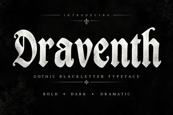
Broad rounded blackletter with curled D and pointed lower joins
Draventh is a wide gothic blackletter display face with heavy stems, sharp hooked shoulders and a weathered silver fill that reads as rubbed metal.
Ideas for this font
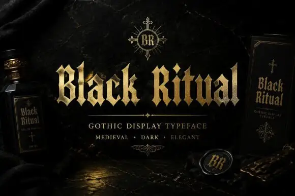
Faceted blackletter with split B and sharp diamond dots
Black Ritual sets heavy gothic capitals with diamond finials in a gold finish on a black ground, and shows the same face printed on a bottle label and a book cover so the range is visible.
Ideas for this font
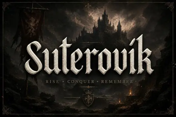
Narrow gothic display with sweep
Suterovik is a narrow gothic display in silver on a dark landscape: mixed case with a sweeping S, a hooked tall k, angular shoulders and a scaled texture, set as one word with a tracked line beneath and a small crest at the foot, framed against a castle and a banner.
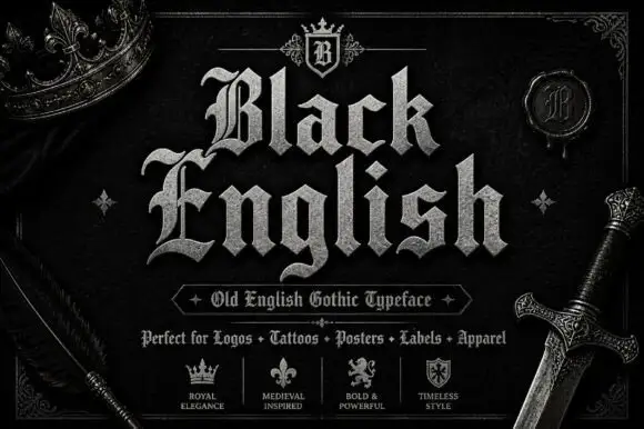
Angular blackletter with diamond-ended strokes and ornate initials
Black English shows pale Gothic mixed case on black, where angular broken bowls, pointed joins and diamond stroke endings give the lowercase a dense rhythm, the large B and E carry extra entry flourishes and a grey hatched treatment adds surface detail to the shown title.
Ideas for this font
Same independent foundry
Allow optional Google Analytics to measure visits and catalogue actions. Your search words and notes are not included. Privacy & storage



