Neutral Sans Workhorse

Sand + Swaraga
Lets Sand own the focal silhouette while handling secondary copy, sizing and subheads cleanly.
Inspect Swaraga specimenDisclosure: MakerFileHub may earn a commission from qualifying purchases via paid links on this page. How our links work.
Sand-cast lettering set
Sand is a bitmap lettering set shown as four capitals pressed into a sand surface: each letter is a hollow dug into the grain with raised edges throwing small shadows, in the same warm tone as the ground, with a small crab drawn at the upper left and tracked notes above and beneath.
Paid link
Get this fontProject & layout blueprintsAt-a-glance maker compatibility
Sturdy stroke walls and open counters weed cleanly on adhesive vinyl, HTV apparel film, and cut cardstock.
Visual anatomy & craft review
This is not a vector face but a bitmap and PNG set, and the plate is honest about that in its own description. What it sells is the effect: the letters are carved into the surface rather than laid on top of it, so the edges cast shadows and the interior keeps the grain, which means the artwork only reads at sizes where the depth is visible. The warm monotone is what makes it convincing, because the letters and the ground are the same material, and the crab at the corner sets the beach context without a caption. Because the shadows are part of the image, the set cannot be recoloured the way a font can, and the plate implicitly warns the buyer by showing only one palette. It suits a single seasonal graphic rather than a typographic system.
Decorative, textured, novelty, photographic
Two-font hierarchy recipes
Tested contrast partners — pairing Sand with grounded secondary typography.
Sand + Swaraga
Lets Sand own the focal silhouette while handling secondary copy, sizing and subheads cleanly.
Inspect Swaraga specimen
Sand + Marquis - Elegant Modern Serif
Grounds bold display lettering with classic typographic authority on posters, badges and apparel.
Inspect Marquis - Elegant Modern Serif specimenPractical applications
Concrete hierarchy, scale and production guidance tailored to Sand’s stroke geometry.
A sand-cast set gives a beach subject a texture no vector face can imitate, and the shadowed edges read at cover size without extra effects.
Hierarchy & layout recipe
Set a 300 by 300 mm square: the title at 90 mm cap height, the subtitle in a 12 pt sans, and one warm tone across the artwork. Keep 25 mm margins and work at 300 dpi so the grain survives.
Pre-production check
Check the file at 300 dpi, where the edges can turn soft; keep the resolution and avoid scaling up. Confirm the subtitle reads at arm's length and that the grain does not band in print.
A photographic letter set suits a summer invitation, and the single warm tone keeps a home print from needing a colour profile.
Hierarchy & layout recipe
A6 card: the greeting at 26 mm cap height, the details in a 9 pt sans, and one tone on a warm stock. Keep 14 mm margins and print at 300 dpi from the PNG files.
Pre-production check
Check the 26 mm greeting at home-print resolution, where the shadows can fill; print one proof sheet first. Confirm the 9 pt details keep a 4.5:1 contrast and that the card folds flat.
A sand-cast graphic reads as a photograph rather than as lettering, which is what a seasonal venue wants on a menu board.
Hierarchy & layout recipe
Print a 600 by 400 mm board: the name at 120 mm cap height, the menu in a 20 mm sans, and one tone on a matt board. Keep 25 mm margins and laminate for outdoor use.
Pre-production check
Check the 120 mm name under laminate, where the grain can flatten; keep the graphics large. Confirm the 20 mm menu reads at two metres and that the edge seal holds in damp air.
Technical & licence verification
Confirm included OTF/TTF/WOFF formats, full glyph tables and licence coverage on the live store page before batch production.
Closest visual alternatives
Matched across letterform anatomy, stroke behaviour and craft applications.
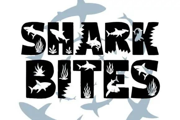
Silhouette cut-out novelty alphabet
Shark Bites is a novelty silhouette alphabet in black and pale blue on white: block capitals with shark silhouettes and seaweed cut out of the fills, jagged bite notches on the vertical edges, and a scatter of pale sharks swimming behind the words.
Ideas for this font
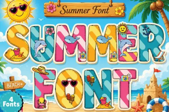
Beach-collage block display
Summer is a novelty display on a painted beach scene: tall block capitals with cream outlines and keylines, filled with diagonal colour panels and inset photographs of beach objects — dolphins, sunglasses, ice cream, sandcastles — with a wooden sign at the top and a badge at the lower left.
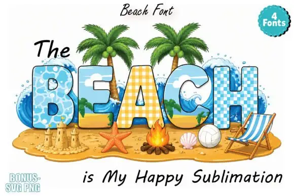
Beach-scene block bundle
The Beach is a colour bundle on a white ground: broad capitals filled with beach scenes — water, sand, palms and a checkered pattern — in blue and yellow, framed by palms, a sandcastle, a starfish, a campfire and a deck chair, with a script line above and below and a count badge at the upper right.
Ideas for this font
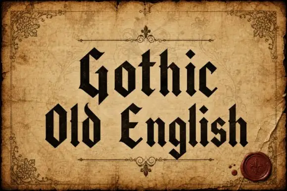
Upright broken-stroke blackletter with diamond dots
Gothic Old English is a classic textura blackletter in mixed case, with dense vertical strokes, diamond feet and a rhythm that reads as print rather than as lettering.
Ideas for this font
Same independent foundry
Allow optional Google Analytics to measure visits and catalogue actions. Your search words and notes are not included. Privacy & storage