Modern Grotesque Body

Naive Line + Cultivo
Creates crisp high-hierarchy contrast beneath Naive Line headlines across menus, websites and labels.
Inspect Cultivo specimenDisclosure: MakerFileHub may earn a commission from qualifying purchases via paid links on this page. How our links work.
Thin monoline serif display
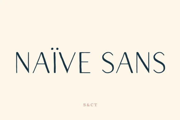
Naive Line is a skeletal monoline serif in navy on cream: hairline strokes of a single weight, serifs reduced to thin horizontal arms on the stems, and so much tracking between the letters that the word reads as two separated halves.
Paid link
Get this fontProject & layout blueprintsAt-a-glance maker compatibility
Set Cricut or Silhouette operation to Pen, Foil Quill, or Laser Score — not Basic Blade Cut.
Visual anatomy & craft review
Both words are set in capitals across the centre of the page, and the drawing strips a serif down to its structure: every stroke is the same thin weight, the serifs are flat lines that extend only slightly past the stems, and there is no contrast at all, so the letterforms read as wire rather than as solid type. The I carries the same thin bars at top and bottom as the other letters, which is what holds the alphabet together, and the closed counters of the A and the E are large and geometric. Tracking is set unusually wide, almost half a letter width, which turns the two words into a measured line and gives the thin strokes enough air to stay visible. The ground is a plain cream with a single small credit in a warm tone at the foot, so the specimen is entirely about the delicacy of the drawing rather than about an image.
Thin, airy, modern, skeletal
Two-font hierarchy recipes
Tested contrast partners — pairing Naive Line with grounded secondary typography.
Naive Line + Cultivo
Creates crisp high-hierarchy contrast beneath Naive Line headlines across menus, websites and labels.
Inspect Cultivo specimen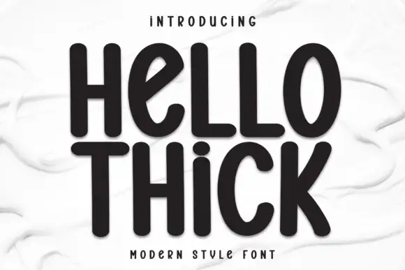
Naive Line + Hello Thick
Adds a warm human signature touch for 1-to-3-word callouts without competing against structured serif capitals.
Inspect Hello Thick specimenPractical applications
Concrete hierarchy, scale and production guidance tailored to Naive Line’s stroke geometry.
A near-weightless serif gives a section divider the look of a line of type rather than a heading, which suits a book that wants the typography to stay quiet.
Hierarchy & layout recipe
Set the divider at 34 pt in caps with tracking at 400 units, centre it on a 130 by 200 mm page, and leave the rest of the page blank. Keep the same measurement for every divider in the book so the sequence reads as a system.
Pre-production check
Check the hairline at 34 pt on the book's uncoated stock, where a single-weight stroke under 0.2 pt tends to break; proof one signature before the run. Confirm the wide tracking does not create a double space between the words and that the line is optically centred.
A skeletal serif gives a practice a mark that reads as a line drawing, which matches the way architects present work and holds on a drawing sheet as well as a card.
Hierarchy & layout recipe
Set the name at 26 pt in caps with tracking at 350 units, and pair it with a 0.25 pt rule at the same width beneath. Keep the mark single-colour for plans and reverse it for a dark website header.
Pre-production check
Check the mark at 26 pt on a plotter print, where a hairline under 0.18 pt may not draw at all; raise the weight for drawings. Confirm the tracking holds the word on one line at A1 and that the rule does not look heavier than the type.
A thin serif cover reads as restrained rather than plain, and because the strokes are even it stays crisp on a small folded programme printed on uncoated paper.
Hierarchy & layout recipe
Set the couple's names at 24 pt in caps with tracking at 300 units on an A5 programme, the date in a 8 pt sans beneath, and a 0.25 pt rule above. Keep 25 mm margins so the airy tracking has a frame to sit inside.
Pre-production check
Check the names at 24 pt on the folded programme, where the fold can crack a hairline if it crosses a stroke; keep the type 15 mm from the fold. Confirm the 8 pt date reads at arm's length and that the rule matches the stroke weight visually.
Technical & licence verification
Confirm included OTF/TTF/WOFF formats, full glyph tables and licence coverage on the live store page before batch production.
Closest visual alternatives
Matched across letterform anatomy, stroke behaviour and craft applications.
Slender open-inline luxury editorial & perfumery serif
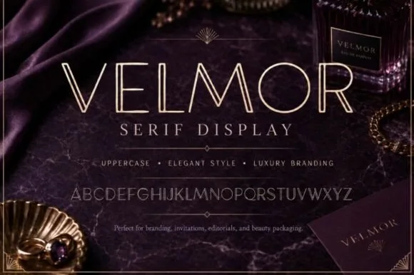
Velmor is an ultra-refined uppercase luxury display serif carved down every primary vertical stem with a delicate open inline channel.
Ideas for this font
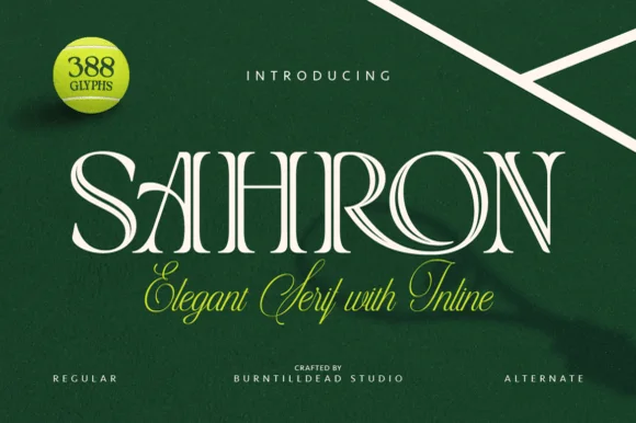
Engraved inline luxury display serif (Regular & Alternate)
Sahron is an aristocratic high-contrast serif accented by fine interior inline grooves down its primary vertical and diagonal stems.
Ideas for this font

High-contrast mixed case with a delicate looping join and an open descender bowl
Idealistic Thinking is a high-contrast serif in which fine hairlines meet broad verticals, the serifs finish sharp, a thin loop rises over the s-t area and the lower g drops into a large open bowl, so a short headline reads as fashion editorial.
Ideas for this font
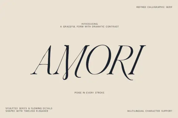
Right-leaning fine capitals with long curved diagonal endings and high contrast
Amori is a fine capital serif in which the letters lean to the right, the diagonals run out into long curves and the contrast between stems and hairlines is extreme, so a single word reads as a refined calligraphic mark.
Ideas for this font
Same independent foundry
Allow optional Google Analytics to measure visits and catalogue actions. Your search words and notes are not included. Privacy & storage