Modern Grotesque Body

Strong Western + Saltriver Grotesk
Creates crisp high-hierarchy contrast beneath Strong Western headlines across menus, websites and labels.
Inspect Saltriver Grotesk specimenDisclosure: MakerFileHub may earn a commission from qualifying purchases via paid links on this page. How our links work.
Western display slab with weathered fill
Strong Western is a heavy western slab in forest green on cream: bracketed slab serifs with spurred feet, thick even strokes, slightly condensed proportions, and a weathered fill with fine speckle that reads as a worn woodblock.
Paid link
Get this fontProject & layout blueprintsAt-a-glance maker compatibility
Sturdy stroke walls and open counters weed cleanly on adhesive vinyl, HTV apparel film, and cut cardstock.
Visual anatomy & craft review
Both words are set in the same weight and stack to fill the frame, and the drawing is the classic western display: slab serifs that flare at the feet, small spurs on the stems, a flat-topped A and a W with crossed strokes that nearly close at the centre. The proportions are slightly condensed, so the words fit the width without tracking, and the counter of the O stays nearly rectangular. The weather is drawn into the letters as a fine speckle and occasional nicks rather than a photographic texture, which keeps the shape readable at a distance and prints cleanly in one ink. Two illustrated cacti stand at the lower corners, two small stars sit at the top, and the descriptor lines are set in a lighter weight of the same family, which shows the design ships as more than one weight.
Western, weathered, heavy, archetypal
Two-font hierarchy recipes
Tested contrast partners — pairing Strong Western with grounded secondary typography.
Strong Western + Saltriver Grotesk
Creates crisp high-hierarchy contrast beneath Strong Western headlines across menus, websites and labels.
Inspect Saltriver Grotesk specimen
Strong Western + Autography
Adds a warm human signature touch for 1-to-3-word callouts without competing against structured serif capitals.
Inspect Autography specimenPractical applications
Concrete hierarchy, scale and production guidance tailored to Strong Western’s stroke geometry.
A western slab reads as a painted board sign, which is what a seasonal farm stand needs, and the weathered fill makes a new sign look established.
Hierarchy & layout recipe
Print 900 by 600 mm on exterior board: the two words at 160 mm cap height, the opening times in the lighter weight at 30 mm, and a 10 mm border at 40 mm from the edge. Keep the lettering in one colour and let the weathered fill carry the texture.
Pre-production check
Check the fill at full size, where the speckle can read as dirt on an outdoor sign; reduce the weathering for the large format. Confirm the 30 mm times read from ten metres and that the border clears the board's mounting holes.
A western slab gives a spice packet a frontier story that fits the product, and the single weight keeps a small label uncluttered on a crowded shelf.
Hierarchy & layout recipe
Print a 60 by 90 mm pouch label: the blend name at 20 pt, the heat level in the lighter weight at 7 pt, and the weight in 6.5 pt. Keep 5 mm of clear space around the word and print one ink on a kraft pouch so the weathered fill reads as part of the paper.
Pre-production check
Check the 20 pt word on kraft, where a dark ink over a textured paper can lose the fine nicks; proof with the actual pouch stock. Confirm the 6.5 pt weight stays legible on the pouch's curved crease and that no part of the word sits over the fold.
A western slab cover signals the genre instantly and gives a reissue the look of a period edition without commissioning an illustration.
Hierarchy & layout recipe
Set the title at 70 pt in two lines on a 178 by 111 mm paperback cover, the author in 14 pt in the lighter weight, and a 0.5 pt rule at the head. Keep the type on a cream field with a single illustration band at the foot so the slab serifs read against flat colour.
Pre-production check
Check the title at 70 pt on the paperback stock, where heavy slab serifs can fill their counters at small trim sizes; proof the actual cover. Confirm the author line clears the illustration band by 10 mm and that the spine version at 12 pt stays readable.
Technical & licence verification
Confirm included OTF/TTF/WOFF formats, full glyph tables and licence coverage on the live store page before batch production.
Closest visual alternatives
Matched across letterform anatomy, stroke behaviour and craft applications.
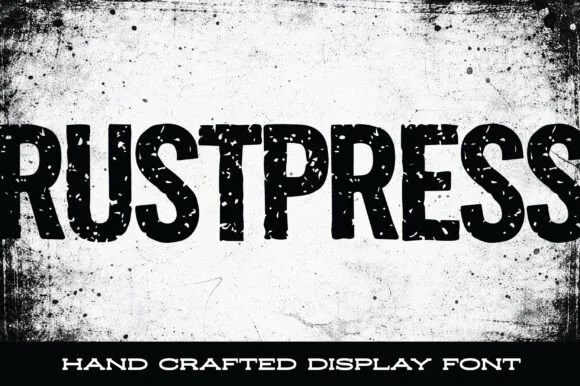
Condensed grunge grotesque
Rustpress is a condensed grotesque in black on a stained white ground: narrow caps with square shoulders, thick even stems, and a distress of punched holes and scratches that makes the word read as a rubber stamp pressed too hard.
Ideas for this font
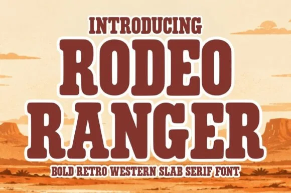
Bold retro western slab with keyline
Rodeo Ranger is a bold retro western slab in brown with a cream keyline: heavy rounded slab serifs, thick uniform strokes, slightly wide proportions, and a raised three-dimensional edge that lifts the word off a desert illustration.
Ideas for this font
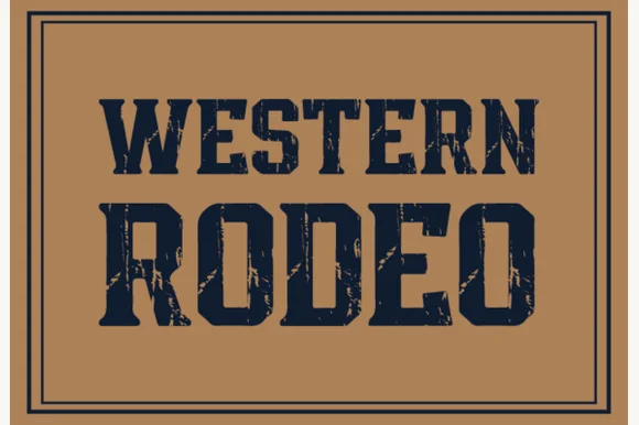
Distressed western slab in a ruled frame
Western Rodeo is a distressed western slab in navy on tan: heavy condensed capitals with flat serifs and worn edges, printed inside a double rule frame, with the first line in a lighter weight than the second.
Ideas for this font
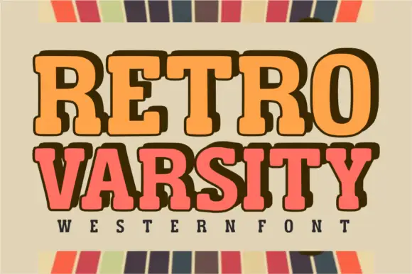
Retro western varsity slab
Retro Varsity is a western-flavoured varsity slab in orange and coral on a sage ground: heavy rounded slabs with deep shoulders, a slight bounce and an extrusion on one line, flanked by a striped border top and bottom with a tracked line naming the category beneath.
Ideas for this font
Same independent foundry
Allow optional Google Analytics to measure visits and catalogue actions. Your search words and notes are not included. Privacy & storage