Modern Grotesque Body

Weathred + Bargain Condensed
Creates crisp high-hierarchy contrast beneath Weathred headlines across menus, websites and labels.
Inspect Bargain Condensed specimenDisclosure: MakerFileHub may earn a commission from qualifying purchases via paid links on this page. How our links work.
Condensed distressed varsity slab
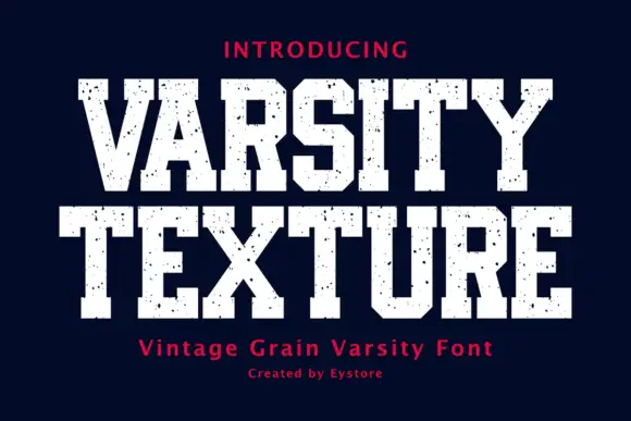
Weathered is a condensed distressed slab in cream on black: heavy square serifs, tight inner counters, chipped edges and speckled interiors, presented as a family of four cuts with a small badge and a row of tracked labels beneath, so the sheet reads as a vintage sign kit.
Paid link
Get this fontProject & layout blueprintsAt-a-glance maker compatibility
Fine grain and micro-texture excel in 300 DPI print, sublimation, and screen print rather than small vinyl weeding.
Visual anatomy & craft review
The word fills the plate and the drawing is a condensed slab with the wear built in: the serifs are flat blocks as thick as the stems, the counters are narrow slots, and the edges are chipped so irregularly that no two letters share the same damage. The interior speckle is consistent in scale across the word, which is what makes the texture read as a printed plate rather than a filter. Spacing is tight, so the word reads as a band of texture with letter shapes resolved inside it, and the face needs a large size because the damage eats into the smaller details. The specimen frames the word with orange rules, adds a small badge with an establishment year, and lists the four styles in tracked caps, which tells a buyer this is a family and not a single display face.
Vintage, distressed, condensed, sporty
Two-font hierarchy recipes
Tested contrast partners — pairing Weathred with grounded secondary typography.
Weathred + Bargain Condensed
Creates crisp high-hierarchy contrast beneath Weathred headlines across menus, websites and labels.
Inspect Bargain Condensed specimen
Weathred + Honey and Lemon
Adds a warm human signature touch for 1-to-3-word callouts without competing against structured serif capitals.
Inspect Honey and Lemon specimenPractical applications
Concrete hierarchy, scale and production guidance tailored to Weathred’s stroke geometry.
A distressed slab reads as painted lettering on a warehouse wall, and the family of four cuts lets one typeface carry the shopfront, the label and the packaging without a second purchase.
Hierarchy & layout recipe
Paint a 1,200 by 500 mm board: the name at 160 mm cap height in the distressed cut, the tagline in a 30 mm sans, and a 8 mm rule beneath. Keep the wear at one scale across the board and paint two colours on bare timber.
Pre-production check
Check the board at 20 m, where the chips can break a thin stem; use the regular cut for the smallest line. Confirm the 30 mm tagline reads at four metres and that the timber grain does not compete with the interior speckle.
A vintage slab gives a milestone birthday a worn, well-loved tone, and the distressed texture hides the small registration slips of a one-colour screen print on fabric.
Hierarchy & layout recipe
Print a 280 mm chest graphic: the name at 70 mm cap height, the year in a 20 mm sans, and one ink on a light shirt. Keep the thinnest chip at 2 mm so the screen holds it, and keep the graphic 80 mm below the collar.
Pre-production check
Check the screen at actual mesh, where the interior speckle can print as solid; open the texture for fabric. Wash-test one shirt and confirm the 20 mm year stays legible after the first wash.
A worn slab frames a retrospective as a document of a period, and the family lets the title, the subtitle and the spine carry the same voice at three sizes.
Hierarchy & layout recipe
Set the title at 95 mm cap height across a 240 mm cover, the subtitle in the italic cut at 14 pt, and the author line in the regular cut at 9 pt. Print one ink on a textured stock so the wear reads as print.
Pre-production check
Check the 9 pt author line, where the distress can close the counters; switch to the regular cut for small sizes. Confirm the subtitle reads under a shop light and that the title holds at thumbnail size in an online listing.
Technical & licence verification
Confirm included OTF/TTF/WOFF formats, full glyph tables and licence coverage on the live store page before batch production.
Closest visual alternatives
Matched across letterform anatomy, stroke behaviour and craft applications.
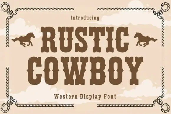
Condensed western display with a rope frame
Rustic Cowboy is a condensed western display in brown on tan: spurred slab letters with small wedge serifs inside a drawn rope border, with a galloping horse on either side.
Ideas for this font

Condensed western capitals with stem ornaments
Saddlewick is a condensed western slab in dark brown on leather: very tall capitals, squared serifs and small nicked ornaments cut into the stems, with a spur and a star in the counters.
Ideas for this font
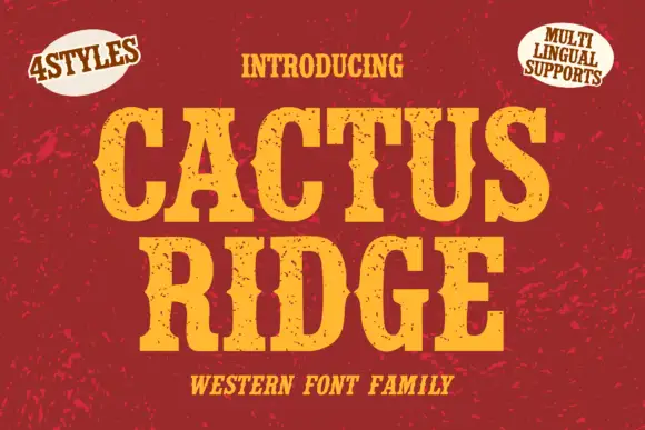
Tall notched Western slabs with small scattered erosion marks
Cactus Ridge shows yellow Western capitals on red, where pinched midsections and long broad slab ends create a tall sign shape and small dark chips interrupt the fill without any complete outline.
Ideas for this font
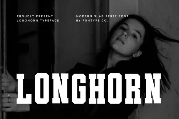
Very condensed clean slab
Longhorn is a very condensed slab in white over a black-and-white portrait: narrow capitals with thick square slabs, clipped rectangular bowls and flat terminals, set as one word across the lower third, with two small tracked notes at the upper left and right.
Ideas for this font
Same independent foundry
Allow optional Google Analytics to measure visits and catalogue actions. Your search words and notes are not included. Privacy & storage