Modern Grotesque Body

Ruined Empire + Memoir Slang
Creates crisp high-hierarchy contrast beneath Ruined Empire headlines across menus, websites and labels.
Inspect Memoir Slang specimenDisclosure: MakerFileHub may earn a commission from qualifying purchases via paid links on this page. How our links work.
Slanted rugged serif
Ruined Empire is a slanted serif in off-white over a red-lit photograph of a crowned figure: capital and mixed case with uneven edges, blunt pointed feet and a forward lean, set in two staggered lines with a small line above and a plain caption beneath.
Paid link
Get this fontProject & layout blueprintsAt-a-glance maker compatibility
Sturdy stroke walls and open counters weed cleanly on adhesive vinyl, HTV apparel film, and cut cardstock.
Visual anatomy & craft review
The two words are staggered on a forward lean and the drawing is a serif with a deliberate ruggedness: the edges are uneven, the feet are blunt points, and the slant gives the block a monumental, almost carved quality. That construction sets a moderate size floor, because the fine details of the feet close first, and the placement over a dark, red-lit image shows that the cream holds where a fine serif would break up. The figure and the crown are staging that names the register, and the small line above and the caption beneath are product copy. Because the letters are slanted and rugged, the face suits a poster, a book cover and a themed bar sign, and a buyer should expect the lean to need clearance at the right margin.
Serif, slanted, rugged, dramatic
Two-font hierarchy recipes
Tested contrast partners — pairing Ruined Empire with grounded secondary typography.
Ruined Empire + Memoir Slang
Creates crisp high-hierarchy contrast beneath Ruined Empire headlines across menus, websites and labels.
Inspect Memoir Slang specimen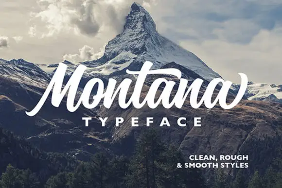
Ruined Empire + Montana
Adds a warm human signature touch for 1-to-3-word callouts without competing against structured serif capitals.
Inspect Montana specimenPractical applications
Concrete hierarchy, scale and production guidance tailored to Ruined Empire’s stroke geometry.
A rugged slanted serif frames an epic without a gothic face, and the lean gives the title motion on a dark cover. The lean gives it motion.
Hierarchy & layout recipe
Set the title at 85 mm cap height across 180 mm on a stagger, the author in a 12 pt serif, and the imprint at 8 pt. Print two colours on a coated stock and keep 22 mm margins at the head.
Pre-production check
Check the title at 85 mm, where an uneven edge can clot; keep the counters open. Confirm the 8 pt imprint survives lamination and that the lean clears the trim by 15 mm.
A rugged serif reads as carved rather than printed, which suits a night with a historical register. It reads as carved stone.
Hierarchy & layout recipe
A2 poster: the event at 100 mm cap height, the details in a 14 mm serif, and the venue at 11 mm. Keep 30 mm margins and print one colour on a dark stock with the type reversed out.
Pre-production check
Check the A2 at five metres, where a pointed foot can vanish; keep it above 2 mm. Confirm the 11 mm venue reads at two metres and that the lean clears the right margin.
A slanted serif gives a venue a sign with character, and the heavy strokes hold on a dark window in vinyl at night. It reads as a carved sign.
Hierarchy & layout recipe
Cut 900 by 320 mm vinyl: the name at 110 mm cap height, the line in a 20 mm serif, and a 4 mm contour. Keep 25 mm margins and apply to a clean pane when the glass is cool.
Pre-production check
Check the cut at 100 mm, where a 4 mm foot can tear on weeding; widen it to 6 mm. Confirm the 20 mm line reads at two metres and that the lean clears the door frame.
Technical & licence verification
Confirm included OTF/TTF/WOFF formats, full glyph tables and licence coverage on the live store page before batch production.
Closest visual alternatives
Matched across letterform anatomy, stroke behaviour and craft applications.
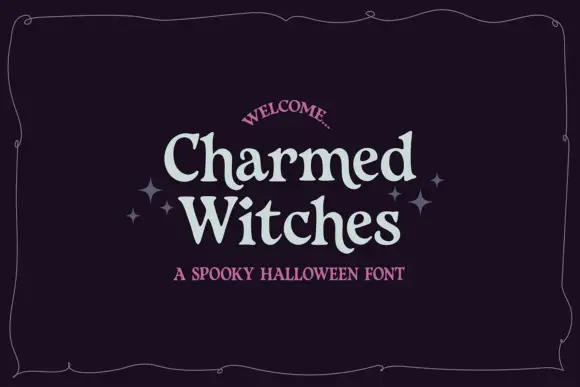
Soft irregular mixed case with flared rounded endings
Charmed Witches shows pale letters with softly curved stems, small flared serifs and uneven proportions: the W spreads broadly while the lowercase h and t rise above compact rounded bowls inside a thin wavy frame.
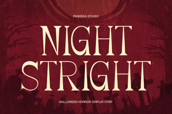
High-contrast horror serif display
Night Stright is a horror display serif in bone cream on blood red: very high contrast, tall pointed serifs that flare into thorns, a splayed M and sharp wedge terminals, set over a graveyard silhouette, so the pair reads as a film title rather than as an editorial serif.
Ideas for this font
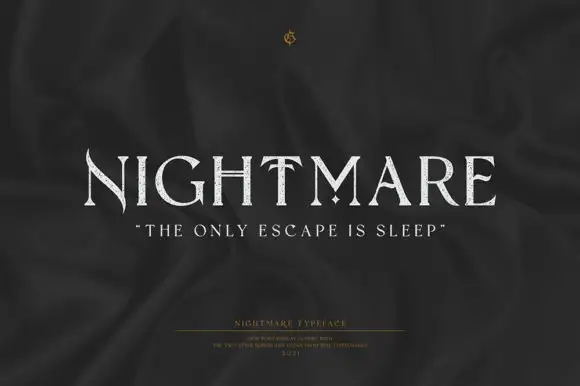
Fine uppercase serifs with blade-like points and a diamond separator
Nightmare is a refined display serif with very wide capitals, high stroke contrast and small sharp spurs at the ends of the stems, set quiet and pale on a dark ground.
Ideas for this font
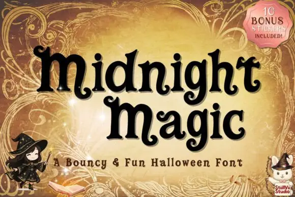
Bouncy rounded serif with curled terminals
Midnight Magic is a bouncy rounded serif in black on a honey-gold ornamental ground: short thick stems, hairline-thin joins and curled ball terminals that flick upward at the ends of letters, bouncing on and off the baseline.
Ideas for this font
Same independent foundry
Allow optional Google Analytics to measure visits and catalogue actions. Your search words and notes are not included. Privacy & storage