Neutral Sans Workhorse

Rope + Modern Limited
Lets Rope own the focal silhouette while handling secondary copy, sizing and subheads cleanly.
Inspect Modern Limited specimenDisclosure: MakerFileHub may earn a commission from qualifying purchases via paid links on this page. How our links work.
Rope-drawn script display
Rope is a display face drawn entirely as twisted rope on a pale textured paper: loose script-like letters with a strand running through each stroke, knot-like curls at the terminals and uneven joins, set in two lines with no other copy on the sheet.
Paid link
Get this fontProject & layout blueprintsAt-a-glance maker compatibility
Set Cricut or Silhouette operation to Pen, Foil Quill, or Laser Score — not Basic Blade Cut.
Visual anatomy & craft review
The plate is almost empty, which suits a novelty construction: two words in rope on a paper ground, so the twist and the knots are the only subject. The drawing is a script skeleton built from a single twisted strand, so the letters read as a length of rope that has been coiled into words, and the knots at the ends are the finishing detail. That construction sets a large size floor, because the individual strands close into a solid line when the letters shrink, and the plate sets the words large enough that the twist reads. The paper ground is staging. Because the letters are drawn rather than set, the face suits a rustic label, a card and a sign for a garden or boat theme.
Decorative, rope, novelty, rustic
Two-font hierarchy recipes
Tested contrast partners — pairing Rope with grounded secondary typography.
Rope + Modern Limited
Lets Rope own the focal silhouette while handling secondary copy, sizing and subheads cleanly.
Inspect Modern Limited specimen
Rope + Papillon Serif – Elegant Modern Luxury
Grounds bold display lettering with classic typographic authority on posters, badges and apparel.
Inspect Papillon Serif – Elegant Modern Luxury specimenPractical applications
Concrete hierarchy, scale and production guidance tailored to Rope’s stroke geometry.
A rope label reads as a rustic product, and the twist gives a short brand name texture on a small die. It names the trade in the lettering.
Hierarchy & layout recipe
Print a 55 by 80 mm label: the shop at 12 pt, the product at 8 pt, and the price at 7 pt. Keep 5 mm inside the die, keep the strands above 0.5 mm and leave 10 mm at the foot for a batch note.
Pre-production check
Check the 12 pt shop on a small die, where the twist closes into a solid line; keep the strands above 0.5 mm. Confirm the price reads at arm's length and that the label takes a fold.
A rope face sets a nautical theme without an illustration, and the knots give the greeting a hand-made finish. It reads as a hand-made card.
Hierarchy & layout recipe
A6 card: the greeting at 26 pt, the details in a 9.5 pt sans, and the date at 8.5 pt. Keep 15 mm margins, print one ink on a kraft card and keep the twist above 0.6 mm at the greeting size.
Pre-production check
Check the 26 pt greeting at home-print resolution, where a strand can fill; keep the twist above 0.6 mm. Confirm the details keep a 4.5:1 contrast and that the card folds flat.
A rope sign reads as a waterside business, and the twist holds on a board seen from a jetty. It reads from a jetty. It names the business in the lettering.
Hierarchy & layout recipe
Paint a 900 by 320 mm board: the rental at 110 mm cap height, the hours in a 22 mm sans, and two colours on a primed board. Keep 24 mm margins and keep the strands above 4 mm.
Pre-production check
Check the board at 110 mm, where a strand can fill with paint; keep it above 4 mm. Confirm the 22 mm hours read at three metres and that the board survives the weather.
Technical & licence verification
Confirm included OTF/TTF/WOFF formats, full glyph tables and licence coverage on the live store page before batch production.
Closest visual alternatives
Matched across letterform anatomy, stroke behaviour and craft applications.
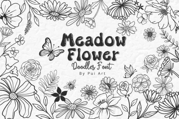
Meadow flower doodle set
Meadow Flower Doodles is a dingbat set drawn in black outline on a pale ground: loose meadow flowers with varied petals, leaves, buds and scattered butterflies, arranged as a border around a central panel that carries the name in a rounded hand, a script line and a small credit.
Ideas for this font
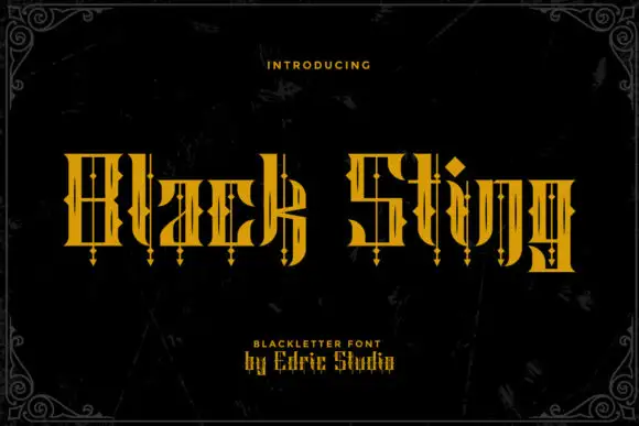
Rectilinear blackletter with fine interior bars and hanging diamond points
Black Sting is a blackletter display face in gold, drawn with square-cut stems, angular shoulders and long spurs that hang below the baseline like a pointed fringe.
Ideas for this font
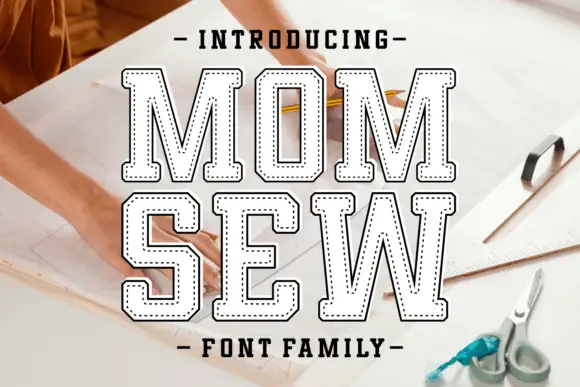
Hollow collegiate slab with stitch line
Mom Sew is a hollow collegiate slab in white on a photograph of a sewing table: heavy caps drawn as a contour with no fill, and inside each letter a dotted line that follows the shape like a running stitch, with tracked caps above and below.
Ideas for this font
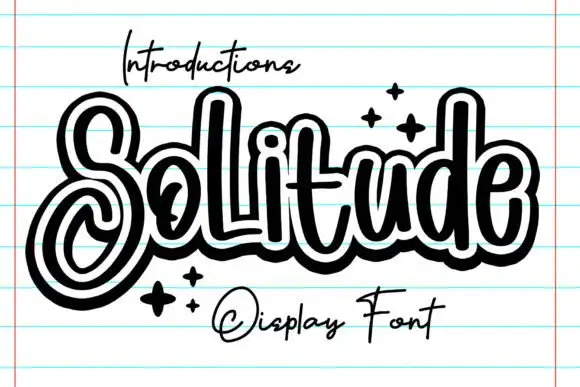
Outlined looping display script
Solitude shows connected upright script forms traced by a thick dark outer contour with a second pale inline inside it, where the S curls into a large lower loop, the tall l and d rise over a compact rounded body and four spark marks sit at the right.
Same independent foundry
Allow optional Google Analytics to measure visits and catalogue actions. Your search words and notes are not included. Privacy & storage