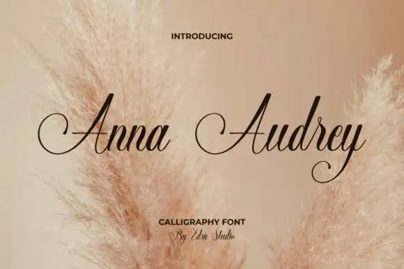
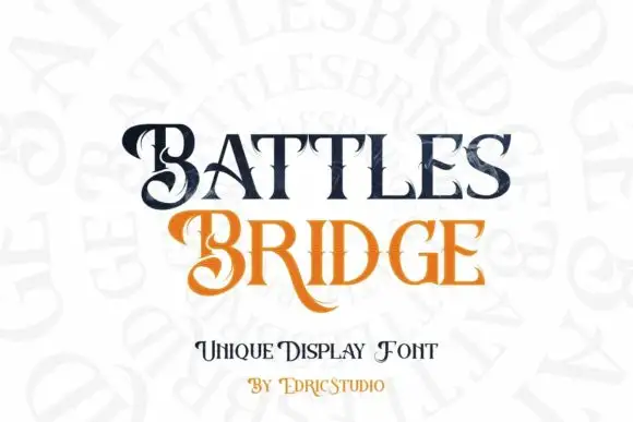
Neutral Sans Workhorse

Black Sting + Mango Dream
Lets Black Sting own the focal silhouette while handling secondary copy, sizing and subheads cleanly.
Inspect Mango Dream specimenDisclosure: MakerFileHub may earn a commission from qualifying purchases via paid links on this page. How our links work.
Rectilinear blackletter with fine interior bars and hanging diamond points
Black Sting is a blackletter display face in gold, drawn with square-cut stems, angular shoulders and long spurs that hang below the baseline like a pointed fringe.
Paid link
Get this fontProject & layout blueprintsAt-a-glance maker compatibility
Sturdy stroke walls and open counters weed cleanly on adhesive vinyl, HTV apparel film, and cut cardstock.
Visual anatomy & craft review
Black Sting spans the card in a flat antique gold on a black ground with a faint marble texture and a thin ornamental border at the corners. The letters are wide and heavy with square terminals, and each stem ends in a hanging spur with a small diamond at the tip, so the baseline of the word is a row of points rather than a line. The shoulders between stem and arch are angular rather than curved, which gives the face a cut-paper feel, and the counters are wide enough that the word reads at poster distance. A caption above names the introduction and two lines at the foot name the style and the studio. The set is a display blackletter for merch, signage and dark editorial, and it works in a single ink because there is no fill or texture in the letterform itself.
Rectilinear blackletter with fine interior bars and hanging diamond points
Two-font hierarchy recipes
Tested contrast partners — pairing Black Sting with grounded secondary typography.
Black Sting + Mango Dream
Lets Black Sting own the focal silhouette while handling secondary copy, sizing and subheads cleanly.
Inspect Mango Dream specimen
Black Sting + Medvilea Editorial
Grounds bold display lettering with classic typographic authority on posters, badges and apparel.
Inspect Medvilea Editorial specimenPractical applications
Concrete hierarchy, scale and production guidance tailored to Black Sting’s stroke geometry.
The gold on black carries the mood of an evening event, and the hanging spurs give the title a silhouette that reads from across a room.
Hierarchy & layout recipe
Print an A2 poster: set the event name at 130 pt on one row, keep 36 mm of clear ground beneath for the hanging spurs before the date at 13 pt, and hold 26 mm of margin so no spur is trimmed.
Pre-production check
Gold ink on black shows every speck; print one poster on the intended stock and check a spur before the run.
The square stems and hanging points give a bottle a period mark that holds on a shelf of modern labels, and one ink keeps a small run affordable.
Hierarchy & layout recipe
Print a 60 by 105 mm label: set the brand name at 22 pt on one row, keep 10 mm of clear ground beneath the spurs before the strength at 4.5 pt, and hold 6 mm from the lowest point to the die line.
Pre-production check
Hanging spurs sit close to a die line; print one label and cut it before ordering the batch.
The face gives a low-budget production a title that looks designed, and the pointed baseline animates well as a simple reveal.
Hierarchy & layout recipe
Print a 1920 by 1080 frame: set the title at 240 px on one row, keep 70 px of clear ground beneath for the spurs before the credit at 34 px, and hold 120 px of margin at both sides.
Pre-production check
Points alias when the frame is compressed; render one still and check the spurs before the export.
Technical & licence verification
Confirm included OTF/TTF/WOFF formats, full glyph tables and licence coverage on the live store page before batch production.
Closest visual alternatives
Matched across letterform anatomy, stroke behaviour and craft applications.
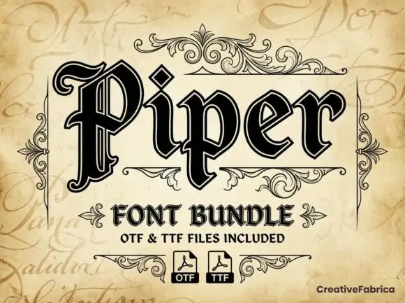
Outlined blackletter with doubled edges
Piper is an outlined blackletter in black on aged cream: a large curled P with doubled edges, narrow bodies, a diamond counter and fine inner lines, set as one large word above a scroll-flanked line that names the bundle and two format marks.
Ideas for this font
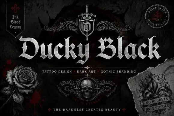
Wide blackletter with sweeping D and a densely split B
Ducky Black is a tattoo and dark-art blackletter with wide stems, sharp spurs and a distressed silver fill, framed by drawn roses, a skull and a fleur.
Ideas for this font
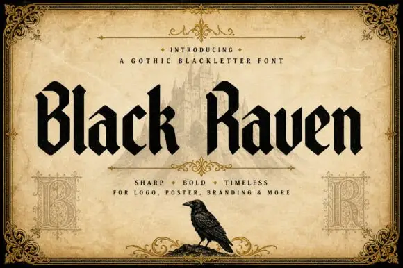
Solid blackletter with angular B and R bowls and pointed feet
Black Raven is a bold blackletter display face with wide stems, tight spacing and a flat black contour, drawn to print solid at large sizes on a light ground.
Ideas for this font
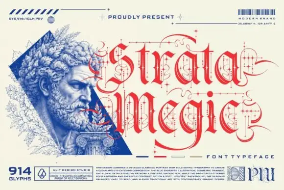
Fine calligraphic blackletter with looping line-and-dot ornaments
Strata Megic is a classical display serif with high contrast, sharp serifs and ornamental flourishes, shown in a technical drawing layout with glyph counts and swatch keys.
Ideas for this font
Same independent foundry
Allow optional Google Analytics to measure visits and catalogue actions. Your search words and notes are not included. Privacy & storage