Modern Grotesque Body

Gridiron Varsity + Prime Nordic
Creates crisp high-hierarchy contrast beneath Gridiron Varsity headlines across menus, websites and labels.
Inspect Prime Nordic specimenDisclosure: MakerFileHub may earn a commission from qualifying purchases via paid links on this page. How our links work.
Heavy square-slab game-day block with layered outlines and tight fit
Gridiron Varsity is a heavy square-slab block in which the letters are wide and solid, the slabs are unbracketed and two outlines register behind the fill, so a word reads as a printed athletic banner.
Paid link
Get this fontProject & layout blueprintsAt-a-glance maker compatibility
Cut solid base, outline, and shadow layers in separate vinyl colors and align on registration marks.
Visual anatomy & craft review
The G closes with a straight bar, the R keeps a squared bowl and a short leg, the I stands as a single bar and the D holds a full bowl, all at a maximal weight with square slabs and a tight fit. The layered construction is the practical part: the fill, an inner keyline and an outer keyline register in the sample, which is how a two-colour athletic print gets its edge. Because the letters are wide and equally weighted, a nine-letter word fits a single line at 60 mm across a jersey front. Counters stay open enough for a screen print and close below 14 pt. The pale ground, the navy and red inks, the football field marks and the two small lines are presentation; the display face is the two words.
Square-slab · Layered · Athletic
Two-font hierarchy recipes
Tested contrast partners — pairing Gridiron Varsity with grounded secondary typography.
Gridiron Varsity + Prime Nordic
Creates crisp high-hierarchy contrast beneath Gridiron Varsity headlines across menus, websites and labels.
Inspect Prime Nordic specimen
Gridiron Varsity + Thick Black
Adds a warm human signature touch for 1-to-3-word callouts without competing against structured serif capitals.
Inspect Thick Black specimenPractical applications
Concrete hierarchy, scale and production guidance tailored to Gridiron Varsity’s stroke geometry.
The square slabs fit a long team name on one line at 60 mm, and the layered outlines give a two-colour athletic print its edge without redrawing.
Hierarchy & layout recipe
Screen a 320 mm front print: lay the fill and keylines at 60 mm, keep the inner keyline at 1.5 mm, and stay 45 mm below the collar so the print clears the shoulder seam allowance.
Pre-production check
Keylines registered by hand drift at jersey scale; check the imposed film at 100 percent and confirm the trap before the screens are burned.
The block weight reads at 20 cm from across a court, and the square slabs suit a printed or routed panel where rounded corners would look soft.
Hierarchy & layout recipe
Print a 2 by 0.6 m panel: set the hall name at 20 cm on one line, set the room labels in a 6 cm caps slab below, and keep 12 cm of clear panel at each end so the fixings miss the letters.
Pre-production check
A routed square slab needs a minimum arm; check the vector at full size and widen the thinnest slab rather than the stems.
The square construction stitches predictably, and the layered edge gives a small embroidered patch a finished border at 60 mm.
Hierarchy & layout recipe
Embroider an 80 mm patch: set the club name at 55 mm, keep the outer keyline as a satin border at 2.5 mm, and stay 6 mm inside the patch edge so the merrow does not pull the letters.
Pre-production check
A merrow edge draws the outer letters inward; check a stitch-out and drop the outer keyline on patches below 70 mm.
Technical & licence verification
Confirm included OTF/TTF/WOFF formats, full glyph tables and licence coverage on the live store page before batch production.
Closest visual alternatives
Matched across letterform anatomy, stroke behaviour and craft applications.
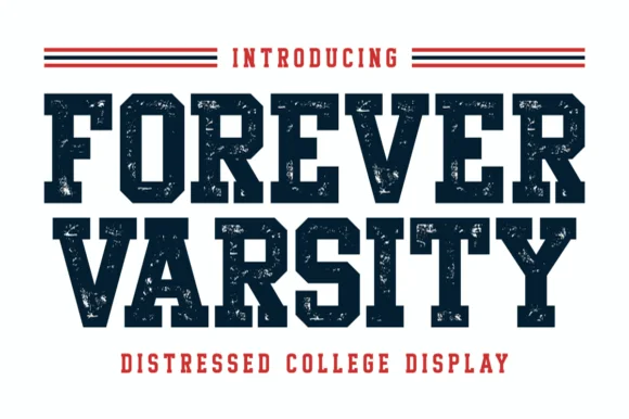
Distressed collegiate block capitals with heavy slabs and worn edges
Forever Varsity is a collegiate block alphabet with heavy slabs, tight fitting and a speckled wear texture, so a word reads as a print pulled off a worn athletic screen.
Ideas for this font
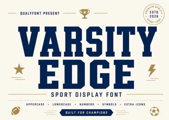
Solid angular varsity blocks
Varsity Edge is a heavyweight collegiate display: wide slab-serifed capitals with flat tops and feet, tight spacing and squared counters, set navy on cream with a set of sport icons around it.
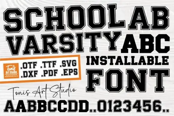
Solid and inset-bordered college blocks
School Varsity is a college block face built as two layers, an outer black letter and a white inset, supplied as font and cut files: OTF, TTF, SVG, DXF, PDF and EPS.
Ideas for this font
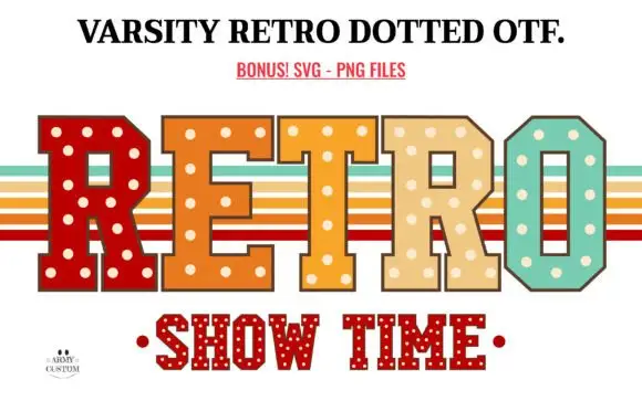
Retro dotted varsity slab
Varsity Retro Dotted is an angular varsity slab in four warm colours on white: heavy caps with chamfered corners and cream dots set into every fill, one letter per colour, with retro stripe bands behind the word and a second dotted line beneath in red.
Same independent foundry
Allow optional Google Analytics to measure visits and catalogue actions. Your search words and notes are not included. Privacy & storage