Modern Grotesque Body

Retro Typewriter + Nyxar
Creates crisp high-hierarchy contrast beneath Retro Typewriter headlines across menus, websites and labels.
Inspect Nyxar specimenDisclosure: MakerFileHub may earn a commission from qualifying purchases via paid links on this page. How our links work.
Typewriter serif with a soft worn edge
Retro Typewriter is a vintage typewriter serif in black on aged parchment: slab serifs, a moderate even stroke and a slightly uneven edge, set between two rules with a caption line beneath.
Paid link
Get this fontProject & layout blueprintsAt-a-glance maker compatibility
Fine grain and micro-texture excel in 300 DPI print, sublimation, and screen print rather than small vinyl weeding.
Visual anatomy & craft review
Two words are stacked on a stained sheet and the face is a typewriter serif with a soft finish: the serifs are small slabs, the stroke is moderately heavy and even, the a and the e keep open counters, the g is single-storey and the t carries a full crossbar, while the edges of the strokes are a little uneven, as if the ink had spread into paper. That slight roughness is what places the face in the period, and it stays subtle enough that a paragraph set in it would still be readable. The lines are set with wide spacing so the words read as typed rather than set, and a caption in the same face at a smaller size sits between two rules at the foot. The ground is an aged parchment with a burn ring, spatter and a torn edge, and a typewriter and a pen are laid over the sheet. Retro Typewriter is a serif for editorial layouts, packaging, invitations and any design that wants an archival voice, and it works at both text and display sizes.
Typewriter, warm, archival
Two-font hierarchy recipes
Tested contrast partners — pairing Retro Typewriter with grounded secondary typography.
Retro Typewriter + Nyxar
Creates crisp high-hierarchy contrast beneath Retro Typewriter headlines across menus, websites and labels.
Inspect Nyxar specimen
Retro Typewriter + Hailey
Adds a warm human signature touch for 1-to-3-word callouts without competing against structured serif capitals.
Inspect Hailey specimenPractical applications
Concrete hierarchy, scale and production guidance tailored to Retro Typewriter’s stroke geometry.
A typewriter face gives a quoted document the authority of paper, and the even stroke stays readable at the small size an extract needs.
Hierarchy & layout recipe
Print a 210 by 280 mm page: set the extract at 11 pt over a 94 mm measure, keep 14 mm of clear ground above the caption, and hold 22 mm of margin on the three open sides.
Pre-production check
An uneven edge at eleven points can look like a printing fault; check one page on the intended stock before the run.
A typed label reads as a record kept on a kitchen shelf, and the small slabs stay legible on a narrow strip of paper at arm's length.
Hierarchy & layout recipe
Print a 55 by 40 mm label: set the contents at 8.5 pt over two lines, keep 3.5 mm of clear ground on all four sides, and hold the label 8 mm from the top of the jar.
Pre-production check
A jar label is handled, not framed; print one on the real paper and check that the letters stay sharp.
A typewriter face suits a studio that sells printing, and the period texture matches a product that was actually made on an old machine.
Hierarchy & layout recipe
Print a 50 by 30 mm tag: set the studio name at 9 pt on one line, keep 3 mm of clear ground above the punched hole, and hold 3 mm of margin on the other sides.
Pre-production check
A punched hole can clip a long name; set the text inside the safe area and print one tag before the batch.
Technical & licence verification
Confirm included OTF/TTF/WOFF formats, full glyph tables and licence coverage on the live store page before batch production.
Closest visual alternatives
Matched across letterform anatomy, stroke behaviour and craft applications.
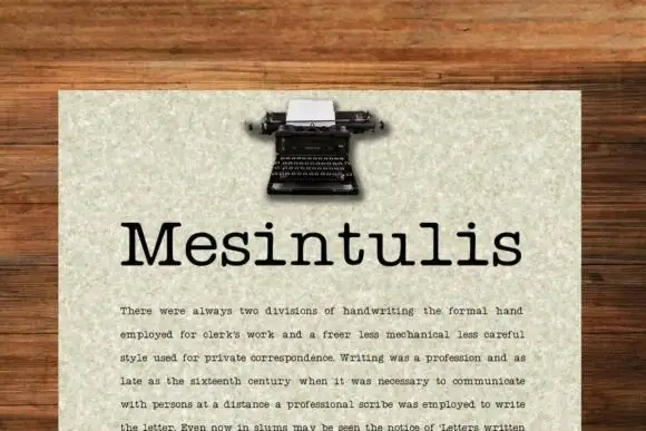
Typewriter slab with text setting
Mesintulis is a typewriter slab in black on flecked cream paper: mixed case with short rounded slab feet, a large x-height and generous sidebearings, set as a heading above a justified paragraph, with a small typewriter photograph at the top of the sheet.
Ideas for this font
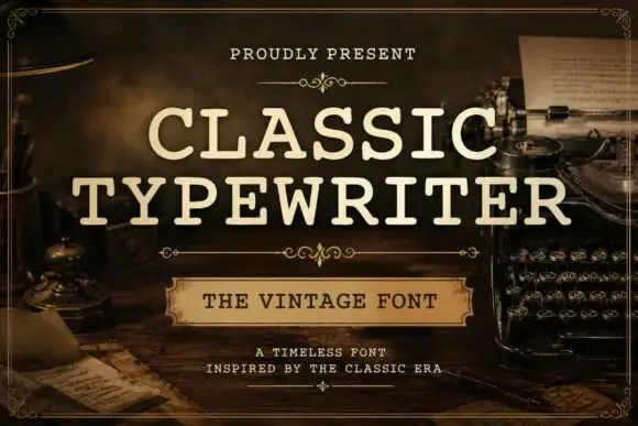
Even typed-looking capitals with rounded slab ends and open bowls
Classic Typewriter shows cream uppercase lettering in two lines over a dark writing-desk scene: the strokes stay comparatively even, the slab ends round off and the open C and P bowls leave generous white space inside the letters.
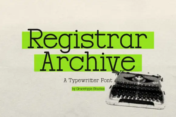
Typewriter slab with highlight blocks
Registrar Archive is a typewriter slab in black with green highlight blocks behind the two words, on a textured paper ground: light mixed case with round bowls, small square feet and even strokes, with a caption line beneath and a credit under that, beside a photograph of a typewriter.
Ideas for this font
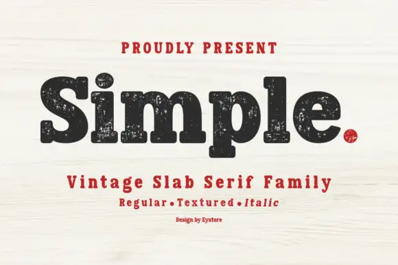
Worn soft slab family
Simple is a soft heavy slab in black on pale wood: mixed case with rounded slab endings, a large x-height and worn ink patches through the fill, with a tracked line above, a second line beneath naming the three cuts in red and a small credit at the foot.
Ideas for this font
Same independent foundry
Allow optional Google Analytics to measure visits and catalogue actions. Your search words and notes are not included. Privacy & storage



