Modern Grotesque Body

Registrar Archive + Nyxar
Creates crisp high-hierarchy contrast beneath Registrar Archive headlines across menus, websites and labels.
Inspect Nyxar specimenDisclosure: MakerFileHub may earn a commission from qualifying purchases via paid links on this page. How our links work.
Typewriter slab with highlight blocks
Registrar Archive is a typewriter slab in black with green highlight blocks behind the two words, on a textured paper ground: light mixed case with round bowls, small square feet and even strokes, with a caption line beneath and a credit under that, beside a photograph of a typewriter.
Paid link
Get this fontProject & layout blueprintsAt-a-glance maker compatibility
Sturdy stroke walls and open counters weed cleanly on adhesive vinyl, HTV apparel film, and cut cardstock.
Visual anatomy & craft review
The two words sit on separate green blocks, which is a layout decision that shows how the face behaves as a reversed-out label and as black on colour in one view, and that is useful for a face sold to documentary and editorial work. The drawing is a typewriter slab at a light weight: the bowls are round, the feet are small and square, and the strokes are even, so a paragraph set in it reads as typed rather than as printed. The typewriter beside the copy is staging that states the premise. Because the weight is light and the feet small, the face works at text sizes on a smooth stock, and the caption beneath the blocks demonstrates the size at which the face is meant to be read.
Slab, typewriter, editorial, documentary
Two-font hierarchy recipes
Tested contrast partners — pairing Registrar Archive with grounded secondary typography.
Registrar Archive + Nyxar
Creates crisp high-hierarchy contrast beneath Registrar Archive headlines across menus, websites and labels.
Inspect Nyxar specimen
Registrar Archive + Wishful Women
Adds a warm human signature touch for 1-to-3-word callouts without competing against structured serif capitals.
Inspect Wishful Women specimenPractical applications
Concrete hierarchy, scale and production guidance tailored to Registrar Archive’s stroke geometry.
A typewriter slab carries a documentary tone, and the light weight keeps a long report readable across forty or more pages.
Hierarchy & layout recipe
A4 interior: the body at 10 pt with 14 pt leading, the headings at 17 pt, and 66 characters per line. Print one ink on a cream stock with 22 mm margins.
Pre-production check
Check a full page at 10 pt, where the small feet can fill; test one page on the stock. Confirm the leading holds the column and that the headings stay distinct.
A typewriter label reads as a record rather than as marketing, and the light strokes keep a reference number legible at six point.
Hierarchy & layout recipe
Print a 70 by 40 mm label: the service at 11 pt, the reference at 7 pt, and the date at 6 pt. Keep 3 mm inside the die and print one ink on a matte stock.
Pre-production check
Check the 7 pt reference on a matte label, where a light stroke can fill; keep the size at 7 pt or above. Confirm the 6 pt date reads at arm's length and that the label peels cleanly.
A typewriter slab suits a celebration where everything looks printed rather than calligraphed, and the light weight reads across a table.
Hierarchy & layout recipe
A5 menu: the heading at 18 pt, the courses at 9 pt with 14 pt leading, and the date at 8 pt. Keep 20 mm margins, print one ink on a cream card and let it stand without a fold.
Pre-production check
Check the 9 pt courses on uncoated card, where the small feet can fill; keep the leading at 14 pt. Confirm the heading reads across the table and that the card stands without a fold.
Technical & licence verification
Confirm included OTF/TTF/WOFF formats, full glyph tables and licence coverage on the live store page before batch production.
Closest visual alternatives
Matched across letterform anatomy, stroke behaviour and craft applications.
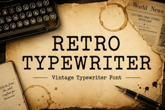
Typewriter serif with a soft worn edge
Retro Typewriter is a vintage typewriter serif in black on aged parchment: slab serifs, a moderate even stroke and a slightly uneven edge, set between two rules with a caption line beneath.
Ideas for this font
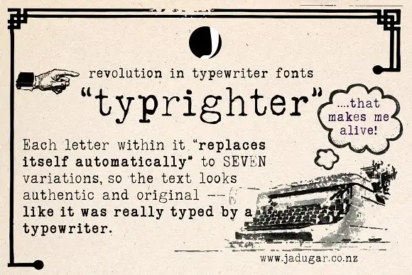
Typewriter face with alternates
Typrighter is a typewriter face in black on aged newsprint, shown inside a period advertisement: a monospaced slab with light uniform strokes and blunt serifs, surrounded by hand-lettered display copy and a printed illustration of a machine.
Ideas for this font
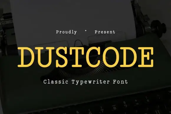
Light even slabs with broad rounded typed bowls
Dustcode shows a yellow uppercase title with thin, fairly even strokes and short rounded slab ends, where the U and O keep open round bowls and the lighter weight contrasts with darker typewriter-style text set beside it on the same cover.
Ideas for this font
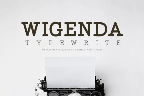
Typewriter slab serif
Wigenda Typewrite is a typewriter slab in dark brown on an off-white wall: heavy unbracketed serifs, a large x-height and generous spacing, with a wide-tracked line beneath and a third line in tiny caps, set above the keys and paper of a vintage machine.
Ideas for this font
Same independent foundry
Allow optional Google Analytics to measure visits and catalogue actions. Your search words and notes are not included. Privacy & storage