Modern Grotesque Body

Mesintulis + Limited Coffee
Creates crisp high-hierarchy contrast beneath Mesintulis headlines across menus, websites and labels.
Inspect Limited Coffee specimenDisclosure: MakerFileHub may earn a commission from qualifying purchases via paid links on this page. How our links work.
Typewriter slab with text setting
Mesintulis is a typewriter slab in black on flecked cream paper: mixed case with short rounded slab feet, a large x-height and generous sidebearings, set as a heading above a justified paragraph, with a small typewriter photograph at the top of the sheet.
Paid link
Get this fontProject & layout blueprintsAt-a-glance maker compatibility
Open counter bridges hold interior islands intact on laser-cut wood, acrylic, and mylar stencils.
Visual anatomy & craft review
The plate does something most typewriter specimens avoid: it sets a paragraph in the face at roughly ten point beneath the heading, which is the only honest way to judge a typewriter cut, because the genre is bought for documents as often as for posters. The drawing has short rounded feet, a large x-height and a slightly uneven stem, and the wide sidebearings keep the monospaced rhythm of the machine without the rigidity of a strict monospace. The paper is flecked and the typewriter sits above the setting, which sets the context rather than decorating it. Because the texture is in the background rather than in the letters, the face prints cleanly on a modern printer, and the paragraph shows the leading and the measure that actually work.
Typewriter, slab, editorial, readable
Two-font hierarchy recipes
Tested contrast partners — pairing Mesintulis with grounded secondary typography.
Mesintulis + Limited Coffee
Creates crisp high-hierarchy contrast beneath Mesintulis headlines across menus, websites and labels.
Inspect Limited Coffee specimen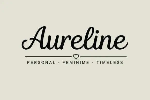
Mesintulis + Aureline
Adds a warm human signature touch for 1-to-3-word callouts without competing against structured serif capitals.
Inspect Aureline specimenPractical applications
Concrete hierarchy, scale and production guidance tailored to Mesintulis’s stroke geometry.
A typewriter slab carries a documentary tone, and the paragraph on the sheet proves the face holds at text size rather than only in a headline.
Hierarchy & layout recipe
A4 interior: the body at 10 pt with 14 pt leading, the headings at 18 pt, and 68 characters per line. Print one ink on a cream stock and keep the margins at 22 mm.
Pre-production check
Check the 10 pt body on cream stock, where the rounded feet can fill; test one page on the stock. Confirm the 14 pt leading holds the column and that the headings stay distinct.
A typewriter face reads as correspondence rather than as corporate print, and the large x-height keeps an address legible at seven point.
Hierarchy & layout recipe
A4 letterhead: the name at 16 pt, the address at 7 pt, and a 0.5 pt rule. Print one ink on an uncoated sheet and keep the type within a 20 mm zone at the foot.
Pre-production check
Check the 7 pt address on uncoated paper, where the rounded feet can close; keep it above 7 pt. Confirm the rule prints without banding and that the type clears the printer's non-print margin.
A typewriter face gives a programme the look of a typed order of service, and the even rhythm keeps a long list of names orderly.
Hierarchy & layout recipe
A5 programme: the title at 18 pt, the readings at 9.5 pt, and the names at 9 pt. Keep 18 mm margins and print one ink on a cream stock so the slab feet stay crisp.
Pre-production check
Check the 9 pt names on cream stock, where tight leading can merge the lines; keep 13 pt leading. Confirm the programme folds without cracking the ink and that the title clears the fold.
Technical & licence verification
Confirm included OTF/TTF/WOFF formats, full glyph tables and licence coverage on the live store page before batch production.
Closest visual alternatives
Matched across letterform anatomy, stroke behaviour and craft applications.
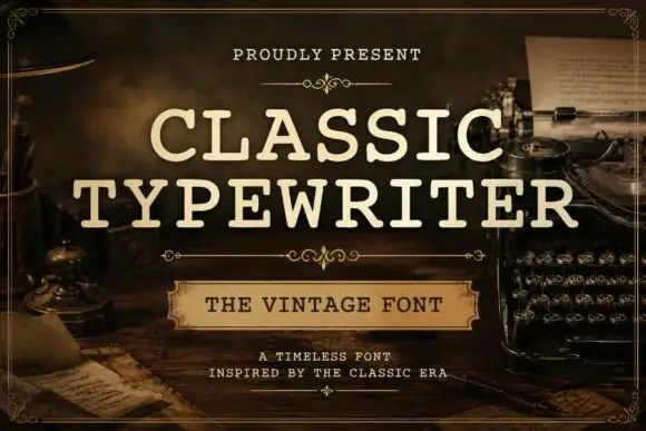
Even typed-looking capitals with rounded slab ends and open bowls
Classic Typewriter shows cream uppercase lettering in two lines over a dark writing-desk scene: the strokes stay comparatively even, the slab ends round off and the open C and P bowls leave generous white space inside the letters.
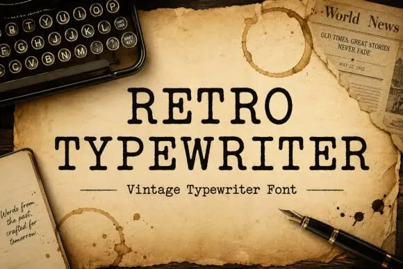
Typewriter serif with a soft worn edge
Retro Typewriter is a vintage typewriter serif in black on aged parchment: slab serifs, a moderate even stroke and a slightly uneven edge, set between two rules with a caption line beneath.
Ideas for this font
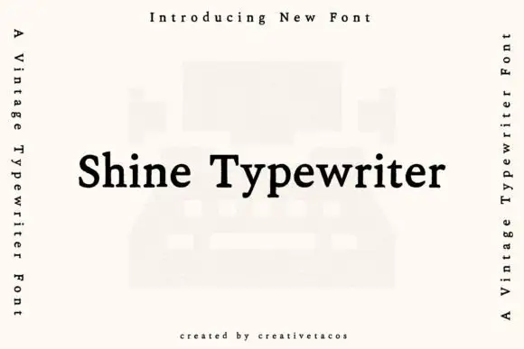
Typewriter serif with a warm even stroke
Shine Typewriter is a vintage typewriter serif in black on white: slab serifs, a moderately heavy even stroke, mixed case and a wide set, shown over a faint illustration of a typewriter with vertical labels down both sides.
Ideas for this font
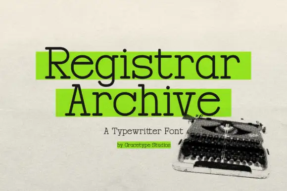
Typewriter slab with highlight blocks
Registrar Archive is a typewriter slab in black with green highlight blocks behind the two words, on a textured paper ground: light mixed case with round bowls, small square feet and even strokes, with a caption line beneath and a credit under that, beside a photograph of a typewriter.
Ideas for this font
Allow optional Google Analytics to measure visits and catalogue actions. Your search words and notes are not included. Privacy & storage