Modern Grotesque Body

Simple + Bargain Condensed
Creates crisp high-hierarchy contrast beneath Simple headlines across menus, websites and labels.
Inspect Bargain Condensed specimenDisclosure: MakerFileHub may earn a commission from qualifying purchases via paid links on this page. How our links work.
Worn soft slab family
Simple is a soft heavy slab in black on pale wood: mixed case with rounded slab endings, a large x-height and worn ink patches through the fill, with a tracked line above, a second line beneath naming the three cuts in red and a small credit at the foot.
Paid link
Get this fontProject & layout blueprintsAt-a-glance maker compatibility
Fine grain and micro-texture excel in 300 DPI print, sublimation, and screen print rather than small vinyl weeding.
Visual anatomy & craft review
The word runs wide and the drawing is a soft slab at a heavy weight: the slabs are rounded rather than square, the x-height is large, and the worn patches are built into the letters, so the face reads as printed from a used block. The red line beneath names the regular, textured and italic cuts, which is the practical information a buyer needs, and the small credit is set in a condensed face. The pale wood behind is a texture test, and the black holds because the ground is light and even. Because the slabs are wide and heavy, the face needs a large size at the small end, and the plate sets the word as large as the width allows. The palette is black and red on wood, which is a fair check for a face used on packaging.
Slab, worn, vintage, warm
Two-font hierarchy recipes
Tested contrast partners — pairing Simple with grounded secondary typography.
Simple + Bargain Condensed
Creates crisp high-hierarchy contrast beneath Simple headlines across menus, websites and labels.
Inspect Bargain Condensed specimen
Simple + Esmeralda
Adds a warm human signature touch for 1-to-3-word callouts without competing against structured serif capitals.
Inspect Esmeralda specimenPractical applications
Concrete hierarchy, scale and production guidance tailored to Simple’s stroke geometry.
A worn slab reads as a printed wrapper, and the large x-height keeps a short brand legible on the small label a paper bag allows.
Hierarchy & layout recipe
Print a 60 by 45 mm label: the bakery at 13 pt, the product at 7 pt, and the weight at 6 pt. Keep 4 mm inside the die and print two colours on a kraft stock.
Pre-production check
Check the 13 pt name on kraft, where the worn patches can fill; keep the size above 11 pt. Confirm the 6 pt weight reads at arm's length and that the label survives a damp wipe.
A soft worn slab gives a cookbook a shopfront feel, and the heavy strokes hold at thumbnail size where a light serif would fade.
Hierarchy & layout recipe
Set the title at 85 mm cap height across 200 mm, the subtitle in a 12 pt slab, and the author at 9 pt. Print two colours on a cream stock and keep the title in the upper half.
Pre-production check
Check the title at thumbnail size, where the worn patches can clot the word; keep them small. Confirm the 9 pt author survives lamination and that the title clears the trim.
A worn slab prints as one screen and looks used from the first wear, which suits a workshop shirt better than a crisp face.
Hierarchy & layout recipe
Print a 230 mm chest graphic: the word at 55 mm cap height, the year at 30 mm, and one ink on a light shirt. Keep the thinnest slab at 4 mm and place the graphic 80 mm below the collar.
Pre-production check
Check the screen at actual mesh, where a 4 mm slab can fill; thicken it. Wash-test one shirt and confirm the letters stay legible after five cycles.
Technical & licence verification
Confirm included OTF/TTF/WOFF formats, full glyph tables and licence coverage on the live store page before batch production.
Closest visual alternatives
Matched across letterform anatomy, stroke behaviour and craft applications.
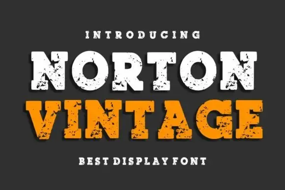
Wide chipped block slab
Norton Vintage is a wide block slab shown in two colours on a charcoal ground: a cream line and an orange line beneath it, with rounded bowls, heavy square slabs and irregular chipped fill across every stroke, plus a dark offset shadow and tracked lines above and beneath.
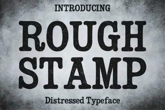
Distressed rounded slab
Rough Stamp is a rounded heavy slab in black on a mottled grey ground: fat stems with round slab serifs, a curled R leg and fine speckled wear across every stroke, set on two lines with tracked caps above and a subtitle beneath.
Ideas for this font
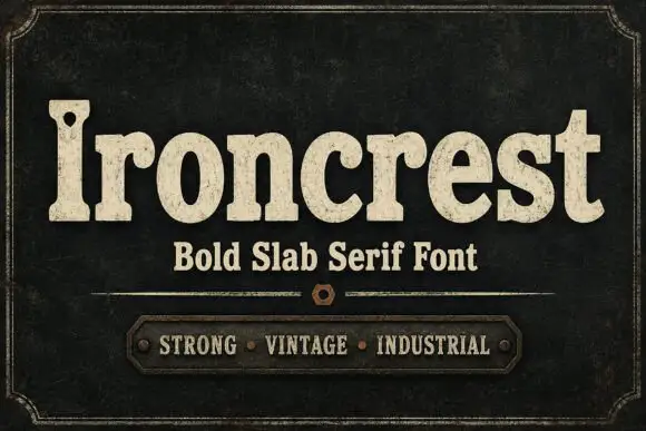
Heavy rounded mixed-case slabs with coarse worn fill and a pierced capital
Ironcrest shows cream mixed-case lettering against dark green-black, where the lowercase bowls stay thick and rounded, the r carries a curled shoulder, the t rises into a blunt wide crossbar and the capital I holds a small dark hole near its upper section while fine mottling roughens the fill.
Ideas for this font
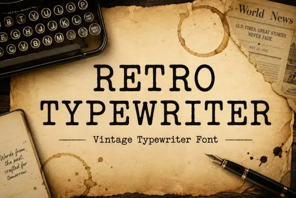
Typewriter serif with a soft worn edge
Retro Typewriter is a vintage typewriter serif in black on aged parchment: slab serifs, a moderate even stroke and a slightly uneven edge, set between two rules with a caption line beneath.
Ideas for this font
Same independent foundry
Allow optional Google Analytics to measure visits and catalogue actions. Your search words and notes are not included. Privacy & storage