High-Contrast Display Serif

Remember Things + Askinо
Pairs sculptural editorial warmth with Remember Things's clean modern geometry.
Inspect Askinо specimenDisclosure: MakerFileHub may earn a commission from qualifying purchases via paid links on this page. How our links work.
Tall narrow display capitals with a looping script
Remember Things is a duo on a pink checker ground: tall narrow display capitals in pastel colours with a heavy dark outline, and a fat looping script in black beneath them.
Paid link
Get this fontProject & layout blueprintsAt-a-glance maker compatibility
Weld or Unite overlapping script joins into one continuous vector path before sending to the blade.
Visual anatomy & craft review
The pairing moves from tall to low: REMEMBER is set in very tall narrow capitals whose stems are cut flat and whose counters stay open, each letter filled with a different pastel colour inside a heavy outline, and things is set in a fat black script whose t and h rise into loops and whose g drops a full descender, so the two words read as a stacked title rather than as a line of text. The contrast in width and weight is the point of the duo, and the script supplies all the movement while the capitals hold the shape. Small four-pointed stars and a pale checker ground complete the composition, with two tracked lines above and below the block. The duo is aimed at school material, posters and packaging, and it needs a short phrase at a large size where both cuts can carry.
A tall capital line over a fat script
Two-font hierarchy recipes
Tested contrast partners — pairing Remember Things with grounded secondary typography.
Remember Things + Askinо
Pairs sculptural editorial warmth with Remember Things's clean modern geometry.
Inspect Askinо specimen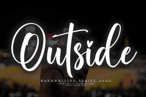
Remember Things + Outside
Introduces organic movement on pull-quotes, signatures and gift tags.
Inspect Outside specimenPractical applications
Concrete hierarchy, scale and production guidance tailored to Remember Things’s stroke geometry.
A tall capital line over a fat script gives a welcome board two voices, and the pair covers the greeting and the names in one purchase.
Hierarchy & layout recipe
Print a 500 by 350 mm board: set the greeting at 96 pt in the capitals, set the names at 56 pt in the script with 22 mm of clear ground, and hold 22 mm of border on all four sides.
Pre-production check
Tall capitals over a low script can look unbalanced; print one at the final size and check the weight of each line before the set.
The pair turns a short message into a designed card, and the colour per letter treatment is optional so a plain ink still reads well.
Hierarchy & layout recipe
Print a 120 by 120 mm square card: set the greeting at 30 pt in the capitals, set the line beneath at 26 pt in the script with 10 mm of clear ground, and hold 14 mm of margin on all four sides.
Pre-production check
Two heavy faces on one small card can crowd; print one at the finished size and check the spacing before the batch.
The capitals read across a table and the script carries the table's name, so a row of cards looks designed rather than printed from a template.
Hierarchy & layout recipe
Print 90 by 60 mm table cards: set the table name at 22 pt in the script, set the number at 14 pt in the capitals with 6 mm of clear ground, and hold 6 mm of margin on all four sides.
Pre-production check
A tall capital at fourteen points can close its counters; print one card at the real size and check the letters before the set.
Technical & licence verification
Confirm included OTF/TTF/WOFF formats, full glyph tables and licence coverage on the live store page before batch production.
Closest visual alternatives
Matched across letterform anatomy, stroke behaviour and craft applications.
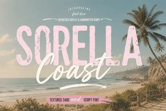
Distressed display sans and handwritten script
Sorella Coast is a duo: a tall distressed display sans in dusty pink with worn edges and speckles, and a loose handwritten script in cream that crosses the block letters.
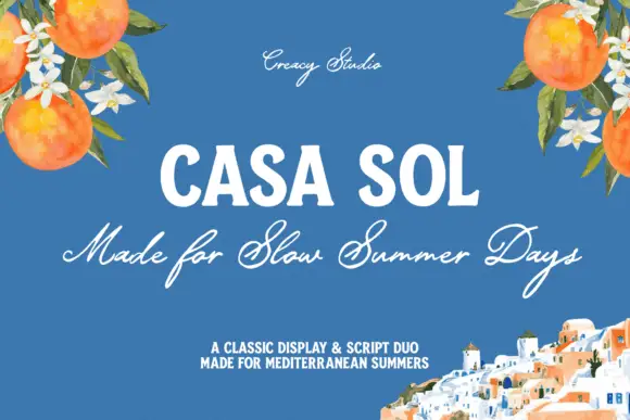
Robust display capitals with a light companion script
Casa Sol pairs a heavy condensed display face with a light summer script, so the block capitals hold the top line while the script underneath carries the sentence at roughly half the weight.
Ideas for this font
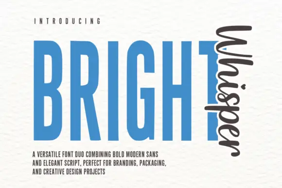
Very tall condensed bold sans paired with a loose script set vertically
Bright Whisper Duo pairs an extremely tall condensed sans in heavy weight with a loose upright script, and the sample sets the script sideways against the sans so the two voices sit at right angles.
Ideas for this font
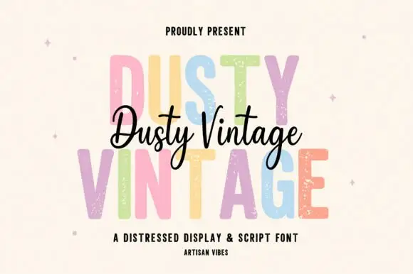
Tall distressed display caps layered with a flowing connected script
Dusty Vintage layers a tall distressed capital alphabet with a flowing connected script, so the same name appears as a worn printed word and as a light handwritten line across it.
Ideas for this font
Same independent foundry
Allow optional Google Analytics to measure visits and catalogue actions. Your search words and notes are not included. Privacy & storage