High-Contrast Display Serif

Dusty Vintage + Marquis - Elegant Modern Serif
Pairs sculptural editorial warmth with Dusty Vintage's clean modern geometry.
Inspect Marquis - Elegant Modern Serif specimenDisclosure: MakerFileHub may earn a commission from qualifying purchases via paid links on this page. How our links work.
Tall distressed display caps layered with a flowing connected script
Dusty Vintage layers a tall distressed capital alphabet with a flowing connected script, so the same name appears as a worn printed word and as a light handwritten line across it.
Paid link
Get this fontProject & layout blueprintsAt-a-glance maker compatibility
Cut solid base, outline, and shadow layers in separate vinyl colors and align on registration marks.
Visual anatomy & craft review
The display half is a narrow capital face with a speckled mask: the D keeps a square bowl, the U holds two straight stems, the S reverses through flat curves and the Y forks high, all at an even weight with the texture printed out of the strokes. The script half is a light connected hand with open bowls, a long entry stroke and a tail that runs past the word, set in the sample across the middle of the caps. Because the caps are narrow and the script is light, the two can overlap without either disappearing. The distressed texture is the fragile part at small sizes, where the speckle turns into noise. The cream ground, the pastel fills, the sparkles and the two caption lines are presentation; the duo is the two layers.
Distressed · Tall · Layered
Two-font hierarchy recipes
Tested contrast partners — pairing Dusty Vintage with grounded secondary typography.
Dusty Vintage + Marquis - Elegant Modern Serif
Pairs sculptural editorial warmth with Dusty Vintage's clean modern geometry.
Inspect Marquis - Elegant Modern Serif specimen
Dusty Vintage + Rebel Marks
Introduces organic movement on pull-quotes, signatures and gift tags.
Inspect Rebel Marks specimenPractical applications
Concrete hierarchy, scale and production guidance tailored to Dusty Vintage’s stroke geometry.
The tall worn caps give a box a printed vintage feel while the script signs it by hand, so one lid carries craft and warmth together at 22 pt.
Hierarchy & layout recipe
Print a 200 by 200 mm lid: set the shop name in the caps at 22 pt across the upper half, lay the script at 34 pt across it, and keep 18 mm of margin so neither layer is cut when the lid is wrapped.
Pre-production check
A distressed mask at 22 pt reads as dirt rather than texture; check the printed lid and use a heavier cut of the caps below that size.
The worn caps carry table names that read at 5 cm across a field, and the script adds a handwritten note without a second board.
Hierarchy & layout recipe
Print an A1 plan: set the table names in the caps at 5 cm, lay the couple's names in the script at 7 cm across the head, and leave 5 cm of border so the distressed edges are not trimmed by the frame.
Pre-production check
Outdoor light flattens a light script on white paper; check the board in daylight and choose a tinted stock rather than a heavier script.
The narrow caps fit a small band at 9 pt while the script adds the scent note, and the pair keeps a plain jar from looking generic.
Hierarchy & layout recipe
Print a 40 mm band: set the brand in the caps at 9 pt, set the scent in the script at 11 pt beneath, and leave 5 mm of clear band at the overlap so the light script is not hidden under the glued join.
Pre-production check
A glued overlap can swallow a light script; check the assembled band and move the script away from the seam before the run.
Technical & licence verification
Confirm included OTF/TTF/WOFF formats, full glyph tables and licence coverage on the live store page before batch production.
Closest visual alternatives
Matched across letterform anatomy, stroke behaviour and craft applications.
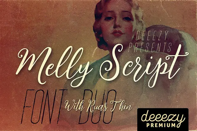
Slanted rounded script paired with an extremely narrow display face
Melly Script Font Duo pairs a slanted rounded script with an extremely narrow capital display face, so a design can carry a soft headline and a tall thin second line from one purchase.
Ideas for this font
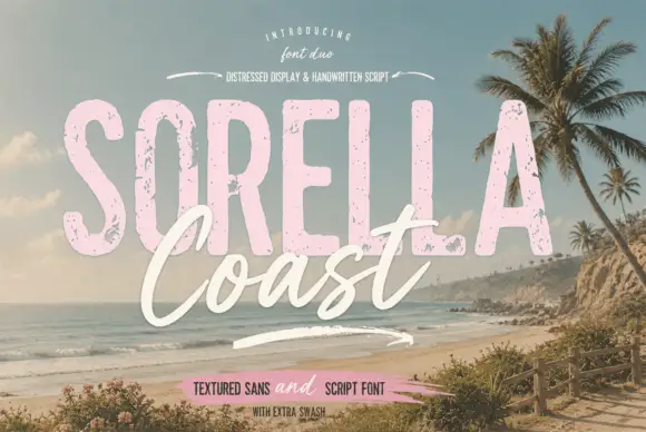
Distressed display sans and handwritten script
Sorella Coast is a duo: a tall distressed display sans in dusty pink with worn edges and speckles, and a loose handwritten script in cream that crosses the block letters.
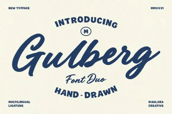
Slanted brush script with broad rough capitals
Gulberg is a slanted brush script with strong pressure changes and short angular shoulders, laid over broad, lightly roughened capital lettering.
Ideas for this font
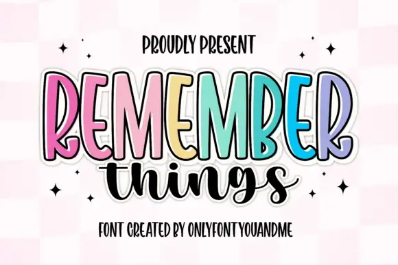
Tall narrow display capitals with a looping script
Remember Things is a duo on a pink checker ground: tall narrow display capitals in pastel colours with a heavy dark outline, and a fat looping script in black beneath them.
Ideas for this font
Same independent foundry
Allow optional Google Analytics to measure visits and catalogue actions. Your search words and notes are not included. Privacy & storage