High-Contrast Display Serif

Sorella Coast + Grandeur – Elegant Classic Serif
Pairs sculptural editorial warmth with Sorella Coast's clean modern geometry.
Inspect Grandeur – Elegant Classic Serif specimenDisclosure: MakerFileHub may earn a commission from qualifying purchases via paid links on this page. How our links work.
Distressed display sans and handwritten script
Sorella Coast is a duo: a tall distressed display sans in dusty pink with worn edges and speckles, and a loose handwritten script in cream that crosses the block letters.
Paid link
Get this fontProject & layout blueprintsAt-a-glance maker compatibility
Fine grain and micro-texture excel in 300 DPI print, sublimation, and screen print rather than small vinyl weeding.
Visual anatomy & craft review
Sorella fills the card in tall capitals, and the display face is deliberately damaged: the stems carry speckles and small chips, a few strokes break at the terminals, and the whole row looks printed on paper that has been handled. Coast is written in a loose script in cream across the lower part of the capitals, overlapping the pink letters rather than sitting beneath them, with a small decorative swash at the left of the line. The ground is a photograph of a coastline with palms at the right, and three small captions at the top and bottom name the duo and the extras. The pair is a packaging and apparel combination: the distressed sans takes the loud word, the script takes the smaller line, and the overlap is what makes the two read as a design rather than as two fonts on one page.
A grunge display pair over a coast
Two-font hierarchy recipes
Tested contrast partners — pairing Sorella Coast with grounded secondary typography.
Sorella Coast + Grandeur – Elegant Classic Serif
Pairs sculptural editorial warmth with Sorella Coast's clean modern geometry.
Inspect Grandeur – Elegant Classic Serif specimen
Sorella Coast + Honey
Introduces organic movement on pull-quotes, signatures and gift tags.
Inspect Honey specimenPractical applications
Concrete hierarchy, scale and production guidance tailored to Sorella Coast’s stroke geometry.
The distressed pair suits an outdoor ceremony on sand, and the overlap gives a plain board the layout a decorator would otherwise have to build.
Hierarchy & layout recipe
Print a 600 by 400 mm board: set the main word at 130 pt, set the script line at 60 pt overlapping the lower third with 22 mm of clear ground beneath, and hold 24 mm of border on all sides.
Pre-production check
Distressed edges read as damage at large sizes; print one board at the final size and check the wear looks intentional before the set.
A worn sans on a hang tag says summer without a photograph, and the script crossing it gives a small brand a two-voice mark.
Hierarchy & layout recipe
Print a 40 by 80 mm hang tag: set the main word at 16 pt, set the script at 9 pt crossing the lower third, and hold 4 mm from the widest letter to the punch hole.
Pre-production check
Overlapping letters can look like a mistake on a small tag; print one at the real size and check the two voices stay separate before the order.
The distressed sans matches the graphic language of a surf shop, and a two-colour sticker on a window is cheap to produce and hard to miss.
Hierarchy & layout recipe
Print a 100 mm round sticker: set the main word at 24 pt, set the script at 16 pt beneath with 6 mm of clear ground, and hold 8 mm between the letters and the rim.
Pre-production check
Speckles disappear on cheap vinyl; print one sticker on the real material and check the texture before the roll.
Technical & licence verification
Confirm included OTF/TTF/WOFF formats, full glyph tables and licence coverage on the live store page before batch production.
Closest visual alternatives
Matched across letterform anatomy, stroke behaviour and craft applications.
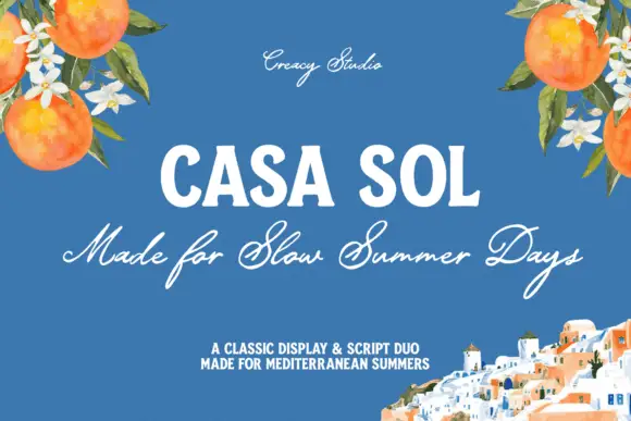
Robust display capitals with a light companion script
Casa Sol pairs a heavy condensed display face with a light summer script, so the block capitals hold the top line while the script underneath carries the sentence at roughly half the weight.
Ideas for this font
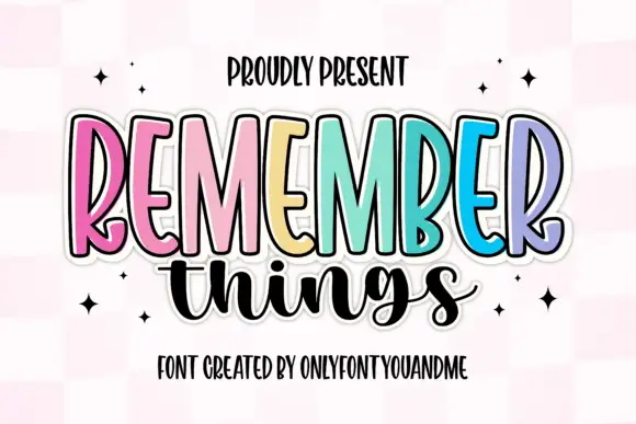
Tall narrow display capitals with a looping script
Remember Things is a duo on a pink checker ground: tall narrow display capitals in pastel colours with a heavy dark outline, and a fat looping script in black beneath them.
Ideas for this font
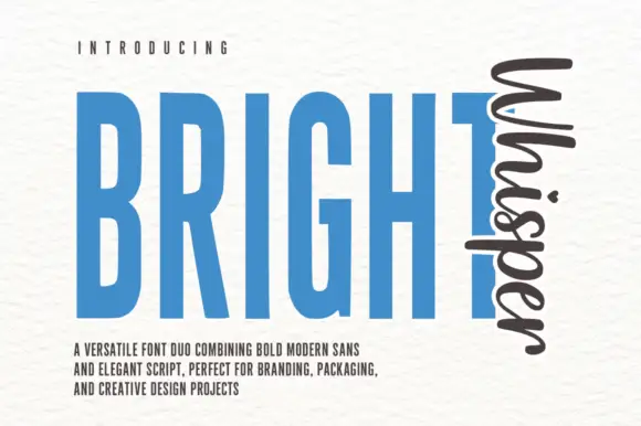
Very tall condensed bold sans paired with a loose script set vertically
Bright Whisper Duo pairs an extremely tall condensed sans in heavy weight with a loose upright script, and the sample sets the script sideways against the sans so the two voices sit at right angles.
Ideas for this font
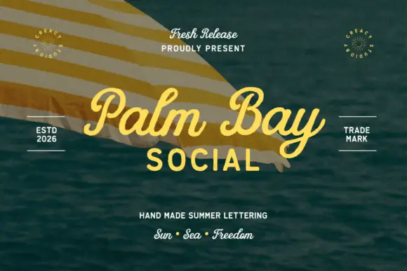
Summer script with an upright block companion
Palm Bay Social is a duo on a sunlit water photograph: a casual looped script in golden yellow for the place name and a plain uppercase block line beneath it, with small tracked proofs and stamps around the edges.
Same independent foundry
Allow optional Google Analytics to measure visits and catalogue actions. Your search words and notes are not included. Privacy & storage