High-Contrast Display Serif

Bright Whisper Duo + Cervelique
Pairs sculptural editorial warmth with Bright Whisper Duo's clean modern geometry.
Inspect Cervelique specimenDisclosure: MakerFileHub may earn a commission from qualifying purchases via paid links on this page. How our links work.
Very tall condensed bold sans paired with a loose script set vertically
Bright Whisper Duo pairs an extremely tall condensed sans in heavy weight with a loose upright script, and the sample sets the script sideways against the sans so the two voices sit at right angles.
Paid link
Get this fontProject & layout blueprintsAt-a-glance maker compatibility
Weld or Unite overlapping script joins into one continuous vector path before sending to the blade.
Visual anatomy & craft review
The sans half is built from narrow rectangles: the B keeps two tall bowls at almost no width, the R carries a straight leg, the G closes a small counter and the H joins two stems with a bar as tall as the letters are wide, so a five-letter word fills a whole panel with height rather than width. There is no contrast and no serif anywhere. The script half is a loose upright hand with a small x-height, a light even stroke and letters that lean slightly back, and in the sample it runs vertically down the right edge, which is a layout trick rather than a property of the face. Together they cover a tall panel and a quiet line. The blue ink, the cream paper and the small descriptive block are presentation; the duo is the two words.
Condensed · Tall · Paired
Two-font hierarchy recipes
Tested contrast partners — pairing Bright Whisper Duo with grounded secondary typography.
Bright Whisper Duo + Cervelique
Pairs sculptural editorial warmth with Bright Whisper Duo's clean modern geometry.
Inspect Cervelique specimen
Bright Whisper Duo + Handmade Calligraphy
Introduces organic movement on pull-quotes, signatures and gift tags.
Inspect Handmade Calligraphy specimenPractical applications
Concrete hierarchy, scale and production guidance tailored to Bright Whisper Duo’s stroke geometry.
The condensed weight lets a long title fill a portrait cover without shrinking to a size that stops reading, and the script supplies a quiet second line.
Hierarchy & layout recipe
Set the title in the sans at 96 pt down the left two thirds of an A4 cover, set the subtitle in the script at 24 pt running vertically on the right, and leave 18 mm of margin at each edge.
Pre-production check
A vertical script line on a cover can look accidental; check the proof at final size and align the script to the trim rather than the text block.
The tall condensed sans gives a poster its stack of type at arm's length, and the script carries the date and time in a hand that feels announced.
Hierarchy & layout recipe
Set the exhibition title in the sans at 120 pt on an A2 poster, set the dates in the script at 30 pt beneath, and hold 30 mm between the title and the first detail line.
Pre-production check
Tall condensed letters at 120 pt on A2 can look like a column rather than a title; check the full-size proof and widen the tracking rather than the letters.
The pair lets a single spread carry a shouted statistic in the condensed sans and a whispered attribution in the script, using one purchase for both.
Hierarchy & layout recipe
Set the statistic in the sans at 72 pt on a 90 mm measure, set the attribution in the script at 18 pt beneath it, and hold 12 mm between the two blocks.
Pre-production check
A vertical or angled script next to dense body text can break the reading order; check the spread and keep the script outside the text column.
Technical & licence verification
Confirm included OTF/TTF/WOFF formats, full glyph tables and licence coverage on the live store page before batch production.
Closest visual alternatives
Matched across letterform anatomy, stroke behaviour and craft applications.
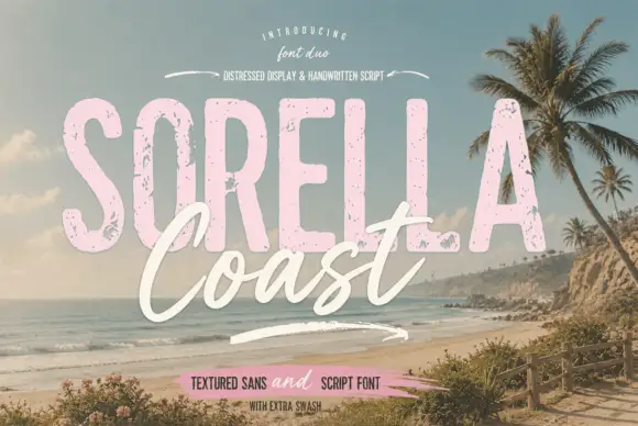
Distressed display sans and handwritten script
Sorella Coast is a duo: a tall distressed display sans in dusty pink with worn edges and speckles, and a loose handwritten script in cream that crosses the block letters.
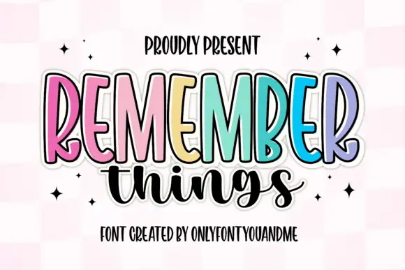
Tall narrow display capitals with a looping script
Remember Things is a duo on a pink checker ground: tall narrow display capitals in pastel colours with a heavy dark outline, and a fat looping script in black beneath them.
Ideas for this font
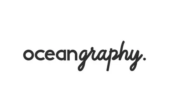
Rounded sans and flowing script duo
Oceangraphy is a duo in near-black on white: a rounded upright lowercase sans for the first part of the word and a flowing slanted script for the second, joined without a space, with a looped descender on the g and a full stop at the end, and nothing else on the sheet.
Ideas for this font
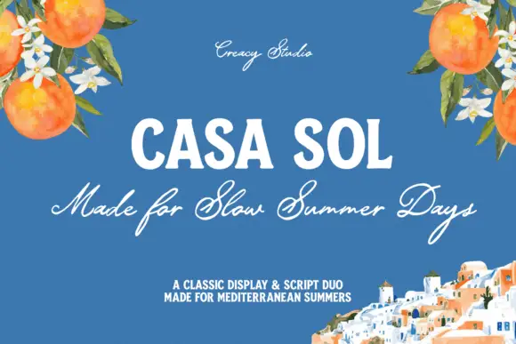
Robust display capitals with a light companion script
Casa Sol pairs a heavy condensed display face with a light summer script, so the block capitals hold the top line while the script underneath carries the sentence at roughly half the weight.
Ideas for this font
Same independent foundry
Allow optional Google Analytics to measure visits and catalogue actions. Your search words and notes are not included. Privacy & storage