High-Contrast Display Serif

Casa Sol + Raffined
Pairs sculptural editorial warmth with Casa Sol's clean modern geometry.
Inspect Raffined specimenDisclosure: MakerFileHub may earn a commission from qualifying purchases via paid links on this page. How our links work.
Robust display capitals with a light companion script
Casa Sol pairs a heavy condensed display face with a light summer script, so the block capitals hold the top line while the script underneath carries the sentence at roughly half the weight.
Paid link
Get this fontProject & layout blueprintsAt-a-glance maker compatibility
Weld or Unite overlapping script joins into one continuous vector path before sending to the blade.
Visual anatomy & craft review
The cover sets CASA SOL in heavy condensed capitals, evenly spaced with flat terminals and a small flare at the joins, then runs Made for Slow Summer Days in a white script whose capital M opens with a broad first stroke and whose lowercase keeps tall narrow loops. The two lines are optically the same width, which is what lets the heavy and the light face sit as one lockup instead of two competing ones. The script's x-height stays small, so its ascenders and loops stand well above the middle of the word and the line reads as a decorative rule under the caps. The oranges, white flowers, the small studio signature at the top and the tracked footer are all part of the cover artwork rather than the alphabet.
Robust · Mediterranean · Paired
Two-font hierarchy recipes
Tested contrast partners — pairing Casa Sol with grounded secondary typography.
Casa Sol + Raffined
Pairs sculptural editorial warmth with Casa Sol's clean modern geometry.
Inspect Raffined specimen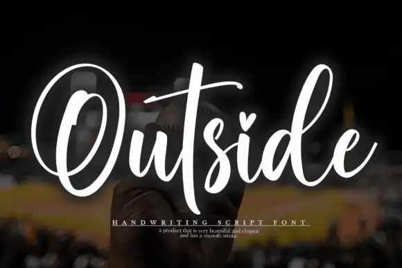
Casa Sol + Outside
Introduces organic movement on pull-quotes, signatures and gift tags.
Inspect Outside specimenPractical applications
Concrete hierarchy, scale and production guidance tailored to Casa Sol’s stroke geometry.
The heavy top line gives a seasonal menu a masthead that holds at arm's length on a table, while the light script below it can carry a changing daily line without being reset in a second typeface.
Hierarchy & layout recipe
Set the club name at 30 pt on the menu cover, run the daily line in the script at 18 pt directly beneath it, and keep the item list in a plain sans at 9 pt starting 12 mm below the script's lowest loop.
Pre-production check
Print the cover on the same uncoated stock as the inside pages: the heavy caps are safe, but the script's light strokes grey out on absorbent paper.
One heavy face for room numbers and one script for welcome lines covers a whole property with two voices, which keeps a small hotel's signage consistent from the gate to the door.
Hierarchy & layout recipe
Set the property name at 40 mm on the entrance panel, keep the script for the welcome board at 25 mm, and hold every room number in the heavy caps so the script never has to carry wayfinding information.
Pre-production check
Check the script's light strokes at the smallest size it will appear before it goes on a door plate, since backlit or brushed metal eats thin lines.
The pair separates a place name from a descriptive line without a change of typeface, which is what a travel opener needs when the destination and the season are both on the page.
Hierarchy & layout recipe
Run the destination in the heavy caps at 60 pt across the top of the spread, set the season line in the script at 30 pt under it, and keep the standfirst in a plain face at 10 pt with 6 mm of clearance before it starts.
Pre-production check
The script's tall loops can collide with a following headline; measure the gap from the lowest descender rather than from the baseline before you stack the next block.
Technical & licence verification
Confirm included OTF/TTF/WOFF formats, full glyph tables and licence coverage on the live store page before batch production.
Closest visual alternatives
Matched across letterform anatomy, stroke behaviour and craft applications.
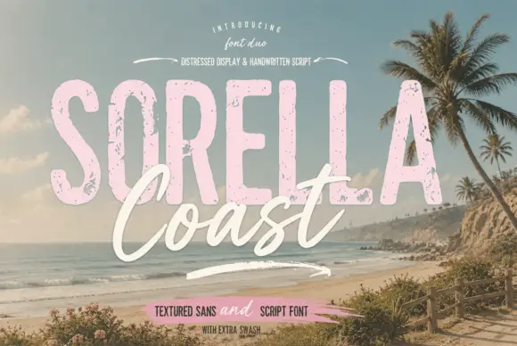
Distressed display sans and handwritten script
Sorella Coast is a duo: a tall distressed display sans in dusty pink with worn edges and speckles, and a loose handwritten script in cream that crosses the block letters.
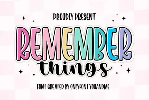
Tall narrow display capitals with a looping script
Remember Things is a duo on a pink checker ground: tall narrow display capitals in pastel colours with a heavy dark outline, and a fat looping script in black beneath them.
Ideas for this font
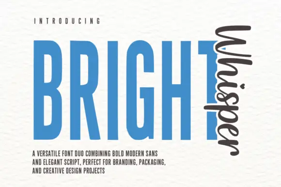
Very tall condensed bold sans paired with a loose script set vertically
Bright Whisper Duo pairs an extremely tall condensed sans in heavy weight with a loose upright script, and the sample sets the script sideways against the sans so the two voices sit at right angles.
Ideas for this font
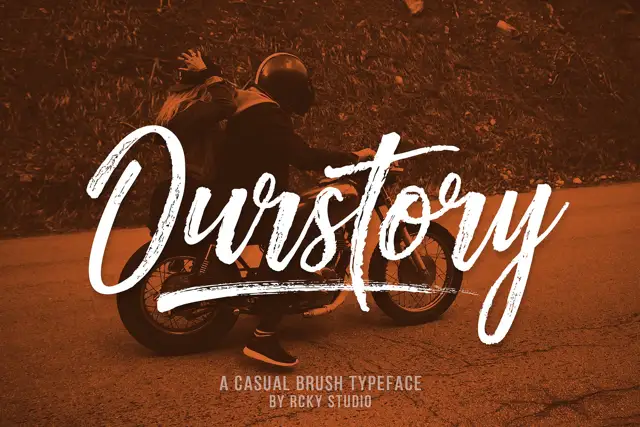
Rough brush script with a fine companion
Ourstory is a duo on a warm-toned photograph: a rough brush script in white with dry, split strokes and a long underline swash, plus a fine companion hand for smaller lines.
Same independent foundry
Allow optional Google Analytics to measure visits and catalogue actions. Your search words and notes are not included. Privacy & storage