High-Contrast Display Serif

Rainbow Memories + Svara
Pairs sculptural editorial warmth with Rainbow Memories's clean modern geometry.
Inspect Svara specimenDisclosure: MakerFileHub may earn a commission from qualifying purchases via paid links on this page. How our links work.
Multicolour outlined blocks with a monoline script
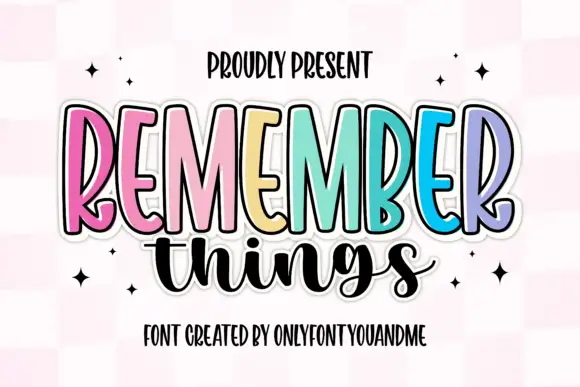
Rainbow Memories is a duo: a set of fat outlined capitals, each printed in a different pastel with a doubled shadow outline, and a looping monoline script that is set across them so the two voices overlap.
Paid link
Get this fontProject & layout blueprintsAt-a-glance maker compatibility
Weld or Unite overlapping script joins into one continuous vector path before sending to the blade.
Visual anatomy & craft review
The preview puts RAINBOW in capitals across the middle of the card, and no two letters are the same colour: pink, orange, yellow, teal, lilac and rose, each with a black contour and a second offset outline that reads as a drop shadow. Underneath, memories is written in a thin monoline script whose loops rise up between the capitals, so the two lines interlock instead of stacking. A pink radial ground, a Font Duo badge and a script credit at the foot complete the card. The construction is a matched pair rather than one face: the capitals take colour and size, the script takes the small words, and the practical rule is to keep the outline weight consistent so the shadow does not turn into a blur when the pair is scaled down.
Pastel outlined capitals crossed by a looping monoline script
Two-font hierarchy recipes
Tested contrast partners — pairing Rainbow Memories with grounded secondary typography.
Rainbow Memories + Svara
Pairs sculptural editorial warmth with Rainbow Memories's clean modern geometry.
Inspect Svara specimen
Rainbow Memories + Black Ink Brush
Introduces organic movement on pull-quotes, signatures and gift tags.
Inspect Black Ink Brush specimenPractical applications
Concrete hierarchy, scale and production guidance tailored to Rainbow Memories’s stroke geometry.
The colour-per-letter capitals read as a party before the text is read, and the duo supplies both the headline and the small detail line.
Hierarchy & layout recipe
Print a 105 by 148 mm invitation: set the party name at 34 pt across two rows, keep 16 mm of clear ground beneath before the time and address at 8.5 pt, and hold 12 mm from the outer outline to the card edge.
Pre-production check
Home printers flatten pastel fills next to a black outline; print one invitation on the actual machine and check the contrast before the batch.
Bright letters on a wall are how a primary classroom labels its boards, and the monoline script can carry the subject word beneath.
Hierarchy & layout recipe
Print a 420 by 297 mm sheet: set the display word at 130 pt on one row, keep 30 mm of clear ground beneath before the class name at 24 pt, and hold 20 mm of margin on all four sides.
Pre-production check
Toned-down school printers lose the pastel difference between letters; print one sheet and check that each letter still separates before the set.
The duo gives a small workshop a friendly mark with a headline and a slogan, and a sticker survives on a water bottle for a whole term.
Hierarchy & layout recipe
Print a 90 mm round sticker: set the workshop name at 22 pt on one row, keep 6 mm of clear ground between the outline and the rim, and leave 8 mm beneath for the term dates at 6 pt.
Pre-production check
Doubled outlines print as a smudge on small vinyl; print one sticker on the real material and check the shadow before the roll.
Technical & licence verification
Confirm included OTF/TTF/WOFF formats, full glyph tables and licence coverage on the live store page before batch production.
Closest visual alternatives
Matched across letterform anatomy, stroke behaviour and craft applications.
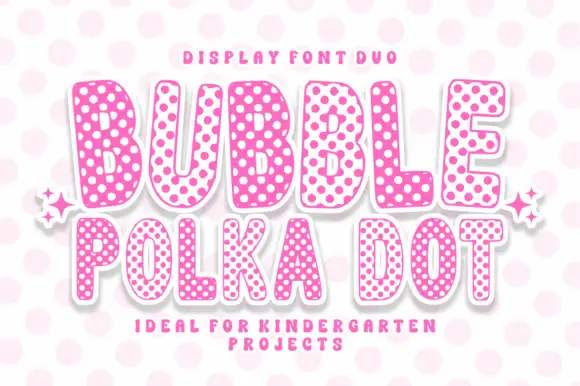
Rounded bubble capitals in two polka-dot colourways with a soft edge
Bubble Polka Dot is a duo of rounded bubble capitals supplied in two dotted colourways, one pale letters on a pink dot field and one pink letters on a pale field, so a poster can alternate letters for contrast.
Ideas for this font
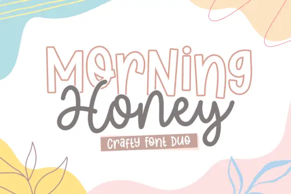
Outlined display and rounded script
Morning Honey Duo is a craft pair on white: outlined tall capitals with a thin double contour, and a rounded joined script beneath, framed by soft painted shapes in pastel yellow, pink and blue.
Ideas for this font
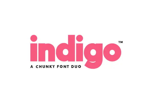
Very heavy geometric lowercase sans paired with a matching outline cut
Indigo is a two-cut duo in which a very heavy lowercase sans leaves small round counters and its outline twin keeps the same skeleton, so a header can be set solid, hollow, or stacked as a two-layer block.
Ideas for this font
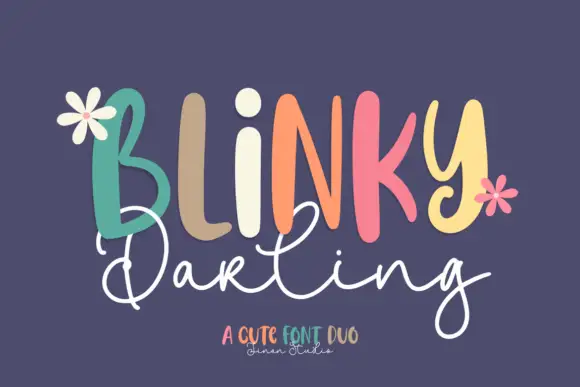
Duo
Blinky Darling Duo shows tall uneven printed forms with rounded ends, each capital in a different pastel tone across a plum ground, above a fine white script line whose D and g carry large open loops and whose tails extend well past the caps.
Ideas for this font
Same independent foundry
Allow optional Google Analytics to measure visits and catalogue actions. Your search words and notes are not included. Privacy & storage