High-Contrast Display Serif

Blinky Darling Duo + Resquel
Pairs sculptural editorial warmth with Blinky Darling Duo's clean modern geometry.
Inspect Resquel specimenDisclosure: MakerFileHub may earn a commission from qualifying purchases via paid links on this page. How our links work.
Duo
Blinky Darling Duo shows tall uneven printed forms with rounded ends, each capital in a different pastel tone across a plum ground, above a fine white script line whose D and g carry large open loops and whose tails extend well past the caps.
Paid link
Get this fontProject & layout blueprintsAt-a-glance maker compatibility
Sturdy stroke walls and open counters weed cleanly on adhesive vinyl, HTV apparel film, and cut cardstock.
Visual anatomy & craft review
The caps stay narrow and separate, their heights rise and fall, the endings round off and every letter takes its own colour, while the script below keeps one thin white weight. That height irregularity is the character, because the row reads as hand-cut letters rather than a set face. The two small flowers and the pastel palette belong to the cover. Keep 36 pt so the uneven heights stay deliberate and check whether the colours are per-glyph work in your file or cover treatment.
Tall heavy print and thin loose cursive
Two-font hierarchy recipes
Tested contrast partners — pairing Blinky Darling Duo with grounded secondary typography.
Blinky Darling Duo + Resquel
Pairs sculptural editorial warmth with Blinky Darling Duo's clean modern geometry.
Inspect Resquel specimen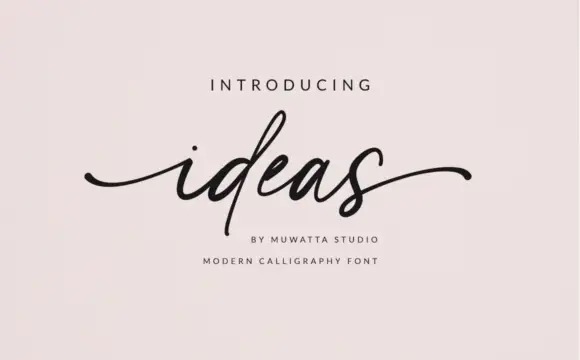
Blinky Darling Duo + Ideas
Introduces organic movement on pull-quotes, signatures and gift tags.
Inspect Ideas specimenPractical applications
Concrete hierarchy, scale and production guidance tailored to Blinky Darling Duo’s stroke geometry.
The bouncy caps and the fine script make a friendly card, and the uneven heights keep a short name from looking like a label.
Hierarchy & layout recipe
Print a 105 by 148 mm card: set the name in the caps at 34 pt on one row, set the wish in the script at 16 pt beneath with 10 mm of clear ground, and keep 15 mm of margin at each side.
Pre-production check
The script loops drop under the caps; check the card and raise the script row 4 mm if they collide.
The pastel caps give a box a soft identity while the white script keeps the detail line readable at a small label size on a shelf.
Hierarchy & layout recipe
Print a 70 by 70 mm label: set the bakery name in the caps at 22 pt on one row, set the strapline in the script at 12 pt beneath with 7 mm of clear ground, and keep 6 mm to the die edge.
Pre-production check
Per-letter colouring is manual work; check the artwork time before quoting a five-colour label.
The uneven letters read at a child's eye level and the thin script supplies a second line for a room name on a shelf edge.
Hierarchy & layout recipe
Print a 250 by 150 mm panel: set the room word in the caps at 44 pt on one row, set the small line in the script at 14 pt beneath, keep 16 mm of clear ground, and keep 18 mm of border.
Pre-production check
The white script needs a dark ground; check the panel and keep the contrast above four to one.
Technical & licence verification
Confirm included OTF/TTF/WOFF formats, full glyph tables and licence coverage on the live store page before batch production.
Closest visual alternatives
Matched across letterform anatomy, stroke behaviour and craft applications.
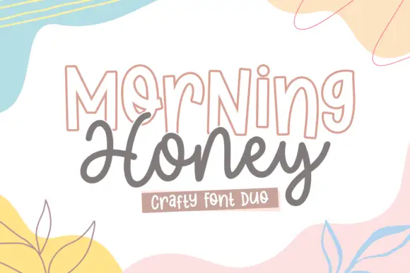
Outlined display and rounded script
Morning Honey Duo is a craft pair on white: outlined tall capitals with a thin double contour, and a rounded joined script beneath, framed by soft painted shapes in pastel yellow, pink and blue.
Ideas for this font
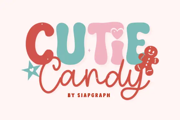
Playful duo pairing puffy candy capitals with a loose monoline script
Cutie Candy is a two-cut family in which puffy pastel capitals bounce along a wavy baseline and a loose monoline script writes the second word, so a short greeting reads as something decorated on a gingerbread tile.
Ideas for this font
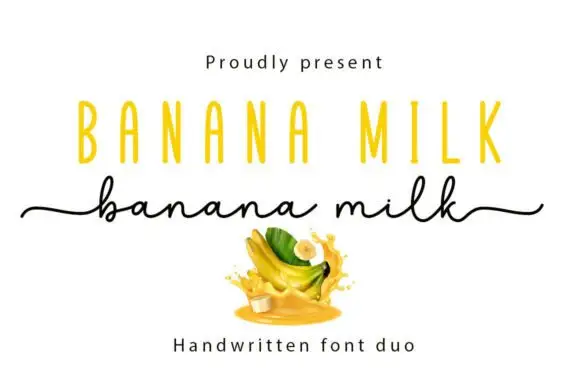
Casual marker handwriting with a bouncing baseline
Banana Milk is casual handwriting drawn with a rounded marker weight, its baseline bouncing up and down between letters, the ascenders short and the joins broken, so a word looks written quickly on a note rather than set on a line.
Ideas for this font
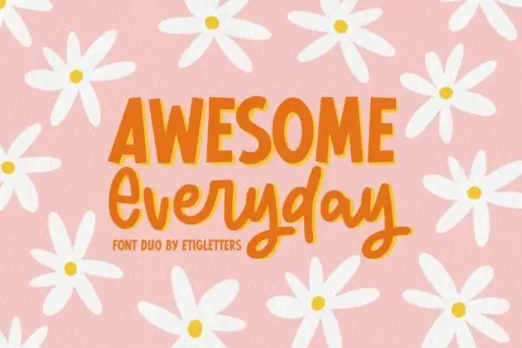
Irregular upright capitals paired with connected rounded script and long y loops
Awesome Everyday Duo places a capital row with thick narrow stems and uneven top edges above a connected rounded script whose y descenders drop into large lower loops and whose capital E begins with an open curl.
Ideas for this font
Same independent foundry
Allow optional Google Analytics to measure visits and catalogue actions. Your search words and notes are not included. Privacy & storage