Neutral Sans Workhorse

Fairy Sprinkle + Base Edge
Lets Fairy Sprinkle own the focal silhouette while handling secondary copy, sizing and subheads cleanly.
Inspect Base Edge specimenDisclosure: MakerFileHub may earn a commission from qualifying purchases via paid links on this page. How our links work.
Pastel rounded letters with tiny flowers and overlapping fairy details
Fairy Sprinkle sets a spring scene in tall pastel colour-font letters, each interior printed with flowers, clouds and butterflies, each edge closed by a dashed stitch line, with small fairies perched on top.
Paid link
Get this fontProject & layout blueprintsAt-a-glance maker compatibility
Weld or Unite overlapping script joins into one continuous vector path before sending to the blade.
Visual anatomy & craft review
Fairy over sprinkle in lavender, pink, mint and pale blue, the strokes tall and slightly bowed, the stitching running inside a thin white keyline. Interiors carry tiny mushrooms, daisies, clouds and glitter dots, and the letters vary in height so the two rows step rather than lock. Around them sit butterflies, fairy characters with wings, blossoms and 4-point stars, all in the same pastel range. The banner at the foot notes the file types and a decoration set. It is a colour font with dense interior art, so a word reads as a soft pastel shape from a distance and needs a decent print size to show the drawings.
Pastel rounded letters with tiny flowers and overlapping fairy details
Two-font hierarchy recipes
Tested contrast partners — pairing Fairy Sprinkle with grounded secondary typography.
Fairy Sprinkle + Base Edge
Lets Fairy Sprinkle own the focal silhouette while handling secondary copy, sizing and subheads cleanly.
Inspect Base Edge specimen
Fairy Sprinkle + The Avenue Editorial
Grounds bold display lettering with classic typographic authority on posters, badges and apparel.
Inspect The Avenue Editorial specimenPractical applications
Concrete hierarchy, scale and production guidance tailored to Fairy Sprinkle’s stroke geometry.
The pastel interiors carry a spring theme without extra artwork, and the stitched edges give a printed card a handmade look.
Hierarchy & layout recipe
Print a 105 by 148 mm invitation: set the heading at 34 pt across two rows, keep 14 mm of clear ground beneath before the details at 9 pt, and keep 12 mm of margin so the butterflies stay inside the card.
Pre-production check
Interior drawings close below 20 pt; check the printed card before the card batch goes to the printer.
The fairy figures and the pastel palette set the theme in one element, and the tall letters fill a banner without adding balloons.
Hierarchy & layout recipe
Print a 1200 by 350 mm banner: set the name at 130 pt on one row, keep 30 mm of clear ground beneath before the age at 22 pt, and keep 34 mm of border so no letter is cropped.
Pre-production check
Pastel inks print pale on glossy banner stock; check a sample print before the banner order.
The soft palette suits a children's clothing label, and the stitched edge prints as a secure border on a small woven tag.
Hierarchy & layout recipe
Print a 40 by 60 mm woven tag: set the brand at 12 pt on one row, keep 5 mm of clear ground beneath before the size at 4 pt, and keep 4 mm from the art to the edge of the tag.
Pre-production check
Fine glitter dots vanish in weaving; check a woven sample before the tag production run begins.
Technical & licence verification
Confirm included OTF/TTF/WOFF formats, full glyph tables and licence coverage on the live store page before batch production.
Closest visual alternatives
Matched across letterform anatomy, stroke behaviour and craft applications.
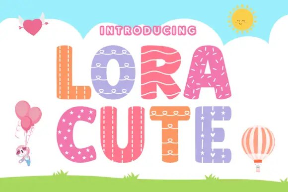
Stitched-pattern block display
Lora Cute is a patterned block display on a sky-blue ground: broad rounded capitals, each filled with a different treatment — stitching, loops, waves, stars — with a pale outline around every letter, plus small balloon, heart and sun illustrations around the edges.
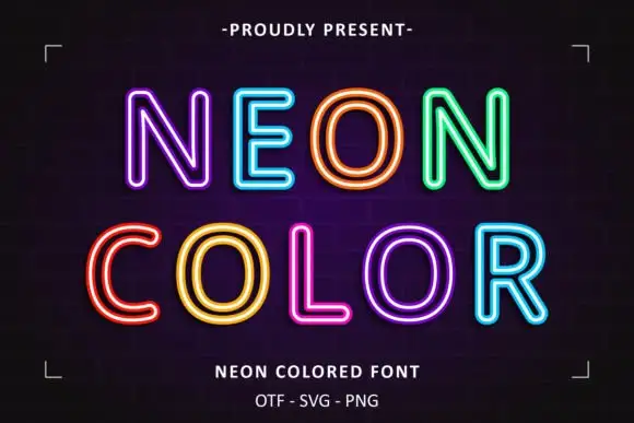
Neon double-line outline display
Neon Colored is a colour display on a dark brick ground: rounded outline capitals in bright double-line neon colours — violet, blue, orange, green, yellow, pink — with soft glow, set in two lines inside small corner brackets, with a small presenting line above and two plain lines below.
Ideas for this font
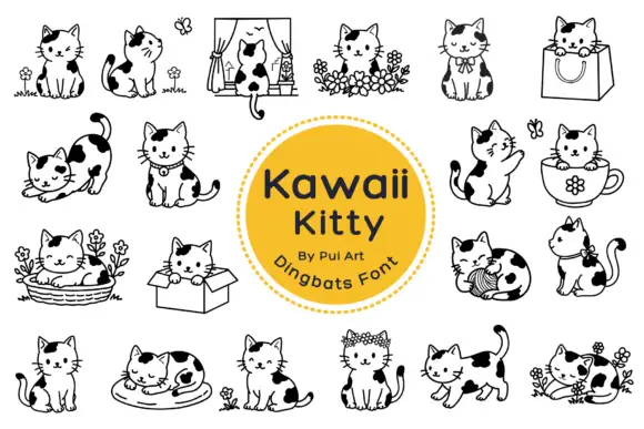
Black-patched kitten outlines in small domestic scenes
Kawaii Kitty Doodle shows black-and-white kittens with rounded heads, dark patches and small whiskers, where a window, a shopping bag, a cup, a basket, a cardboard box and a ball of yarn turn the poses into little scenes, flowers surround several cats and other figures sit alone with an upright or curled tail.
Ideas for this font
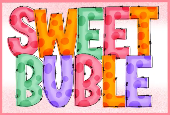
Stitched dotted translucent blocks
Sweet Buble is a colour display on a pale textured ground: tall blocks in pastel pink, orange, green and violet with large darker dots inside, a translucent-looking overlay, fine drawn edge stitches and dark outlines, set in two stacked words.
Ideas for this font
Same independent foundry
Allow optional Google Analytics to measure visits and catalogue actions. Your search words and notes are not included. Privacy & storage