Neutral Sans Workhorse

Politer + Monure
Lets Politer own the focal silhouette while handling secondary copy, sizing and subheads cleanly.
Inspect Monure specimenDisclosure: MakerFileHub may earn a commission from qualifying purchases via paid links on this page. How our links work.
Chunky rounded display with a heavy outer keyline
Politer is a chunky rounded display drawn with a thick cream keyline and a thin black inner line: uneven hand-made widths, rounded slab terminals, a wide O and a T whose arms overhang, shown with each letter in a different flat colour.
Paid link
Get this fontProject & layout blueprintsAt-a-glance maker compatibility
Sturdy stroke walls and open counters weed cleanly on adhesive vinyl, HTV apparel film, and cut cardstock.
Visual anatomy & craft review
The word is set at the centre of the page and every letter is filled with its own colour, but the construction is consistent: a heavy rounded slab skeleton, a cream outer keyline of even thickness, and a thin dark line inside it that separates the fill from the outline, so the letters read as cut stickers rather than printed type. Widths vary by letter in a way that looks hand-drawn, with the P, R and E noticeably narrower than the O and the T, and the counters are small and rounded, which suits the face to short words at large sizes and to nothing smaller than about 24 pt. The ground is a geometric mockup of pale paper planes and pink shapes, and the surrounding lines are small tracked capitals in a light serif, so the busy display face is the only decorative element on the page. This is a face for posters, packaging stickers and playful event graphics where the keyline can carry a second colour cheaply.
Chunky, playful, keylined, multicolour
Two-font hierarchy recipes
Tested contrast partners — pairing Politer with grounded secondary typography.
Politer + Monure
Lets Politer own the focal silhouette while handling secondary copy, sizing and subheads cleanly.
Inspect Monure specimen
Politer + Alerigue
Grounds bold display lettering with classic typographic authority on posters, badges and apparel.
Inspect Alerigue specimenPractical applications
Concrete hierarchy, scale and production guidance tailored to Politer’s stroke geometry.
A chunky keylined face survives being cut out by hand and stuck on a wall, because the outer line keeps the letters visible even when the fill colour matches the surface.
Hierarchy & layout recipe
Print A5 on adhesive stock: the word at 40 pt, one colour per letter, with a 3 mm outer keyline in cream and a 2 mm cream gap to the cut line. Keep 6 mm of clear adhesive around each letter so the knife line in the shop stays clean.
Pre-production check
Check the cut file at actual size: the 3 mm keyline must not pinch at the joins of the R and the P, and the keyline has to stay visible when the sticker is applied to a cream wall. Confirm the 2 mm gap holds on a vinyl cutter.
A keylined display face reads as a hand-lettered bottle label while staying cheap to print, because the extra line is one more flat plate rather than a process image.
Hierarchy & layout recipe
Round label of 70 mm: the name at 22 pt with a 1.5 mm keyline, the flavour in a 7 pt sans beneath, and the volume in 6 pt caps at the foot. Keep the keyline clear of the label edge by 5 mm on all sides.
Pre-production check
Check the keyline at print size on the chosen stock, where flexo gain thickens a 1.5 mm line to nearly 1.8 mm and can close the counters of the O. Confirm the 6 pt caps stay readable on a curved surface at the label's top arc.
A multicolour chunky face with a keyline gives an A3 poster the look of a sign painted by hand, and it holds the eye at a distance where smaller type does not.
Hierarchy & layout recipe
A3 portrait: the word at 130 mm cap height spanning the width, one flat colour per letter and a 5 mm cream keyline, with the date in a bold sans at 24 mm beneath and the venue at 12 mm. Keep the display word in the upper two thirds.
Pre-production check
Check the poster at three metres in the corridor, where the keyline has to separate two neighbouring letters of similar value; if it does not, adjust the fills rather than the outline. Confirm the date line stays clear of the descending keyline.
Technical & licence verification
Confirm included OTF/TTF/WOFF formats, full glyph tables and licence coverage on the live store page before batch production.
Closest visual alternatives
Matched across letterform anatomy, stroke behaviour and craft applications.
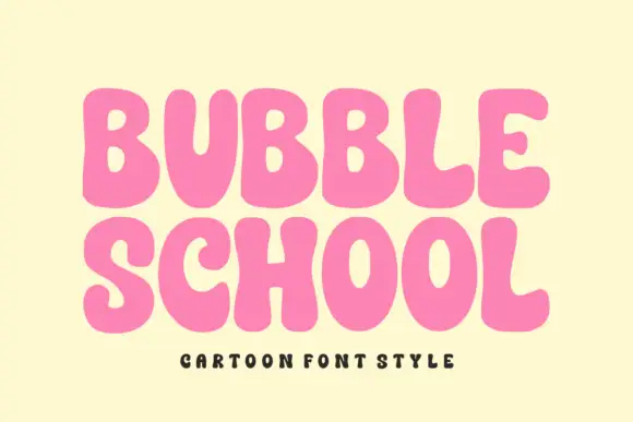
Solid bubble capitals with soft uneven contours and a heavy fill
Bubble School is a solid bubble capital alphabet in which the strokes swell, the contours wobble slightly and the fill is flat, so a word reads as thick foam letters rather than as a sticker.
Ideas for this font
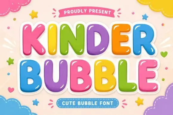
Smooth rounded bubble blocks with a glossy highlight and thick white outline
Kinder Bubble is a smooth rounded block alphabet in which every letter carries a bright highlight and a thick white outline, so a word reads as a set of glossy plastic letters.
Ideas for this font
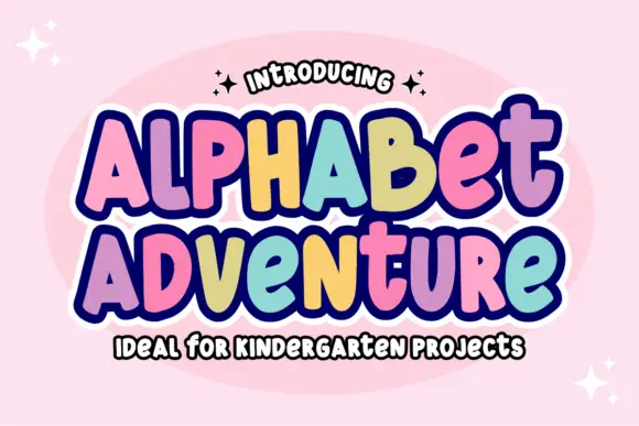
Irregular rounded blocks with a heavy outline and a rainbow of fills
Alphabet Adventure is an irregular rounded block alphabet in which the letters bounce at different heights, a heavy outline surrounds the whole phrase and each letter can take its own colour.
Ideas for this font
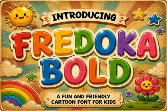
Rounded cartoon capitals in glossy colour with heavy shading
Fredoka Bold is a rounded cartoon capital alphabet in which every letter carries a glossy highlight, a darker shade along the lower edge and a thick cream outline, so a word reads as inflated toy lettering.
Ideas for this font
Same independent foundry
Allow optional Google Analytics to measure visits and catalogue actions. Your search words and notes are not included. Privacy & storage