Neutral Sans Workhorse

Bubble School + Mango Dream
Lets Bubble School own the focal silhouette while handling secondary copy, sizing and subheads cleanly.
Inspect Mango Dream specimenDisclosure: MakerFileHub may earn a commission from qualifying purchases via paid links on this page. How our links work.
Solid bubble capitals with soft uneven contours and a heavy fill
Bubble School is a solid bubble capital alphabet in which the strokes swell, the contours wobble slightly and the fill is flat, so a word reads as thick foam letters rather than as a sticker.
Paid link
Get this fontProject & layout blueprintsAt-a-glance maker compatibility
Sturdy stroke walls and open counters weed cleanly on adhesive vinyl, HTV apparel film, and cut cardstock.
Visual anatomy & craft review
The B closes two plump lobes of unequal size, the C swells past a half circle, the H keeps a low bar and the L turns with a rounded foot, all at a maximal weight with fully rounded ends and outlines that are not ruled. The wobble is the character: the edges breathe, which is what keeps the face from reading as a mechanical rounded sans at 50 pt and gives it a hand-cut character at nursery scale. Because the letters are solid and equally weighted, they can take a different colour each without losing the rhythm, as the sample shows. Counters close below 20 pt. The pale ground, the pink fill, the small caption are presentation; the display face is the two words.
Bubble · Soft · Solid
Two-font hierarchy recipes
Tested contrast partners — pairing Bubble School with grounded secondary typography.
Bubble School + Mango Dream
Lets Bubble School own the focal silhouette while handling secondary copy, sizing and subheads cleanly.
Inspect Mango Dream specimen
Bubble School + Grandeur – Elegant Classic Serif
Grounds bold display lettering with classic typographic authority on posters, badges and apparel.
Inspect Grandeur – Elegant Classic Serif specimenPractical applications
Concrete hierarchy, scale and production guidance tailored to Bubble School’s stroke geometry.
The solid rounded letters read at 45 mm and cut cleanly from card, which is what a nursery display needs in place of printed type.
Hierarchy & layout recipe
Cut a wall set: set each letter at 45 mm tall, keep 6 mm of material at every point of the contour, and leave 8 mm between letters so each reads as a separate foam shape on the wall.
Pre-production check
Card letters with a thin contour tear at the swell; check one cut letter and thicken the thinnest part before running the set.
The heavy bubble shapes read at 13 pt on a small sticker, and the flat fill keeps the word legible against a coloured bag.
Hierarchy & layout recipe
Print a 50 mm round sticker: set the word at 13 pt, keep 5 mm inside the die so the rounded swell is not clipped, and check that the counter of the B still opens at that size.
Pre-production check
Small bubble counters under 1 mm close up on a digital press; check the printed sticker and raise the type size rather than thinning the strokes.
The friendly weight keeps a worksheet header warm at 22 pt, and the even fill survives a photocopy where a textured face would break up.
Hierarchy & layout recipe
Print an A4 worksheet: set the header at 22 pt across the top margin, set the tasks in an 11 pt rounded sans at 15 pt leading, and keep 10 mm below the header so the swells do not crowd the first line.
Pre-production check
Photocopiers close rounded counters; check a copy at full size and open the a and e if the letters begin to bridge.
Technical & licence verification
Confirm included OTF/TTF/WOFF formats, full glyph tables and licence coverage on the live store page before batch production.
Closest visual alternatives
Matched across letterform anatomy, stroke behaviour and craft applications.
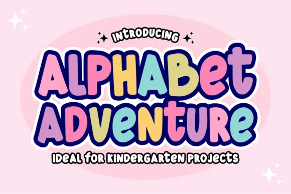
Irregular rounded blocks with a heavy outline and a rainbow of fills
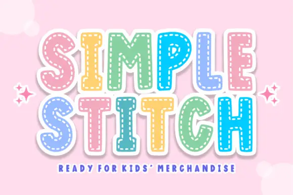
Alphabet Adventure is an irregular rounded block alphabet in which the letters bounce at different heights, a heavy outline surrounds the whole phrase and each letter can take its own colour.
Ideas for this font
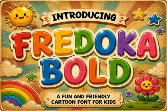
Rounded cartoon capitals in glossy colour with heavy shading
Fredoka Bold is a rounded cartoon capital alphabet in which every letter carries a glossy highlight, a darker shade along the lower edge and a thick cream outline, so a word reads as inflated toy lettering.
Ideas for this font
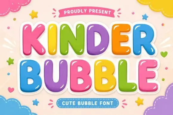
Smooth rounded bubble blocks with a glossy highlight and thick white outline
Kinder Bubble is a smooth rounded block alphabet in which every letter carries a bright highlight and a thick white outline, so a word reads as a set of glossy plastic letters.
Ideas for this font
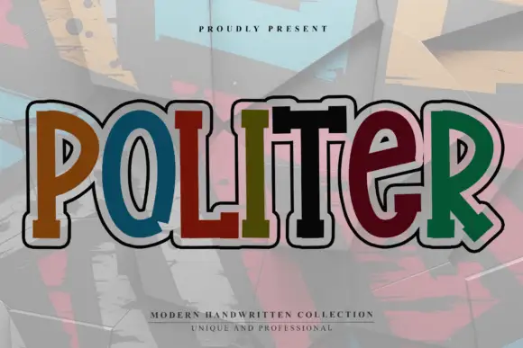
Chunky rounded display with a heavy outer keyline
Politer is a chunky rounded display drawn with a thick cream keyline and a thin black inner line: uneven hand-made widths, rounded slab terminals, a wide O and a T whose arms overhang, shown with each letter in a different flat colour.
Ideas for this font
Same independent foundry
Allow optional Google Analytics to measure visits and catalogue actions. Your search words and notes are not included. Privacy & storage