Editorial Serif Anchor

Nothing + Papillon Serif – Elegant Modern Luxury
Anchors Nothing's fluid strokes with crisp Roman proportions on wedding suites, headers and packaging.
Inspect Papillon Serif – Elegant Modern Luxury specimenDisclosure: MakerFileHub may earn a commission from qualifying purchases via paid links on this page. How our links work.
Tall compact display capitals
Nothing is a set of tall condensed hand-drawn capitals, set in white over a dark landscape: narrow stems, short crossbars and a few letters that step out of the line.
Paid link
Get this fontProject & layout blueprintsAt-a-glance maker compatibility
Weld or Unite overlapping script joins into one continuous vector path before sending to the blade.
Visual anatomy & craft review
The word fills the card in white capitals, and each letter is a narrow rectangle of strokes: the N is drawn as two uprights and a diagonal, the O closes into a tall loop that leans slightly, the H carries its crossbar high and the G finishes with a flat shelf instead of a spur. Behind the capitals a fine script writes the same word at a much smaller size, which is the only colour in the composition, and the ground is a dark photograph of water with a single small boat. Two captions above and below are set in the same narrow hand. The face is a tall hand-drawn display for posters, covers and merchandise: it is legible at a distance, it wants a large size, and its narrow width is what lets a long word fit a portrait format.
Tall compact hand-drawn capitals
Two-font hierarchy recipes
Tested contrast partners — pairing Nothing with grounded secondary typography.
Nothing + Papillon Serif – Elegant Modern Luxury
Anchors Nothing's fluid strokes with crisp Roman proportions on wedding suites, headers and packaging.
Inspect Papillon Serif – Elegant Modern Luxury specimen
Nothing + Montreal
Keeps small-scale dates, URLs, nutrition facts and care instructions crisp and legible below script titles.
Inspect Montreal specimenPractical applications
Concrete hierarchy, scale and production guidance tailored to Nothing’s stroke geometry.
A tall narrow word fits a portrait menu cover, and the hand-drawn strokes suit a celebration held outdoors rather than in a formal hall.
Hierarchy & layout recipe
Print a 130 by 210 mm menu: set the heading at 50 pt on one row, keep 22 mm of clear ground beneath before the courses at 9 pt, and hold 16 mm of margin on both sides.
Pre-production check
Narrow strokes can look spindly on a large format; print one menu at the final size and check the weight before the set.
A tall neutral wordmark lets the work behind it do the talking, and the narrow letters give a plain portfolio a recognisable cover.
Hierarchy & layout recipe
Print a 210 by 297 mm cover: set the studio name at 110 pt on one row, keep 30 mm of clear ground beneath before the contact line at 11 pt, and hold 20 mm of margin on all sides.
Pre-production check
A hand-drawn wordmark scanned over a photograph loses its edges; print one cover and check the letterforms stay crisp before the run.
A tall condensed capital set works over photography, and the hand-drawn irregularity keeps a travel opener from looking like an advertisement.
Hierarchy & layout recipe
Print a 230 by 300 mm opener: set the title at 100 pt on one row, keep 26 mm of clear ground beneath before the standfirst at 11 pt, and hold 20 mm of margin so the image can bleed one side.
Pre-production check
White lettering over a light sky loses contrast; print one opener and check the title separates from the photograph before the issue.
Technical & licence verification
Confirm included OTF/TTF/WOFF formats, full glyph tables and licence coverage on the live store page before batch production.
Closest visual alternatives
Matched across letterform anatomy, stroke behaviour and craft applications.
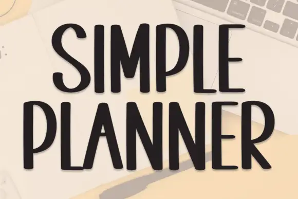
Tall condensed handwriting with light shadow
Simple Planner is a tall condensed hand-drawn display in near-black on a pale desk: narrow letters with blunt ends, a small light shadow and a level rhythm, drawn as two uppercase rows.
Ideas for this font
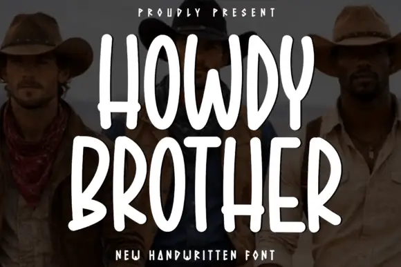
Tall condensed rounded capitals, all caps
Howdy Brother is an all-caps handwriting drawn tall and narrow with thick even strokes and rounded corners, so two stacked words fill a square frame without losing the space between them.
Ideas for this font
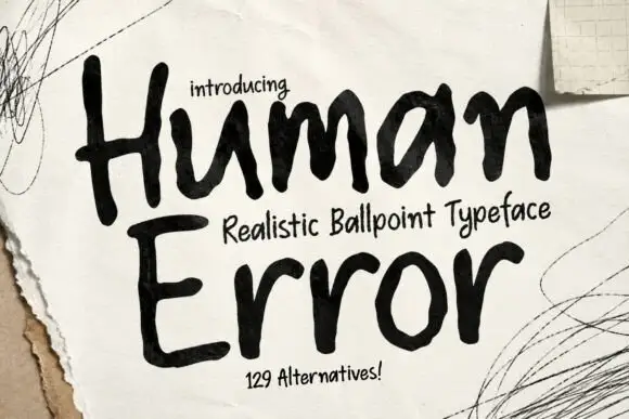
Thick irregular ballpoint capitals with a mixed-case lowercase
Human Error draws its capitals with a thick ballpoint, letting the stroke swell and thin at random and setting the two-line title on a hand-drawn baseline that tilts and settles instead of ruling flat.
Ideas for this font
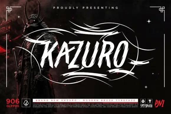
Sharp slanted brush capitals with cut terminals and a wide flourish frame
Kazuro is a sharp slanted brush alphabet in capitals, with strokes that end in hard cut angles and a flourish frame of thin sweeping lines drawn around the word.
Ideas for this font
Same independent foundry
Allow optional Google Analytics to measure visits and catalogue actions. Your search words and notes are not included. Privacy & storage