Modern Grotesque Body

Railla Sore + Memoir Slang
Creates crisp high-hierarchy contrast beneath Railla Sore headlines across menus, websites and labels.
Inspect Memoir Slang specimenDisclosure: MakerFileHub may earn a commission from qualifying purchases via paid links on this page. How our links work.
Hand-drawn serif with soft edges
Railla Sore is a hand-drawn serif in cream over a sea photograph: rounded slab-like serifs with soft, slightly broken edges, moderate contrast, and letters that vary a little in width, so the word reads as lettered by hand rather than set from a file.
Paid link
Get this fontProject & layout blueprintsAt-a-glance maker compatibility
Sturdy stroke walls and open counters weed cleanly on adhesive vinyl, HTV apparel film, and cut cardstock.
Visual anatomy & craft review
The two words are stacked and the drawing is a serif that has been drawn rather than constructed: the serifs are thick and rounded at the corners, the stems carry a slight wobble, and the joins are soft, which gives the face a friendly rather than formal voice. Contrast is moderate, so the word holds at small sizes as well as at display, and the letter widths drift enough to feel written without disrupting the baseline. The Q and the R carry the most character, with rounded bowls and a leg that curves rather than snaps. The ground is a photograph of the sea viewed through a rounded window frame, and the cream type sits on the darker water, with a small round badge and a caption in a tracked sans beneath.
Serif, hand-drawn, warm, coastal
Two-font hierarchy recipes
Tested contrast partners — pairing Railla Sore with grounded secondary typography.
Railla Sore + Memoir Slang
Creates crisp high-hierarchy contrast beneath Railla Sore headlines across menus, websites and labels.
Inspect Memoir Slang specimen
Railla Sore + I Heart You
Adds a warm human signature touch for 1-to-3-word callouts without competing against structured serif capitals.
Inspect I Heart You specimenPractical applications
Concrete hierarchy, scale and production guidance tailored to Railla Sore’s stroke geometry.
A hand-drawn serif reads as painted signage, which suits a coastal cafe, and the moderate contrast keeps the mark legible on a menu board and a cup.
Hierarchy & layout recipe
Set the mark at 34 pt for the board, 15 pt for the cup and 80 mm wide for the window. Keep the mark one colour and leave clear space equal to half the cap height, and pair it with a plain sans for prices.
Pre-production check
Check the 15 pt cup version, where the soft serifs can fill in; thicken the joins for that size. Confirm the window decal cuts cleanly at 80 mm and that the mark holds on a dark green fascia.
A hand-drawn serif gives a travel feature warmth without the formality of a didone, and the moderate weight holds over a photograph where a hairline serif would vanish.
Hierarchy & layout recipe
Set the title at 90 pt across 180 mm over a sea photograph, the standfirst in a 10 pt serif beneath, and a 0.5 pt rule at the foot. Keep the title on the darker band of the image so the contrast stays above 4.5:1.
Pre-production check
Check the title at 90 pt over the image, where the soft edges can blur into the water's texture; move the type rather than adding a scrim. Confirm the 10 pt standfirst reads at arm's length and that the rule does not cross a descender.
A hand-lettered serif looks painted on wood, which is what a beach hut sign needs, and the moderate contrast survives sun-bleached timber.
Hierarchy & layout recipe
Paint a 500 by 300 mm board: the name at 90 mm cap height, the opening times in a 22 mm sans beneath, and a 4 mm hand-drawn rule between. Keep 25 mm between the display and the rule so the descenders stay clear.
Pre-production check
Check the board in direct sun, where cream on bare timber loses contrast; use a darker ground or an outline. Confirm the 22 mm times read from three metres and that the rule sits level beneath the baseline.
Technical & licence verification
Confirm included OTF/TTF/WOFF formats, full glyph tables and licence coverage on the live store page before batch production.
Closest visual alternatives
Matched across letterform anatomy, stroke behaviour and craft applications.
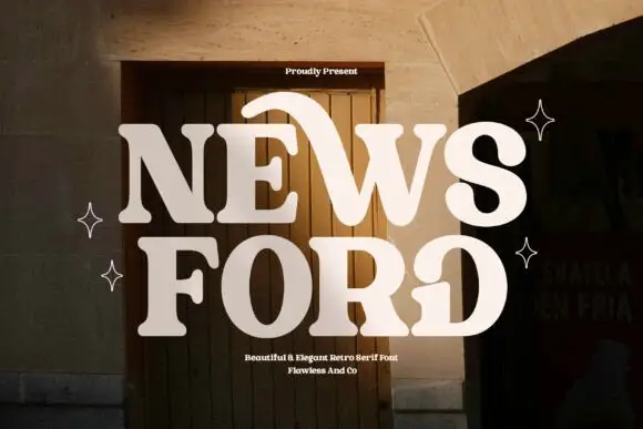
Retro serif with sweeping curved details
News Ford is a retro serif in cream over a warm doorway photograph: fat letters with a moderate contrast, curved details that sweep out of the W and the O, and rounded serifs, with small capital lines above and below.
Ideas for this font

Elegant feminine serif
Olivia Serif is an elegant serif in black on warm cream: high contrast, bracketed serifs, a large x-height and round bowls, set in title case on one line with a smaller serif line beneath, two tracked caps lines under that, and a fine ornamental frame with fleurons at the corners.
Ideas for this font

Fine serif title with large upper and lower loops
Amilea shows pale yellow high-contrast letters with fine tapered serifs and broad rounded lowercase over a dark portrait, where a thin loop curves below the capital A and a tall upper flourish crosses the central ascender before sweeping right.

Modern combination serif with italic
Things is a modern serif in blue on white: moderate-high contrast, a wide f with an overhanging arm, a g whose descender loops fully closed, and tall ascenders, presented with a note that the family includes an italic and a paragraph of small text.
Ideas for this font
Same independent foundry
Allow optional Google Analytics to measure visits and catalogue actions. Your search words and notes are not included. Privacy & storage