Neutral Sans Workhorse

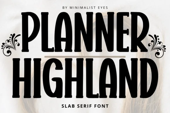
Bold Kiddo + Miniplate
Lets Bold Kiddo own the focal silhouette while handling secondary copy, sizing and subheads cleanly.
Inspect Miniplate specimenDisclosure: MakerFileHub may earn a commission from qualifying purchases via paid links on this page. How our links work.
Heavy rounded sans capitals with a hand-drawn bounce
Bold Kiddo is a heavy rounded sans in capitals, drawn with a slight hand-cut bounce and squeezed so tightly that the two words read as one solid block of letters.
Paid link
Get this fontProject & layout blueprintsAt-a-glance maker compatibility
Sturdy stroke walls and open counters weed cleanly on adhesive vinyl, HTV apparel film, and cut cardstock.
Visual anatomy & craft review
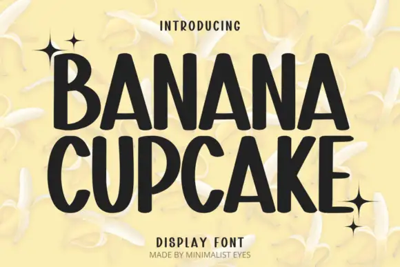
The B, O and D are built on the same wide curve, the counters are cut small and rounded, and the letter spacing is tight enough that the words nearly touch at the joins while each letter keeps a distinct outline. The bounce is small but deliberate: the D and the O sit at slightly different heights, the K's leg kicks out, and the second word repeats the same step so the block looks hand-set rather than ruled. Weight is heavy and even with rounded terminals and no tapering, which suits both cutting and printing at large sizes. The small stars and four-point sparkles drawn around the block, the tracked subtitle and the pale cream ground are the cover's decoration, and the sparkles are drawn marks rather than glyphs from the alphabet.
Bold · Rounded · Playful
Two-font hierarchy recipes
Tested contrast partners — pairing Bold Kiddo with grounded secondary typography.
Bold Kiddo + Miniplate
Lets Bold Kiddo own the focal silhouette while handling secondary copy, sizing and subheads cleanly.
Inspect Miniplate specimen
Bold Kiddo + Augler
Grounds bold display lettering with classic typographic authority on posters, badges and apparel.
Inspect Augler specimenPractical applications
Concrete hierarchy, scale and production guidance tailored to Bold Kiddo’s stroke geometry.
A heavy rounded block reads instantly at a size a child can recognise, and its even strokes print solidly on the cheap card stock that a class-set invitation usually uses.
Hierarchy & layout recipe
Set the name at 60 mm wide on an A6 card, keep the date and address in a plain sans at 9 pt, and use no more than three of the drawn sparkles so the small card stays legible.
Pre-production check
Small counters in the O and D can fill on a cheap digital press; proof the card at 100 percent before printing the class set.
Letters this heavy stay visible from the back of a classroom where a normal headline face would need to be set twice as large, which saves wall space on a crowded display board.
Hierarchy & layout recipe
Print the header at 200 mm wide on an A1 sheet, keep the subheading in a plain sans at 40 mm, and leave 50 mm between the header and the first row of work on display.
Pre-production check
Photocopied posters lose the rounded terminals first; check one copy on the school machine before the run, since a heavy face can print as a solid block.
A bold rounded face reads from a distance at a park entrance and matches the tone of a play scheme without looking institutional, which matters when the sign is competing with trees and sunlight.
Hierarchy & layout recipe
Set the scheme name at 300 mm wide on a 1.2 m board, keep the times in a plain face at 60 mm, and hold 100 mm of plain board at the foot so the sign clears the grass line.
Pre-production check
Outdoor boards are read in glare; check the sign in daylight with a matte finish rather than gloss, because the rounded shapes reflect and lose their edges.
Technical & licence verification
Confirm included OTF/TTF/WOFF formats, full glyph tables and licence coverage on the live store page before batch production.
Closest visual alternatives
Matched across letterform anatomy, stroke behaviour and craft applications.
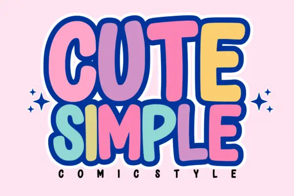
Tall rounded comic blocks with bubble outlines and per-letter colour
Cute Simple is a tall rounded comic alphabet in which the blocks stack tightly, the outlines bubble outward and each letter can take its own colour without breaking the composition.
Ideas for this font
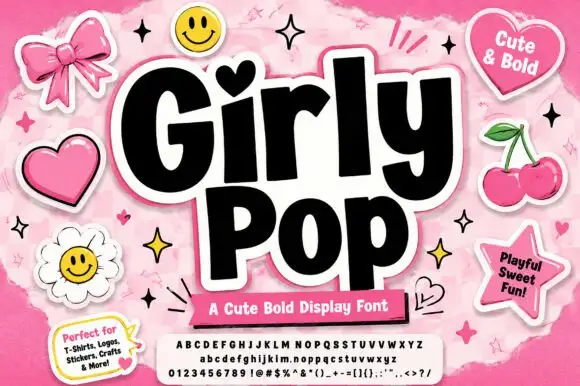
Heavy playful sans with a heart dot and slightly tilted letter bodies
Girly Pop is a heavy playful sans in which the letters stand at slightly different tilts, the i carries a heart dot and the weight stays maximal from first letter to last.
Ideas for this font
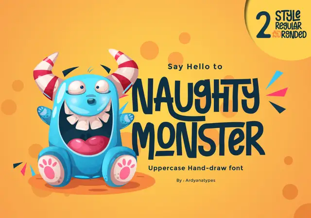
Tall eccentric cartoon capitals
Naughty Monster stretches cartoon letterforms into tall narrow capitals whose cross-strokes run out past their neighbouring letters and whose tops refuse to line up.
Ideas for this font
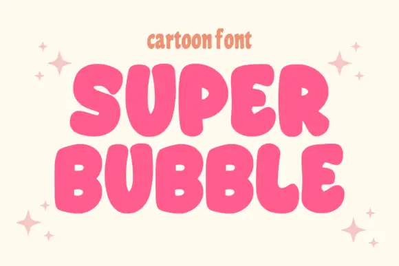
Heavy rounded cartoon capitals with small counters and uneven widths
Super Bubble is a heavy rounded cartoon display in which the capitals inflate, the counters shrink to small openings and the widths vary, so two stacked words read as gently over-full balloons.
Ideas for this font
Same independent foundry
Allow optional Google Analytics to measure visits and catalogue actions. Your search words and notes are not included. Privacy & storage