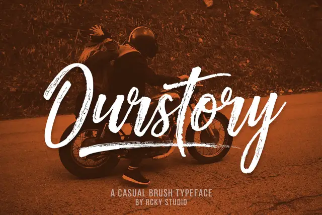
High-Contrast Display Serif

Kind Heart Font Duo + Bulgary
Pairs sculptural editorial warmth with Kind Heart Font Duo's clean modern geometry.
Inspect Bulgary specimenDisclosure: MakerFileHub may earn a commission from qualifying purchases via paid links on this page. How our links work.
Rough brush title with a handwritten pair
Kind Heart Font Duo pairs a rough-edged brush title with a smaller, calmer handwritten companion, both of them cut with the same angled flat tool.
Paid link
Get this fontProject & layout blueprintsAt-a-glance maker compatibility
Sturdy stroke walls and open counters weed cleanly on adhesive vinyl, HTV apparel film, and cut cardstock.
Visual anatomy & craft review
The upper word is drawn with a wide flat brush: edges break into dry streaks, thick downstrokes turn almost solid, and the joins between letters carry visible bristle marks. The lower word sits smaller and calmer, with a finer tool and an even weight, so the hierarchy comes from texture as much as from size. Cap heights differ between the two members, which is deliberate in a duo, and both lean slightly right. The pencils, the wooden figure and the dark board behind the card are studio photography, the heart mark after the title is a dingbat-style extra, and the tracked credit line at the bottom belongs to a separate label face.
Rough · Brushed · Warm
Two-font hierarchy recipes
Tested contrast partners — pairing Kind Heart Font Duo with grounded secondary typography.
Kind Heart Font Duo + Bulgary
Pairs sculptural editorial warmth with Kind Heart Font Duo's clean modern geometry.
Inspect Bulgary specimen
Kind Heart Font Duo + I Heart You
Introduces organic movement on pull-quotes, signatures and gift tags.
Inspect I Heart You specimenPractical applications
Concrete hierarchy, scale and production guidance tailored to Kind Heart Font Duo’s stroke geometry.
Rough brush texture suits hand-painted boards far better than a clean display face, and the smaller companion can carry the practical line underneath it.
Hierarchy & layout recipe
Paint the title at 8-inch height on a 90 cm board, set the companion at 30 percent of that height beneath, and keep 6 cm of clear board around the dry streaks so they read as texture.
Pre-production check
Dry-brush edges break up when scaled down; keep the title above five inches or use the cleaner companion instead.
A brushed title reads warmly against timber, which is the usual setting for an outdoor ceremony sign at a farm or garden venue.
Hierarchy & layout recipe
Set the greeting at 4-inch height on an A1 board, place the names in the companion face at 30 percent of that height, and keep 10 cm from the lowest tail to the board edge.
Pre-production check
Outdoor light flattens texture, so check the sign in daylight before the event rather than in a workshop.
A rough brush marks a card as handmade, which suits a personal note far more than a polished script or a clean serif would.
Hierarchy & layout recipe
Print the title at 28 pt on a 105 by 148 mm card, keep the companion quote at 11 pt, and leave 8 mm between the border and the roughest edge of the stroke.
Pre-production check
Letterpress deepens rough edges but also fills fine detail; proof before committing the plate.
Technical & licence verification
Confirm included OTF/TTF/WOFF formats, full glyph tables and licence coverage on the live store page before batch production.
Closest visual alternatives
Matched across letterform anatomy, stroke behaviour and craft applications.
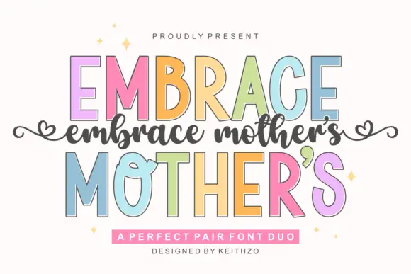
Fine slanted script with long flowing joins
Embrace Mothers is a fine slanted script in which the joins are as long as the letters they connect, so a phrase reads as one continuous flowing line with a light, even pressure throughout.
Ideas for this font
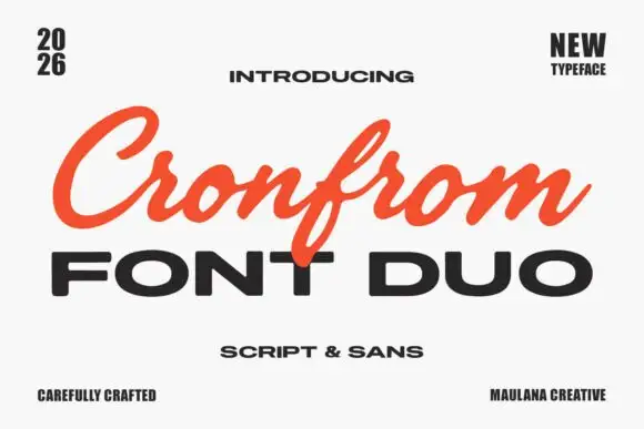
Slanted retro script paired with a wide bold sans in capitals
Cronfrom pairs a slanted retro script with a wide bold sans, so one lockup can carry a handwritten sign name and a hard-edged second line beneath it.
Ideas for this font
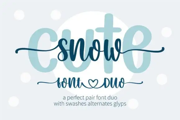
Heavy print and thin swash script
Snow Cute Duo is a pairing in icy blue: a very heavy rounded capital face drawn as a pale ghost, and a thin swash script written across it, with curls and a heart under the caption line.
Ideas for this font
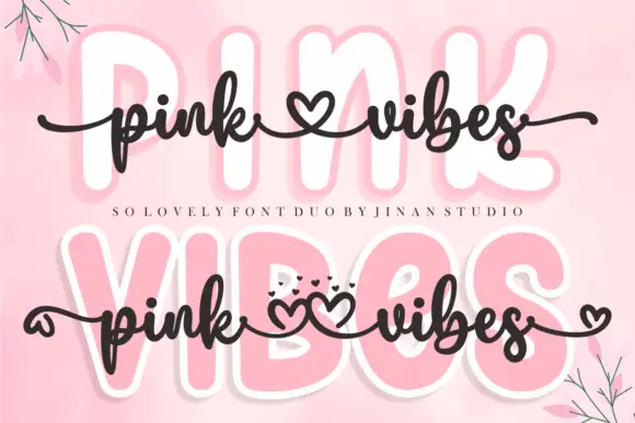
Duo
Pink Vibes Duo pairs two fat rounded capital rows, drawn in white with a soft pink glow, with a small dark connected script that runs across them, and in the lower sample the script joins the words with heart shapes instead of a plain connector stroke.
Ideas for this font
Same independent foundry
Allow optional Google Analytics to measure visits and catalogue actions. Your search words and notes are not included. Privacy & storage