High-Contrast Display Serif

Peace and Love + Aureline
Pairs sculptural editorial warmth with Peace and Love's clean modern geometry.
Inspect Aureline specimenDisclosure: MakerFileHub may earn a commission from qualifying purchases via paid links on this page. How our links work.
Bulbous retro display duo
Peace and Love is a duo in pink, mustard and maroon on a pastel ground: bulbous retro letters with heavy round bowls and thin joins, an ampersand drawn as a large open spiral, and a small tracked line beneath naming the pair, with four-point sparkles scattered across the sheet.
Paid link
Get this fontProject & layout blueprintsAt-a-glance maker compatibility
Sturdy stroke walls and open counters weed cleanly on adhesive vinyl, HTV apparel film, and cut cardstock.
Visual anatomy & craft review
The plate sets the two words in two colours with the ampersand between them, which is the arrangement the duo is sold for: the eye reads the phrase as one composition, and the buyer can see how the two weights behave together. The drawing is a bulbous retro style with round bowls and thin joins, so the letters look inflated rather than drawn, and the ampersand is drawn larger than the letters, which is a deliberate break in the hierarchy. The tracked line beneath names the product in a plain face, and the sparkles are period furniture. Because the bowls are heavy, the face works at display sizes and on a poster or a shirt, and the pastel ground keeps the three colours readable. The palette is warm and limited, which suits the period.
Duo, retro, bulbous, playful
Two-font hierarchy recipes
Tested contrast partners — pairing Peace and Love with grounded secondary typography.
Peace and Love + Aureline
Pairs sculptural editorial warmth with Peace and Love's clean modern geometry.
Inspect Aureline specimen
Peace and Love + Abigail
Introduces organic movement on pull-quotes, signatures and gift tags.
Inspect Abigail specimenPractical applications
Concrete hierarchy, scale and production guidance tailored to Peace and Love’s stroke geometry.
A bulbous retro duo sets the decade in one line, and the two colours let a small print run look like a screen print without extra passes.
Hierarchy & layout recipe
A3 poster: the slogan at 70 mm cap height, the date in a 20 mm retro face, and the address at 9 mm. Keep 25 mm margins and print two colours on a pastel stock.
Pre-production check
Check the poster at four metres, where the thin joins can disappear; keep them above 1.5 mm. Confirm the 9 mm address reads at arm's length and that the ampersand stays open.
A retro duo gives a themed wedding a period sign, and the two colours read as painted board rather than as printed paper.
Hierarchy & layout recipe
A1 board: the greeting at 90 mm cap height, the names at 55 mm, and the date at 22 mm. Keep 35 mm margins and paint two colours on a light board with a matte varnish.
Pre-production check
Check the board at five metres, where the ampersand can read as a blob; keep the spiral open above 10 mm. Confirm the 22 mm date reads from the door and that the varnish dulls evenly.
A bulbous retro pair reads as a sweet brand, and the two weights let one small label carry both a product name and a flavour note.
Hierarchy & layout recipe
Print a 65 by 65 mm label: the brand at 13 pt, the flavour at 8 pt, and the weight at 6 pt. Keep 4 mm inside the die and print three colours on a white stock.
Pre-production check
Check the 13 pt brand on a jar, where the outer letters distort; reduce the width. Confirm the 6 pt weight reads on the shelf and that the label survives a chilled cabinet.
Technical & licence verification
Confirm included OTF/TTF/WOFF formats, full glyph tables and licence coverage on the live store page before batch production.
Closest visual alternatives
Matched across letterform anatomy, stroke behaviour and craft applications.

Heavy retro script paired with a rounded block sans in two sizes
Tropical Sunlight is a duo of a heavy retro script with broad loops and a rounded block sans, shown stacked so the script carries the name and the sans shouts the second line.
Ideas for this font
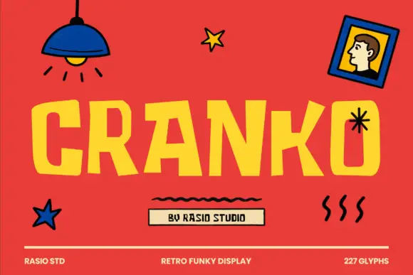
Retro funky display with uneven widths and bouncy caps
Cranko is a retro funky display alphabet in which the caps bounce on an uneven baseline, the widths vary letter to letter and the counters stay wide, so a single word reads as hand-painted lettering on a market stall.
Ideas for this font
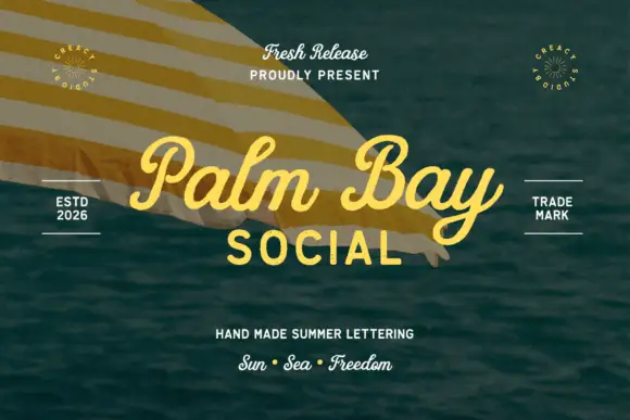
Summer script with an upright block companion
Palm Bay Social is a duo on a sunlit water photograph: a casual looped script in golden yellow for the place name and a plain uppercase block line beneath it, with small tracked proofs and stamps around the edges.
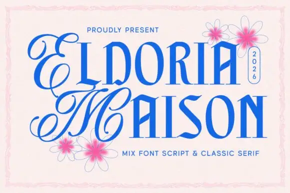
Looping script initials paired with narrow angular capitals
Eldoria Maison pairs looping script initials with narrow angular capitals, so a word can open with an ornamental monogram and continue in a tall condensed face that holds the rest of the line.
Ideas for this font
Same independent foundry
Allow optional Google Analytics to measure visits and catalogue actions. Your search words and notes are not included. Privacy & storage