Neutral Sans Workhorse

Cranko + Cultivo
Lets Cranko own the focal silhouette while handling secondary copy, sizing and subheads cleanly.
Inspect Cultivo specimenDisclosure: MakerFileHub may earn a commission from qualifying purchases via paid links on this page. How our links work.
Retro funky display with uneven widths and bouncy caps
Cranko is a retro funky display alphabet in which the caps bounce on an uneven baseline, the widths vary letter to letter and the counters stay wide, so a single word reads as hand-painted lettering on a market stall.
Paid link
Get this fontProject & layout blueprintsAt-a-glance maker compatibility
Sturdy stroke walls and open counters weed cleanly on adhesive vinyl, HTV apparel film, and cut cardstock.
Visual anatomy & craft review
The C swells a wide crescent, the R flattens a short leg, the A opens a heavy apex, the N keeps one wide diagonal and the K splays two uneven arms, all at a poster weight with rounded corners and a rhythm that changes with every letter. The uneven width is the character: no two letters share a measure, which is why the sample sets one word at full width with small doodles around it. Because the counters stay open, the face reads from 30 pt and prints in one flat ink; at small sizes the bounce turns into noise. The red ground, the lamp, the star, the framed portrait and the studio tag are presentation; the yellow display word is the face.
Retro · Funky · Bouncy
Two-font hierarchy recipes
Tested contrast partners — pairing Cranko with grounded secondary typography.
Cranko + Cultivo
Lets Cranko own the focal silhouette while handling secondary copy, sizing and subheads cleanly.
Inspect Cultivo specimen
Cranko + Askinо
Grounds bold display lettering with classic typographic authority on posters, badges and apparel.
Inspect Askinо specimenPractical applications
Concrete hierarchy, scale and production guidance tailored to Cranko’s stroke geometry.
The uneven bounce reads as hand painting, and the wide counters keep a short stall name legible at 80 mm on a board across an aisle.
Hierarchy & layout recipe
Print a 600 by 300 mm board: set the stall name at 80 mm in one flat ink, keep 35 mm of border all round, and set the price lines in a 20 pt rounded sans beneath with 25 mm of clearance.
Pre-production check
An uneven baseline set above a straight price list looks crooked; check the board and align the price block to the optical centre of the word rather than its lowest letter.
The uneven bounce gives a funky party card its energy, and the open counters still read at 34 pt on a matte card in one colour.
Hierarchy & layout recipe
Print an A6 card: set the greeting at 34 pt, set the date in a 10 pt rounded sans beneath, and keep 12 mm of margin so the widest letter stays clear of the trim.
Pre-production check
The widest letter in a bouncy set decides the margin; check the printed card and centre on the whole word rather than on the average width.
The retro weight reads from the fair gate, and the uneven rhythm suits a hand-painted harvest poster at 110 mm in one ink.
Hierarchy & layout recipe
Print an A2 poster: set the headline at 110 mm, set the opening times in a 22 pt rounded sans in the lower band, and keep 30 mm of clear ground between the two blocks.
Pre-production check
A bouncy headline can crowd the details beneath it; check the poster at two metres and open the gap rather than reducing the word.
Technical & licence verification
Confirm included OTF/TTF/WOFF formats, full glyph tables and licence coverage on the live store page before batch production.
Closest visual alternatives
Matched across letterform anatomy, stroke behaviour and craft applications.
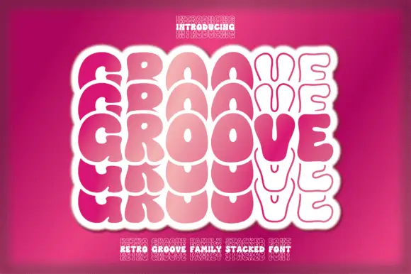
Textured tall slab
Oldstone is a textured slab in off-white on a dark green ground: tall condensed slabs with heavy bracketed serifs, a worn surface that chips the edges and fills the counters at random, offered in regular and stamp, with small flanking notes and a bordered strip beneath, so the plate reads as an aged print.
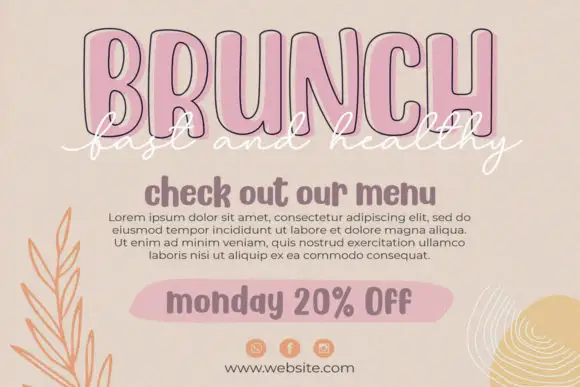
Condensed outline capitals with a script overlay
Twinkling Stars is a layered set on a beige page: tall condensed outline capitals in pink for a headline, a white script written across them, a rounded sans for a subhead and a tinted pill for a note, laid out as a social post.
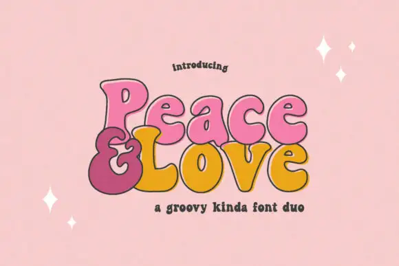
Bulbous retro display duo
Peace and Love is a duo in pink, mustard and maroon on a pastel ground: bulbous retro letters with heavy round bowls and thin joins, an ampersand drawn as a large open spiral, and a small tracked line beneath naming the pair, with four-point sparkles scattered across the sheet.
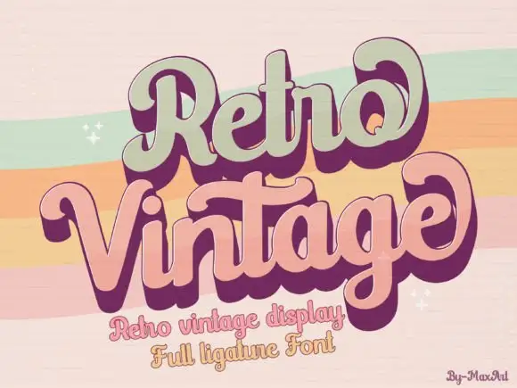
Groovy layered display with heavy offset
Retro Vintage is a groovy display in sage green and dusty pink with a deep plum offset: fat rounded letters that lean and swell, a solid shadow layer that steps down and to the right, and ligatures that fuse adjoining letters into a single shape.
Ideas for this font
Same independent foundry
Allow optional Google Analytics to measure visits and catalogue actions. Your search words and notes are not included. Privacy & storage



