High-Contrast Display Serif

Handmade Wanderlust Duo + Augler
Pairs sculptural editorial warmth with Handmade Wanderlust Duo's clean modern geometry.
Inspect Augler specimenDisclosure: MakerFileHub may earn a commission from qualifying purchases via paid links on this page. How our links work.
Spaced sans capitals shown in thick white and thin muted-pink lines
Handmade Wanderlust Duo shows two centred uppercase words on a soft pink background, where Handmade is white and noticeably heavier while Wanderlust beneath is thin, muted pink and more widely spaced, with slightly uneven edges and broad A and M diagonals.
Paid link
Get this fontProject & layout blueprintsAt-a-glance maker compatibility
Sturdy stroke walls and open counters weed cleanly on adhesive vinyl, HTV apparel film, and cut cardstock.
Visual anatomy & craft review
The weights differ strongly, the tracking widens on the lighter line, the edges stay a little uneven and the diagonals open wide. That weight-and-tracking contrast is the character: one line states and the other breathes, which is why the sample centres both over a flat field. The low contrast of the presentation limits inspection, so check the contours at your own size, keep 28 pt and avoid setting the pair at equal weight. The thin line is the one that disappears: it drops out on uncoated stock and at 18 pt, so keep 28 pt and put the light line on a smooth sheet rather than the dark one.
Spaced sans capitals shown in thick white and thin muted-pink lines
Two-font hierarchy recipes
Tested contrast partners — pairing Handmade Wanderlust Duo with grounded secondary typography.
Handmade Wanderlust Duo + Augler
Pairs sculptural editorial warmth with Handmade Wanderlust Duo's clean modern geometry.
Inspect Augler specimen
Handmade Wanderlust Duo + Welcome
Introduces organic movement on pull-quotes, signatures and gift tags.
Inspect Welcome specimenPractical applications
Concrete hierarchy, scale and production guidance tailored to Handmade Wanderlust Duo’s stroke geometry.
The spaced caps give a studio a calm mark, and the two weights hold a two-word name at 28 pt on a card, where the tracking keeps the light line airy.
Hierarchy & layout recipe
Print an 85 by 55 mm card: set the heavy word at 28 pt, set the light word at 24 pt with 6 mm of tracking beneath, and keep 16 mm of clear ground before the address.
Pre-production check
The lighter line printed at 18 pt fades on uncoated card; check the proof and hold it at 22 pt or above.
The pairing suits a contemporary invitation, and the weight contrast holds two names at 30 pt and 26 pt on heavy stock, where the wide tracking reads as calm.
Hierarchy & layout recipe
Print a 105 by 148 mm card: set the first name at 30 pt in the heavy cut, set the second at 26 pt in the light cut beneath with 20 mm of clear ground, and keep 18 mm of margin.
Pre-production check
Two spaced rows at similar size flatten the contrast; check the card and keep a clear weight difference.
The duo gives a small label hierarchy, and the heavy cut holds the brand at 22 pt on a 50 mm panel, where the light line carries the scent.
Hierarchy & layout recipe
Print a 50 by 60 mm label: set the brand at 22 pt, set the scent at 18 pt in the light cut beneath with 10 mm of clear ground, and keep 5 mm of border each side.
Pre-production check
Wide tracking on a narrow label pushes the words to the edges; check the artwork and keep 4 mm.
Technical & licence verification
Confirm included OTF/TTF/WOFF formats, full glyph tables and licence coverage on the live store page before batch production.
Closest visual alternatives
Matched across letterform anatomy, stroke behaviour and craft applications.
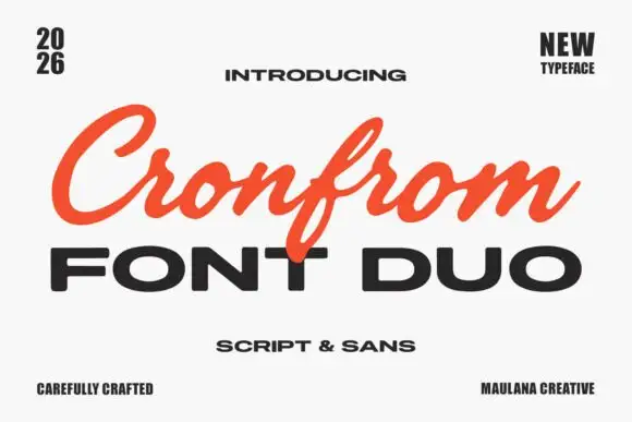
Slanted retro script paired with a wide bold sans in capitals
Cronfrom pairs a slanted retro script with a wide bold sans, so one lockup can carry a handwritten sign name and a hard-edged second line beneath it.
Ideas for this font
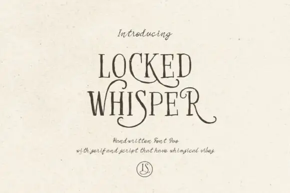
Ornate serif capitals with a whiskered script
Locked Whisper is a duo on speckled cream: ornate display capitals with thin strokes, curled serifs and long whiskers, and a fine script beneath whose letters carry the same curls at a smaller scale.
Ideas for this font
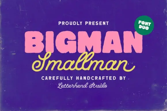
Heavy rounded block capitals paired with a slanted monoline signature script
Bigman Smallman pairs a very heavy rounded capital alphabet with a slanted monoline signature script, so the pair reads as one loud word and one quiet signed line beneath it.
Ideas for this font
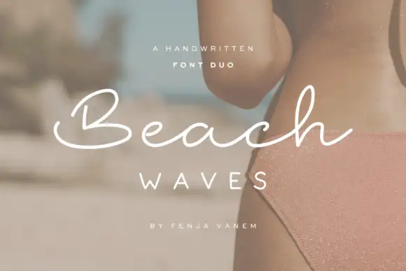
Duo pairing a brushed monoline signature with wide-tracked capitals
Beach Waves is a two-cut family in which a brushed monoline script writes one word and a wide-tracked sans sets the other, so a design gets a relaxed written line and a calm structural line from one purchase.
Ideas for this font
Same independent foundry
Allow optional Google Analytics to measure visits and catalogue actions. Your search words and notes are not included. Privacy & storage