Neutral Sans Workhorse

Mozathia + Hermano
Lets Mozathia own the focal silhouette while handling secondary copy, sizing and subheads cleanly.
Inspect Hermano specimenDisclosure: MakerFileHub may earn a commission from qualifying purchases via paid links on this page. How our links work.
High-contrast serif with botanical flourishes
Mozathia is a high-contrast serif display in cream over a dark floral still life: mixed case with curling botanical flourishes that spring from the first and last letters, fine joins, a swollen stroke through the middle and short serifs, set as one word with a line above and two lines beneath.
Paid link
Get this fontProject & layout blueprintsAt-a-glance maker compatibility
Sturdy stroke walls and open counters weed cleanly on adhesive vinyl, HTV apparel film, and cut cardstock.
Visual anatomy & craft review
The plate is staged over dark red blooms, which gives the cream a rich surround and shows that a fine face holds against a detailed ground. The drawing is a high-contrast serif with flourishes that spring from the outer letters and curl around the word, so the block reads as a botanical mark rather than as a title, and the swollen middle stroke keeps the eye moving across. That construction sets a large size floor, because the flourishes and the joins close first. The three small lines are product copy that name the style, the ligatures and the studio. Because the ornament is this elaborate, the face suits a cover, a label and a certificate rather than a heading in a document.
Decorative, botanical, flourish, elegant
Two-font hierarchy recipes
Tested contrast partners — pairing Mozathia with grounded secondary typography.
Mozathia + Hermano
Lets Mozathia own the focal silhouette while handling secondary copy, sizing and subheads cleanly.
Inspect Hermano specimen
Mozathia + Medvilea Editorial
Grounds bold display lettering with classic typographic authority on posters, badges and apparel.
Inspect Medvilea Editorial specimenPractical applications
Concrete hierarchy, scale and production guidance tailored to Mozathia’s stroke geometry.
A botanical flourish gives a wedding mark a drawn frame, and the fine joins hold in letterpress on a heavy card. The flourish reads as drawn.
Hierarchy & layout recipe
A5 invitation: the names at 30 mm cap height with the flourishes, the request in a 9.5 pt serif, and the date at 8.5 pt. Keep 24 mm margins and letterpress one ink.
Pre-production check
Check the 30 mm names, where a flourish can thin out; keep it above 0.3 mm. Confirm the request reads at arm's length and that the flourishes clear the trim.
A botanical label reads as a small batch product, and the flourishes give a long name a frame on a tall bottle. It reads as a small batch label.
Hierarchy & layout recipe
Print a 50 by 90 mm label: the brand at 12 pt, the botanical at 8 pt, and the year at 7 pt. Keep 5 mm inside the die and keep the finest flourish above 0.3 mm.
Pre-production check
Check the 12 pt brand on a curved bottle, where a flourish can fill; keep it above 0.3 mm. Confirm the 7 pt year reads on the shelf and that the label holds in a cellar.
A flourishing serif gives a botanical cover a drawn title, and the fine joins hold over a dark still life. The joins hold at cover size.
Hierarchy & layout recipe
Set the title at 90 mm cap height across 185 mm, the author in an 11 pt serif, and the imprint at 8 pt. Print two colours on a coated stock and keep 22 mm margins.
Pre-production check
Check the title at 90 mm over the photograph, where a join can break against a bright petal; add a soft shadow. Confirm the 8 pt imprint survives lamination and that the flourishes clear the trim.
Technical & licence verification
Confirm included OTF/TTF/WOFF formats, full glyph tables and licence coverage on the live store page before batch production.
Closest visual alternatives
Matched across letterform anatomy, stroke behaviour and craft applications.
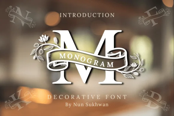
Ribbon-banner floral serif monogram
Amorette Monogram wraps classically built serif initials in a curved ribbon scroll and blooming botanical vines, and the corner specimens show N, F, K and B each carrying their own banner and floral detailing around bold structural stems.
Ideas for this font
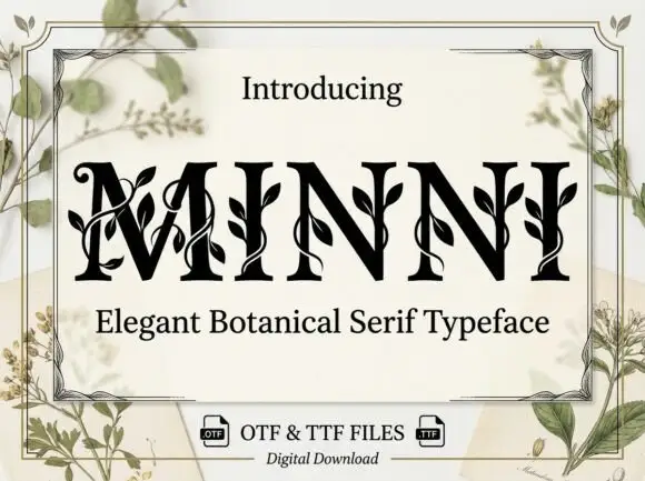
Botanical ornamented serif
Minni is a botanical serif in black on cream: high-contrast caps whose stems sprout leaves and curling vines, sharp serifs and a narrow waist, with a light botanical frame and small file badges at the foot.
Ideas for this font
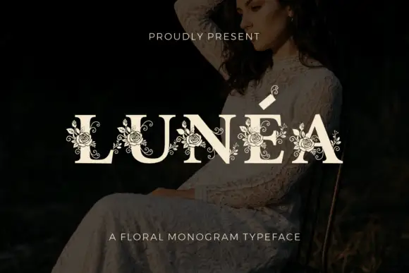
Floral monogram display
Lunéa is a floral monogram display in cream over a dark portrait: broad serif capitals with a fine accent, and fine roses, leaves and curled tendrils drawn over every letter, with a small sprig above the A and a tracked line beneath naming the style.
Ideas for this font
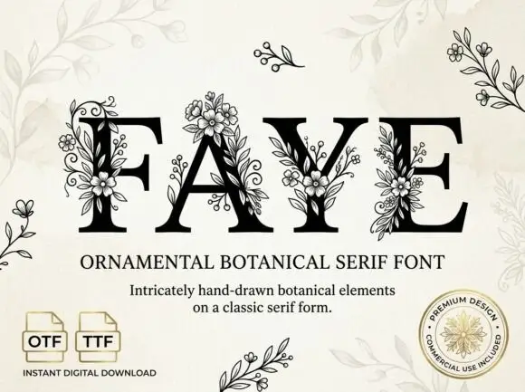
Large contrast serif capitals crossed by fine outlined flower and leaf clusters
Faye places black capitals on pale cream, where large fine-lined flowers overlap the F stem and the A apex, leafy sprigs and small buds cross the Y and E, and narrow curled tendrils climb between the letters while standalone sprigs sit around the page.
Ideas for this font
Same independent foundry
Allow optional Google Analytics to measure visits and catalogue actions. Your search words and notes are not included. Privacy & storage