Neutral Sans Workhorse

Crownspire + Swaraga
Lets Crownspire own the focal silhouette while handling secondary copy, sizing and subheads cleanly.
Inspect Swaraga specimenDisclosure: MakerFileHub may earn a commission from qualifying purchases via paid links on this page. How our links work.
Pointed blackletter with a split ornate C and descending p
Crownspire is an old English display face with long entry and exit flourishes, sharp spurs and a heavy lower stem weight, framed here by a symmetrical ornament of curls and diamonds.
Paid link
Get this fontProject & layout blueprintsAt-a-glance maker compatibility
Sturdy stroke walls and open counters weed cleanly on adhesive vinyl, HTV apparel film, and cut cardstock.
Visual anatomy & craft review
CROWNSPIRE runs across the frame in white on a moonlit photograph of a castle reflected in water, the initials taller than the rest of the word and the whole line surrounded by a drawn frame of curls, arrow rules and small diamond finials. The blackletter bones are clear in the black-topped stems and the sharp shoulder spurs, but the ends of the word throw out long flourishes that reach into the margin, and those flourishes are what separate the face from a plain textura. Below the title two lines of spaced serif caps name the style and the year, divided by a rule with a diamond at its centre, and a paragraph of small text at the foot describes the cut. The composition is symmetrical and ceremonial, which is the right setting for this kind of letter: it wants a centred layout, a dark ground and a title with some length to it.
Pointed blackletter with a split ornate C and descending p
Two-font hierarchy recipes
Tested contrast partners — pairing Crownspire with grounded secondary typography.
Crownspire + Swaraga
Lets Crownspire own the focal silhouette while handling secondary copy, sizing and subheads cleanly.
Inspect Swaraga specimen
Crownspire + Grandeur – Elegant Classic Serif
Grounds bold display lettering with classic typographic authority on posters, badges and apparel.
Inspect Grandeur – Elegant Classic Serif specimenPractical applications
Concrete hierarchy, scale and production guidance tailored to Crownspire’s stroke geometry.
The flourishes give an invitation to a dark formal event a ceremonial tone, and the white letters hold against a moonlit photograph without a panel behind them.
Hierarchy & layout recipe
Print a 400 by 600 mm poster: set the event name at 96 pt on one row, keep 30 mm of clear ground beneath before the date at 14 pt, and hold 32 mm from the longest flourish to the poster edge.
Pre-production check
Long flourishes crowd the frame at narrow trims; print one poster at the final size and check the reaches before the run.
The ornament sets the genre on a title page with no illustration, and the symmetrical cut gives a plain page the weight a hardback opening needs.
Hierarchy & layout recipe
Print a 135 by 216 mm title page: set the novel title at 48 pt on one row, keep 34 mm of clear ground beneath before the author at 12 pt, and hold 22 mm of margin from the flourishes to the page edge.
Pre-production check
Fine hairline curls break on uncoated pages; print one page on the real paper and check the thinnest stroke first.
The lettering gives a special release a ceremonial mark, and the symmetrical cut suits a centred label where a modern face would look plain.
Hierarchy & layout recipe
Print a 75 by 110 mm label: set the distillery name at 22 pt on one row, keep 9 mm of clear ground beneath before the age statement at 5.5 pt, and hold 7 mm from the flourishes to the die line.
Pre-production check
Dark glass swallows thin white shapes; print one label on the actual bottle and check the contrast before the order.
Technical & licence verification
Confirm included OTF/TTF/WOFF formats, full glyph tables and licence coverage on the live store page before batch production.
Closest visual alternatives
Matched across letterform anatomy, stroke behaviour and craft applications.
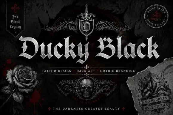
Wide blackletter with sweeping D and a densely split B
Ducky Black is a tattoo and dark-art blackletter with wide stems, sharp spurs and a distressed silver fill, framed by drawn roses, a skull and a fleur.
Ideas for this font
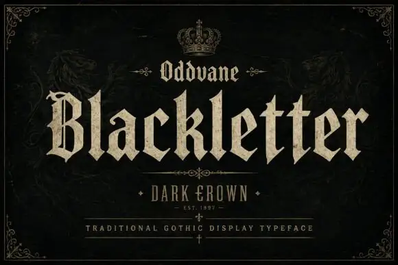
Angular gothic display
Oddvane is an angular gothic display in cream on black: narrow broken strokes with sharp spurs, a split B, broad notched feet and a small crown above the title, with a boxed line beneath naming the collection and a ruled line under that.
Ideas for this font
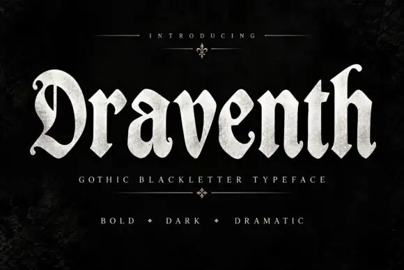
Broad rounded blackletter with curled D and pointed lower joins
Draventh is a wide gothic blackletter display face with heavy stems, sharp hooked shoulders and a weathered silver fill that reads as rubbed metal.
Ideas for this font
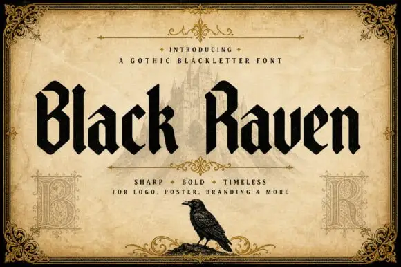
Solid blackletter with angular B and R bowls and pointed feet
Black Raven is a bold blackletter display face with wide stems, tight spacing and a flat black contour, drawn to print solid at large sizes on a light ground.
Ideas for this font
Same independent foundry
Allow optional Google Analytics to measure visits and catalogue actions. Your search words and notes are not included. Privacy & storage