Neutral Sans Workhorse

Avenford + Noar
Lets Avenford own the focal silhouette while handling secondary copy, sizing and subheads cleanly.
Inspect Noar specimenDisclosure: MakerFileHub may earn a commission from qualifying purchases via paid links on this page. How our links work.
Smooth vintage Victorian blackletter
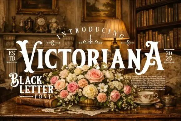
Avenford softens traditional gothic blackletter with smooth Victorian curves and open counters, presented for heritage labels, coffee roasters and book covers, where rounded arch transitions and a graceful sweeping crossbar on the A replace the spiked angles of a stricter gothic.
Paid link
Get this fontProject & layout blueprintsAt-a-glance maker compatibility
Sturdy stroke walls and open counters weed cleanly on adhesive vinyl, HTV apparel film, and cut cardstock.
Visual anatomy & craft review
The arches round off, the counters stay open, the strokes keep their blackletter rhythm and the A crossbar sweeps wide. That softening is the character: the face reads as a Victorian shopfront rather than a dense manuscript hand, which is why the sample suits heritage packaging. Only a short cover line is shown, so confirm the lowercase set and the numeral shapes, keep 34 pt before the open counters close, and give the sweeping crossbar its own clearance. The sweeping crossbar needs its own clearance: it runs past the letter body, so 12 mm of clear ground keeps it off a neighbour, and the open counters close below about 34 pt.
Refined · Vintage · Curled
Two-font hierarchy recipes
Tested contrast partners — pairing Avenford with grounded secondary typography.
Avenford + Noar
Lets Avenford own the focal silhouette while handling secondary copy, sizing and subheads cleanly.
Inspect Noar specimen
Avenford + Lumera Editorial
Grounds bold display lettering with classic typographic authority on posters, badges and apparel.
Inspect Lumera Editorial specimenPractical applications
Concrete hierarchy, scale and production guidance tailored to Avenford’s stroke geometry.
The smoothed blackletter gives a roaster provenance, and the open counters keep a two-word name legible at 22 pt on a 60 by 90 mm bag label, where the arch transitions stay visible on kraft.
Hierarchy & layout recipe
Print a 60 by 90 mm kraft label: set the roaster name at 22 pt on one row, keep 12 mm of clear ground beneath before the roast level at 6 pt, and print one flat ink so the open counters do not fill.
Pre-production check
Open counters printed at 16 pt close up on textured kraft; check the plate proof and hold the name at 20 pt or above.
The Victorian curves set a jacket title, and the sweeping crossbar gives a short word its flourish at 60 pt on a paperback, where the smooth arches stay crisp at press size.
Hierarchy & layout recipe
Print a 129 by 198 mm paperback jacket: set the title at 60 pt on one row, keep 26 mm of clear ground beneath before the author line at 11 pt, and keep the spine version on a single flat colour.
Pre-production check
A sweeping crossbar can collide with the spine fold; check the wrap and keep 8 mm of clear fold either side.
The heritage letterforms suit a farm shop, and the heavy blackletter holds a short sign at 50 mm on a painted board, where the rounded arches read from the lane.
Hierarchy & layout recipe
Paint a 600 by 300 mm board: set the shop name at 50 mm on one row, keep 22 mm of clear ground beneath before the opening hours at 15 pt, and keep 22 mm of border all round the panel.
Pre-production check
Rounded arches painted freehand blur together; check the mask artwork and keep the letter gaps open.
Technical & licence verification
Confirm included OTF/TTF/WOFF formats, full glyph tables and licence coverage on the live store page before batch production.
Closest visual alternatives
Matched across letterform anatomy, stroke behaviour and craft applications.
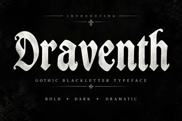
Broad rounded blackletter with curled D and pointed lower joins
Draventh is a wide gothic blackletter display face with heavy stems, sharp hooked shoulders and a weathered silver fill that reads as rubbed metal.
Ideas for this font
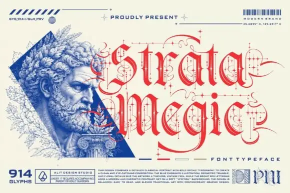
Fine calligraphic blackletter with looping line-and-dot ornaments
Strata Megic is a classical display serif with high contrast, sharp serifs and ornamental flourishes, shown in a technical drawing layout with glyph counts and swatch keys.
Ideas for this font
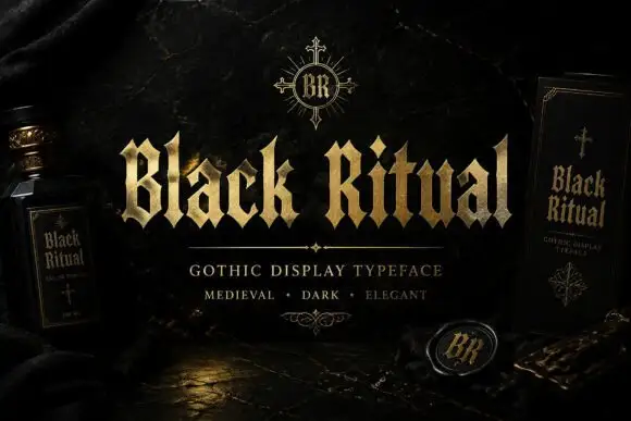
Faceted blackletter with split B and sharp diamond dots
Black Ritual sets heavy gothic capitals with diamond finials in a gold finish on a black ground, and shows the same face printed on a bottle label and a book cover so the range is visible.
Ideas for this font
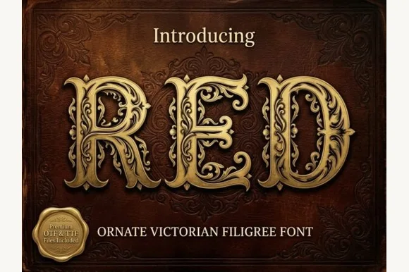
Ornate Victorian capitals with filigree
Red is an ornate Victorian display face in gold on a dark red damask ground: capitals built from heavy stems wrapped in filigree scrollwork, with small leaves and curls growing out of every curve, and a drop shadow that lifts them off the leather.
Ideas for this font
Same independent foundry
Allow optional Google Analytics to measure visits and catalogue actions. Your search words and notes are not included. Privacy & storage