Modern Grotesque Body

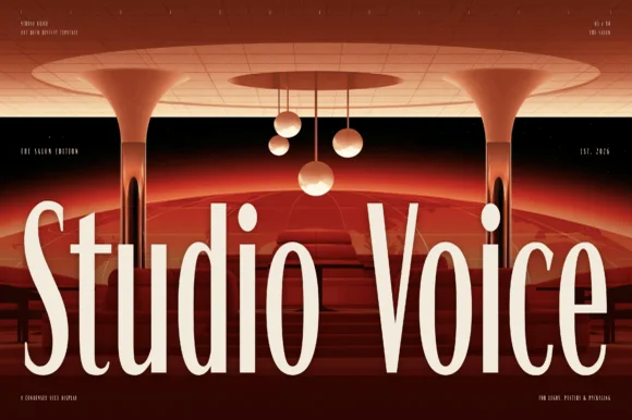
Oat and Ember + Swaraga
Creates crisp high-hierarchy contrast beneath Oat and Ember headlines across menus, websites and labels.
Inspect Swaraga specimenDisclosure: MakerFileHub may earn a commission from qualifying purchases via paid links on this page. How our links work.
Storytelling serif with script ampersand
Oat and Ember is a storytelling serif in cream over a painted fantasy landscape: moderate contrast, sturdy bracketed serifs, a slightly condensed rhythm, and an ampersand drawn as a separate script flourish that turns the middle of the lockup into a detail.
Paid link
Get this fontProject & layout blueprintsAt-a-glance maker compatibility
Sturdy stroke walls and open counters weed cleanly on adhesive vinyl, HTV apparel film, and cut cardstock.
Visual anatomy & craft review
The two lines are stacked over an illustration of a castle, a red moon and a river, and the drawing is a serif built for readability rather than display: the stems are sturdy, the serifs are short and softly bracketed, and the bowls are open, so the words hold at book sizes as well as at title size. The ampersand is the exception, drawn as a small script letter with a swash that lifts above the cap line, which is what gives the pair its character without changing the letterforms. Spacing is open and the lines are set close, so the lockup reads as a book title rather than a poster headline. The ground is a warm painted landscape, and the cream type sits on the darker wooded areas, which keeps the contrast even across both lines.
Storytelling, warm, editorial, illustrated
Two-font hierarchy recipes
Tested contrast partners — pairing Oat and Ember with grounded secondary typography.
Oat and Ember + Swaraga
Creates crisp high-hierarchy contrast beneath Oat and Ember headlines across menus, websites and labels.
Inspect Swaraga specimen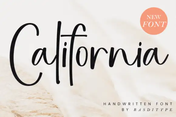
Oat and Ember + California
Adds a warm human signature touch for 1-to-3-word callouts without competing against structured serif capitals.
Inspect California specimenPractical applications
Concrete hierarchy, scale and production guidance tailored to Oat and Ember’s stroke geometry.
A storytelling serif reads comfortably at book sizes, and the script ampersand gives a title page a single drawn moment without a second typeface.
Hierarchy & layout recipe
Set the title at 40 pt on a 148 by 210 mm page, the author in a 12 pt serif, and the imprint in 8 pt caps. Keep 25 mm margins and use the script ampersand only in the title, so the text pages stay plain.
Pre-production check
Check the script ampersand at 40 pt, where its swash can run into the word above; give it 6 mm of air. Confirm the 12 pt author line reads at arm's length and that the imprint sits outside the title's optical block.
A readable serif suits a storybook cover that will be printed on inexpensive paper, and the script ampersand adds a decorative moment a child will notice.
Hierarchy & layout recipe
Set the title at 44 pt on a 210 by 210 mm cover, the author in a 12 pt serif, and the series line in 8 pt caps. Keep the title on the palest part of the illustration so the cream type reads, and print two inks.
Pre-production check
Check the title over the illustration, where a light sky can swallow cream type; move the type to the darker band. Confirm the 8 pt series line reads at arm's length and that the ampersand's swash clears the line above.
A warm serif reads as story rather than as instruction, which is exactly what a reading scheme needs, and the sturdy strokes survive being photocopied for a class set.
Hierarchy & layout recipe
Print an A4 worksheet header: the scheme name at 40 pt, the level in a 10 pt cap line, and the instructions in a 9 pt serif. Keep the header in one ink and reserve the script ampersand for the scheme name only.
Pre-production check
Check the header after photocopying, where a moderate-contrast serif holds better than a didone but can still thicken; test one copy. Confirm the 9 pt instructions read at arm's length and that the header leaves room for a name line.
Technical & licence verification
Confirm included OTF/TTF/WOFF formats, full glyph tables and licence coverage on the live store page before batch production.
Closest visual alternatives
Matched across letterform anatomy, stroke behaviour and craft applications.
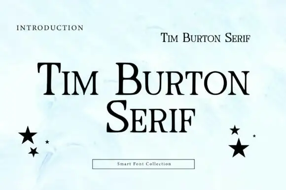
High-contrast serif with small capitals
Tim Burton Serif is a high-contrast serif in black on a pale watercolour page: thin bracketed serifs, a large contrast between stems and hairlines, mixed case with small capitals, and two black stars balanced at either side of the block.
Ideas for this font
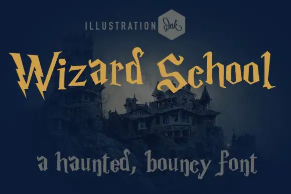
Whimsical gothic with spiky wobbly serifs
Wizard School is a whimsical gothic display in gold on a dark castle scene: letters built from wobbly stems with spiky serifs and uneven heights, with a second line set in a softer grey gothic beneath them.
Ideas for this font
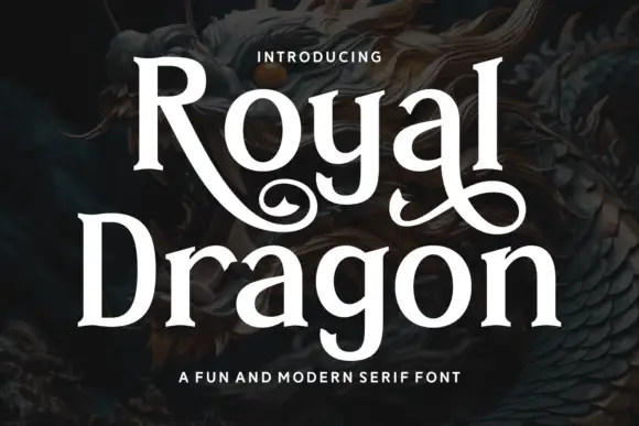
Modern serif with playful flourishes
Royal Dragon is a modern serif in cream on a dark dragon painting: moderate contrast, sturdy serifs, and flourishes that curl from the g and the l, so the word reads as a friendly editorial face with one decorative move.
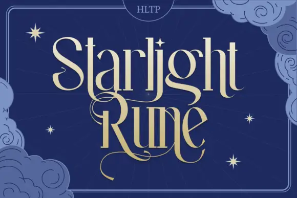
Tall fantasy serif with a long swash
Starlight Rune is a tall fantasy serif in gold on navy: elongated letters with hairline joins, a long swash that runs through the middle of the block, and a drawn night sky of clouds and stars behind it.
Ideas for this font
Same independent foundry
Allow optional Google Analytics to measure visits and catalogue actions. Your search words and notes are not included. Privacy & storage