Neutral Sans Workhorse

Wizard School + Modern Heritage
Lets Wizard School own the focal silhouette while handling secondary copy, sizing and subheads cleanly.
Inspect Modern Heritage specimenDisclosure: MakerFileHub may earn a commission from qualifying purchases via paid links on this page. How our links work.
Whimsical gothic with spiky wobbly serifs
Wizard School is a whimsical gothic display in gold on a dark castle scene: letters built from wobbly stems with spiky serifs and uneven heights, with a second line set in a softer grey gothic beneath them.
Paid link
Get this fontProject & layout blueprintsAt-a-glance maker compatibility
Sturdy stroke walls and open counters weed cleanly on adhesive vinyl, HTV apparel film, and cut cardstock.
Visual anatomy & craft review
Two lines are set over an illustrated castle and each uses a different treatment of the same idea. The first line is gold and bouncy: the stems bend slightly, the serifs break into small spikes, the letters rise and fall against each other, and the bowls of the o and the c are drawn nearly round, so the word reads as hand-cut letters on a sign rather than a printed text face. The second line, in a grey gothic, is calmer and narrower, which lets it carry a phrase without competing with the title. Nothing in either line is straight, and the wobble is consistent, which is what makes it read as style rather than error. A small badge at the top carries the foundry mark, and the ground is a dark blue illustration of towers and roofs at night. Wizard School is a display face for party invitations, game artwork, posters and packaging with a magical theme, and it needs one or two short lines at a large size and a dark ground.
Wobbly, gothic, playful
Two-font hierarchy recipes
Tested contrast partners — pairing Wizard School with grounded secondary typography.
Wizard School + Modern Heritage
Lets Wizard School own the focal silhouette while handling secondary copy, sizing and subheads cleanly.
Inspect Modern Heritage specimen
Wizard School + Mewah
Grounds bold display lettering with classic typographic authority on posters, badges and apparel.
Inspect Mewah specimenPractical applications
Concrete hierarchy, scale and production guidance tailored to Wizard School’s stroke geometry.
A wobbly gothic sets a playful fantasy tone before the date is read, and the gold on dark carries across a dim room without a second decoration.
Hierarchy & layout recipe
Print a 120 by 120 mm card: set the title at 32 pt over two lines, keep 14 mm of clear ground beneath before the details at 9 pt, and hold 12 mm of margin on all four sides.
Pre-production check
Spiky serifs at thirty-two points can fill in on a small card; print one card at the final size and check the tips.
A whimsical gothic separates a children's fantasy from the usual heavy blackletter, and the lighter second line can carry the subtitle in the same voice.
Hierarchy & layout recipe
Print a 135 by 205 mm cover: set the title at 44 pt over two lines, keep 18 mm of clear ground beneath before the author at 11 pt, and hold 14 mm of margin on all four sides.
Pre-production check
A dark illustrated cover can swallow gold type; proof one cover at the final size and check the contrast.
A bouncy fantasy face makes a party sign look drawn for the day, and the second gothic line keeps the practical details readable underneath.
Hierarchy & layout recipe
Print a 400 by 300 mm board: set the greeting at 70 pt over two lines, keep 20 mm of clear ground beneath before the time at 16 pt, and hold 20 mm of border on all four sides.
Pre-production check
A wobbly baseline on a large board can look crooked at the edges; proof one board and check the optical alignment.
Technical & licence verification
Confirm included OTF/TTF/WOFF formats, full glyph tables and licence coverage on the live store page before batch production.
Closest visual alternatives
Matched across letterform anatomy, stroke behaviour and craft applications.
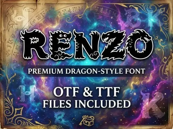
Dragon-style display
Renzo is a dragon-style display in black with a white outline on a purple nebula ground: heavy caps whose terminals and counters become dragon heads with eyes, teeth and scales, with spined edges along the strokes and pointed feet.
Ideas for this font
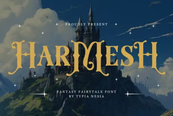
Angular fantasy capitals with hooked tops and curling feet
Harmesh shows gold-coloured capitals over a castle landscape, where tall stems end in pointed hooks and large curling feet, and the heavy H and M shapes use angular inner joins with broad triangular endings while small stars sit around the title.
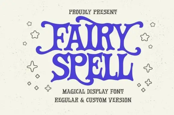
Heavy storybook capitals with wavy arms and curled tips
Fairy Spell shows purple capitals with thick curved strokes, broad pointed feet and irregular wavy horizontal arms, where the F and Y extend outward into curled tips and the R leg sweeps below the following letter.
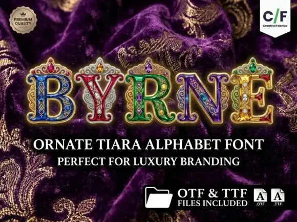
Jewelled serif capitals topped with ornate crown-like flourishes
Byrne builds each capital from a slab of engraved jewellery, the letter filled with filigree and cabochon colour and a small tiara rising from its top edge, so a five-letter word reads as five crowns in a row.
Ideas for this font
Same independent foundry
Allow optional Google Analytics to measure visits and catalogue actions. Your search words and notes are not included. Privacy & storage