Editorial Serif Anchor

Nursing + Auretha
Anchors Nursing's fluid strokes with crisp Roman proportions on wedding suites, headers and packaging.
Inspect Auretha specimenDisclosure: MakerFileHub may earn a commission from qualifying purchases via paid links on this page. How our links work.
Thick brush script
Nursing is a thick brush script in white on slate blue: heavy, slightly varied strokes with visible brush entries, tall loops on the N and the g, and a rhythm that stays connected across the word even at a small size.
Paid link
Get this fontProject & layout blueprintsAt-a-glance maker compatibility
Weld or Unite overlapping script joins into one continuous vector path before sending to the blade.
Visual anatomy & craft review
The word is set large in the middle of the page and the drawing is a loaded-brush lettering rather than a pen script: the downstrokes are wide and the upstrokes thin noticeably, the N opens with a long diagonal and a loop that rises above the cap, and the g drops a descender that curls back to the left. Edges are slightly rough where the brush lifted, which is what differentiates the face from a digital monoline script, and the joins are tight enough that the word reads as one gesture. The ground is a flat slate blue scattered with nursing icons drawn in a washed-out grey-green, so the white type is the only high-contrast element on the page and reads immediately. The caption block beneath is small tracked capitals, which keeps the sample's information from competing with the script.
Brushy, bold, friendly, professional
Two-font hierarchy recipes
Tested contrast partners — pairing Nursing with grounded secondary typography.
Nursing + Auretha
Anchors Nursing's fluid strokes with crisp Roman proportions on wedding suites, headers and packaging.
Inspect Auretha specimen
Nursing + Godthem
Keeps small-scale dates, URLs, nutrition facts and care instructions crisp and legible below script titles.
Inspect Godthem specimenPractical applications
Concrete hierarchy, scale and production guidance tailored to Nursing’s stroke geometry.
A thick brush script reads as celebratory without being informal, and the heavy stroke holds up on a printed banner where a light script would disappear.
Hierarchy & layout recipe
Print 1,200 by 600 mm: the word at 200 mm cap height, the cohort line in a 40 mm sans beneath, and the date at 25 mm. Keep the script's descender at least 60 mm above the banner's lower eyelets so the tail is never punched through.
Pre-production check
Check the descender against the eyelet positions at full size, then confirm the 40 mm cohort line reads from twelve metres. Look at the proof on the banner material, where a white brush stroke can lose its rough edge and read as a flat sans.
A brush script signals that a service is delivered by people rather than a system, which is exactly the tone a home-care brand needs on a card or a tabard.
Hierarchy & layout recipe
Set the name at 26 pt in white on a slate badge, with the service line in a 8 pt sans caps beneath, and build a 16 pt version for the tabard. Keep the mark one colour on the garment and reversed for the website.
Pre-production check
Check the 16 pt version on embroidered fabric, where a brush edge becomes a fuzzy line; simplify the tail for embroidery. Confirm the 8 pt service line stays legible on the badge and that the white on slate holds a 4.5:1 contrast in daylight.
A brush script gives a thank-you card a human voice, and the heavy stroke stays readable on a small folded card that is passed around a ward.
Hierarchy & layout recipe
Print a 105 by 148 mm card: the word at 40 pt at the top, the message in a 9.5 pt sans at 13 pt leading, and the team name in 8 pt caps at the foot. Keep 15 mm margins and leave the inside left blank for signatures.
Pre-production check
Check the 40 pt word on the card stock, where a rough brush edge can fill and look like a smudge; use a coated stock or thicken the edge. Confirm the 9.5 pt message stays legible when the card is signed in pen over the printed line.
Technical & licence verification
Confirm included OTF/TTF/WOFF formats, full glyph tables and licence coverage on the live store page before batch production.
Closest visual alternatives
Matched across letterform anatomy, stroke behaviour and craft applications.
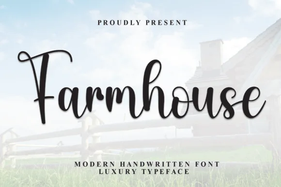
Bold bouncy shaded brush-calligraphy farmhouse script
Farmhouse Font (by andikastudio) is a thick, welcoming brush-calligraphy script with shaded downstrokes and lively baseline bounce.
Ideas for this font
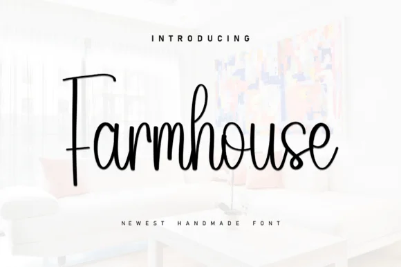
Tall slender modern-rustic farmhouse cursive script
Farmhouse (by KC Production) is a tall, slender monoline-brush farmhouse script pairing a towering straight 'F' stem with airy upright loops.
Ideas for this font
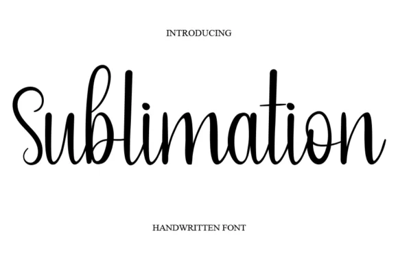
Thin handwritten script with heart detail
Sublimation is a thin handwritten script in black on white: a monoline stroke that swells slightly on the downstrokes, tall loose ascenders, a bouncy baseline, and a small heart replacing the dot on the i, so the phrase reads as a friendly handwritten note.
Ideas for this font
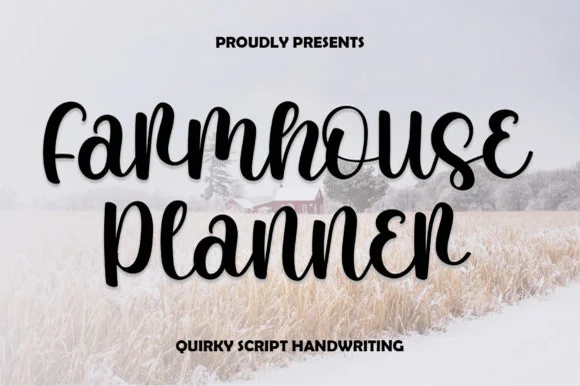
Quirky looped-curl bouncy farmhouse script
Farmhouse Planner is a playful, bouncy connected cursive script curling whimsical little eyelet loops onto 'F', 'r', 's', 'e', and 'n'!
Ideas for this font
Same independent foundry
Allow optional Google Analytics to measure visits and catalogue actions. Your search words and notes are not included. Privacy & storage