Neutral Sans Workhorse

Neon Purple + Bargain Condensed
Lets Neon Purple own the focal silhouette while handling secondary copy, sizing and subheads cleanly.
Inspect Bargain Condensed specimenDisclosure: MakerFileHub may earn a commission from qualifying purchases via paid links on this page. How our links work.
Neon tube display
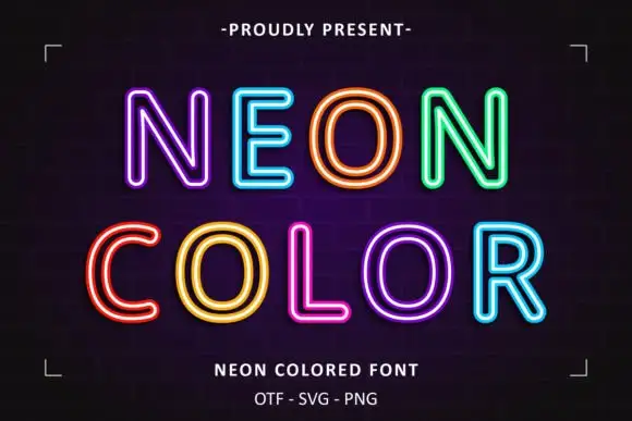
Neon Purple is a neon-tube display in violet on a dark grid: tall caps drawn as an outer tube with a bright inner line and a soft glow, set on two lines inside corner brackets with a perspective floor and tracked notes above and beneath.
Paid link
Get this fontProject & layout blueprintsAt-a-glance maker compatibility
Sturdy stroke walls and open counters weed cleanly on adhesive vinyl, HTV apparel film, and cut cardstock.
Visual anatomy & craft review
The two words are stacked and the face is drawn as a neon tube: each letter is a rounded channel with a lighter core and a glow around it, so the word reads as signage rather than as type. That construction is why the plate needs a dark ground and a grid, and why the effect is part of the file rather than something the buyer adds. Because the glow spreads, the letters need space between them, and the plate gives it. The corner brackets and the perspective floor are staging from the eighties aesthetic, and the notes beneath state the formats, including the vector and raster versions. Because the glow is a raster element in some formats, the face works best at screen sizes and on printed signage at large scale.
Decorative, neon, retro, glowing
Two-font hierarchy recipes
Tested contrast partners — pairing Neon Purple with grounded secondary typography.
Neon Purple + Bargain Condensed
Lets Neon Purple own the focal silhouette while handling secondary copy, sizing and subheads cleanly.
Inspect Bargain Condensed specimen
Neon Purple + Flowsky Editorial
Grounds bold display lettering with classic typographic authority on posters, badges and apparel.
Inspect Flowsky Editorial specimenPractical applications
Concrete hierarchy, scale and production guidance tailored to Neon Purple’s stroke geometry.
A neon display sets an eighties theme instantly, and the glow reads across a dim room where a flat face would disappear.
Hierarchy & layout recipe
A2 print: the greeting at 90 mm cap height, the details in a 20 mm sans, and the address at 10 mm. Keep 28 mm margins and print on a dark stock with the glow as a second pass.
Pre-production check
Check the A2 at four metres, where the glow can halo into the letters; keep 8 mm between them. Confirm the 10 mm address reads at arm's length and that the dark stock stays even.
A neon graphic gives a venue an evening identity, and the tube construction reads through a window from across the street.
Hierarchy & layout recipe
Cut a 700 by 300 mm window film: the name at 110 mm cap height, the hours in a 20 mm sans, and a glow at 6 mm. Keep 25 mm margins and apply to a clean pane.
Pre-production check
Check the film at 700 mm, where the glow can print as a flat band; use the vector layer. Confirm the 20 mm hours read at two metres and that the film lifts cleanly later.
A neon face gives a student night a period poster, and the glow survives a cheap digital print better than a subtle gradient does.
Hierarchy & layout recipe
A3 poster: the event at 80 mm cap height, the date in a 22 mm sans, and the venue at 10 mm. Keep 25 mm margins, print two colours on a dark sheet and keep the glow off the venue line.
Pre-production check
Check the poster at four metres, where the glow can merge two words; keep them on separate lines. Confirm the 10 mm venue reads at arm's length and that the sheet does not scuff.
Technical & licence verification
Confirm included OTF/TTF/WOFF formats, full glyph tables and licence coverage on the live store page before batch production.
Closest visual alternatives
Matched across letterform anatomy, stroke behaviour and craft applications.
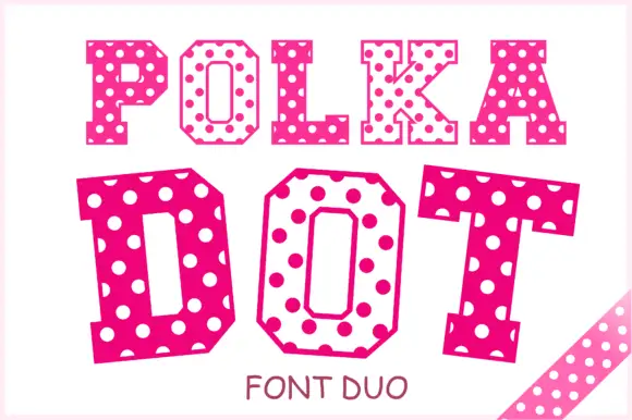
Angular slab-serif capitals alternating solid dotted and hollow dotted treatments
Polka Dot draws its capitals as octagons with the corners cut straight off, then punches a scatter of round holes through the fill so every letter looks like a punched paper tag.
Ideas for this font
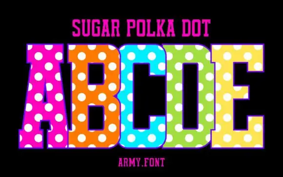
Slab capitals with polka dots
Sugar Polka Dot is a colour display on a black ground: tall slab-like capitals in vivid pink, orange, blue, green and yellow, each covered with large white dots, with a thin outline, a plain name line above and a studio credit beneath.
Ideas for this font
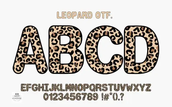
Rounded upright capitals densely filled with leopard-like rosettes
Am Leopard fills fat rounded capitals with a leopard print — a cream ground, brown rosettes with dark centres and small dashes between them — and outlines each letter heavily so a word looks like a row of spots cut out.
Ideas for this font
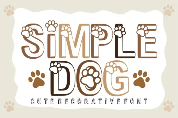
Paw-print outlined display
Simple Dog is an outlined rounded display in warm browns on a pale ground: light caps drawn as a heavy contour with paw prints overlapping the upper edges and sitting inside the counters, with two solid paw prints beside the second line and a tracked line at the foot.
Ideas for this font
Same independent foundry
Allow optional Google Analytics to measure visits and catalogue actions. Your search words and notes are not included. Privacy & storage