Neutral Sans Workhorse

Am Leopard + Borsen
Lets Am Leopard own the focal silhouette while handling secondary copy, sizing and subheads cleanly.
Inspect Borsen specimenDisclosure: MakerFileHub may earn a commission from qualifying purchases via paid links on this page. How our links work.
Rounded upright capitals densely filled with leopard-like rosettes
Am Leopard fills fat rounded capitals with a leopard print — a cream ground, brown rosettes with dark centres and small dashes between them — and outlines each letter heavily so a word looks like a row of spots cut out.
Paid link
Get this fontProject & layout blueprintsAt-a-glance maker compatibility
Sturdy stroke walls and open counters weed cleanly on adhesive vinyl, HTV apparel film, and cut cardstock.
Visual anatomy & craft review
ABCD fills the top of the card in four fat rounded letters, each filled edge to edge with leopard rosettes at a scale that matches the letter rather than a pattern behind the word. Underneath, the rest of the alphabet, the numerals and a row of punctuation follow at a fifth of the size in the same print, which shows the set holds at small sizes. A caption above names the print and there are no other elements on the card. The letters are wide with generous counters, so the print is legible as a print rather than as noise, and the heavy outline is what keeps two adjacent letters from running together into one spotted shape. It is a display face for fashion, kids' products, party print and packaging that wants a pattern without a separate pattern sheet.
Rounded upright capitals densely filled with leopard-like rosettes
Two-font hierarchy recipes
Tested contrast partners — pairing Am Leopard with grounded secondary typography.
Am Leopard + Borsen
Lets Am Leopard own the focal silhouette while handling secondary copy, sizing and subheads cleanly.
Inspect Borsen specimen
Am Leopard + Papillon Serif – Elegant Modern Luxury
Grounds bold display lettering with classic typographic authority on posters, badges and apparel.
Inspect Papillon Serif – Elegant Modern Luxury specimenPractical applications
Concrete hierarchy, scale and production guidance tailored to Am Leopard’s stroke geometry.
The print says fashion before a customer reads the name, and the heavy outline keeps the letters separate on a crowded shelf.
Hierarchy & layout recipe
Print a 55 by 45 mm jar label: set the range name at 15 pt on one row, keep 5 mm of clear ground beneath before the weight at 4.5 pt, and hold 4 mm from the outline to the die line.
Pre-production check
The rosettes close up below 18 pt; print one label on the real stock and check the pattern before the order.
The print sets the theme in one word, and the wide shapes read across a room where a thinner face would disappear into the decorations.
Hierarchy & layout recipe
Print a 500 by 350 mm board: set the greeting at 90 pt across two rows, keep 24 mm of clear ground between the rows, and hold 26 mm of border so no outline is cut.
Pre-production check
Large prints show every rosette; print one board at the final size and check the pattern scale before the set.
The print is the subject of the page, so a cover can carry it in the lettering alone without a photograph of the fabric.
Hierarchy & layout recipe
Print a 240 by 320 mm cover: set the feature word at 145 pt on one row, keep 32 mm of clear ground beneath before the standfirst at 11 pt, and hold 20 mm from the last letter to the right trim.
Pre-production check
Dense prints band on coated stock; print one cover on the real paper and check the rosette edges before the run.
Technical & licence verification
Confirm included OTF/TTF/WOFF formats, full glyph tables and licence coverage on the live store page before batch production.
Closest visual alternatives
Matched across letterform anatomy, stroke behaviour and craft applications.
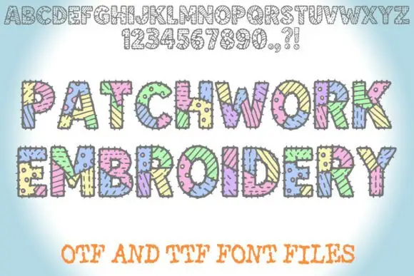
Patched block display with stitches
Patchwork Embroidery is a block display on a soft blue ground: fat capitals divided into patterned patches with short stitch marks along the joins, shown first as a full alphabet and numeral row in outline at the top and then twice at display size in pastel colours, with a plain line beneath that names the formats.
Ideas for this font
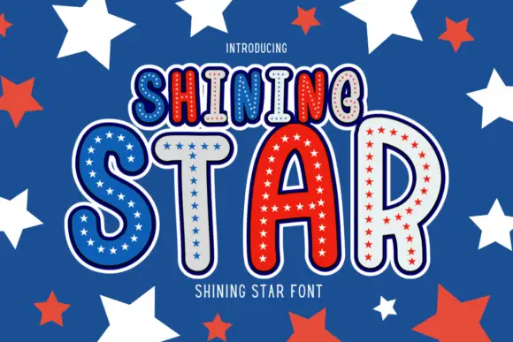
Star-filled bordered display
Shining Star is a novelty display in red, white and blue on a starred field: rounded capitals drawn with a heavy outer border and a white keyline, each letter filled with small stars and edged with dots, with a smaller first line above and a tracked line beneath.
Ideas for this font
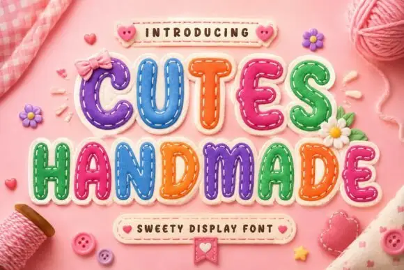
Padded letter shapes with stitch-like details
Cutes Handmade shows rounded inflated capitals outlined by small dashed stitch marks, where uneven coloured fills and highlights make the letters resemble soft fabric patches and yarn, buttons and bows fill the pink textile setting around them.
Ideas for this font
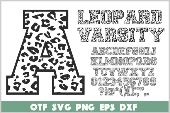
Angular varsity slab capitals filled with irregular leopard-like spots inside a dark border
Leopard Varsity wraps heavy varsity slabs in a dark border and fills the interior with irregular leopard spots, so a block letter looks like animal print cut out and outlined in ink.
Ideas for this font
Same independent foundry
Allow optional Google Analytics to measure visits and catalogue actions. Your search words and notes are not included. Privacy & storage