Neutral Sans Workhorse

Neil + Modern Limited
Lets Neil own the focal silhouette while handling secondary copy, sizing and subheads cleanly.
Inspect Modern Limited specimenDisclosure: MakerFileHub may earn a commission from qualifying purchases via paid links on this page. How our links work.
Faceted geometric display
Neil is a faceted geometric display in gold on a dark ground: each letter assembled from flat polygons with visible bevels, a gold outline and dark inner planes, floating diamonds behind, so the word reads as a cut gem rather than as an alphabet.
Paid link
Get this fontProject & layout blueprintsAt-a-glance maker compatibility
Cut solid base, outline, and shadow layers in separate vinyl colors and align on registration marks.
Visual anatomy & craft review
The word is set once, large, and each letter is built from planes rather than strokes: the stems split into facets, the curves step in angular segments, and every edge carries a highlight and a shadow, which produces the illusion of cut stone. The geometry is consistent across the word, so the letters share a light source and the block reads as one object. Because the facets are small, the face needs a display size, and the specimen sets it across the plate with diamonds and gold flecks around it. Beneath the word two lines of tracked caps name the category and list the formats, and the whole plate stays in two tones — gold and near-black — which is what keeps a highly detailed face readable rather than noisy.
Faceted, geometric, dimensional, metallic
Two-font hierarchy recipes
Tested contrast partners — pairing Neil with grounded secondary typography.
Neil + Modern Limited
Lets Neil own the focal silhouette while handling secondary copy, sizing and subheads cleanly.
Inspect Modern Limited specimen
Neil + Orvelia
Grounds bold display lettering with classic typographic authority on posters, badges and apparel.
Inspect Orvelia specimenPractical applications
Concrete hierarchy, scale and production guidance tailored to Neil’s stroke geometry.
A faceted mark reads as a cut stone, which suits a jeweller, and the flat facets reproduce in print better than a photographic metallic effect would.
Hierarchy & layout recipe
Set the mark at 30 mm on a box and 16 pt on a label, reducing the facets to three per letter below 20 mm. Keep gold on a dark ground and hold clear space equal to the facet width on every side.
Pre-production check
Check the 16 pt label, where the facets can collapse into noise; use the simplified cut. Confirm the box mark reads at arm's length and that the gold holds on an uncoated board.
A faceted display gives a cover a sculptural title that reads as an object, and the flat facets keep the print to two inks rather than a metallic process.
Hierarchy & layout recipe
Set the title at 90 mm cap height across 230 mm, the subtitle in a 10 pt sans, and the year at 8 pt. Print gold on a dark matte stock and keep the diamonds as the only background element.
Pre-production check
Check the title at 90 mm, where thin facet lines can break under the press; keep them above 0.3 mm. Confirm the 8 pt year survives lamination and that the title holds at thumbnail size.
A faceted face reads as cut crystal, which suits a masked ball, and the dark planes let the title sit over a photograph without a panel.
Hierarchy & layout recipe
A2 portrait: the event at 120 mm cap height, the date in a 18 mm sans, and the venue at 12 mm. Keep 30 mm margins, print gold on a deep ground, and keep the small type out of the faceted area.
Pre-production check
Check the poster at five metres, where the facets can read as damage; simplify the detail for that scale. Confirm the 12 mm venue reads at three metres and that the gold holds under hall lighting.
Technical & licence verification
Confirm included OTF/TTF/WOFF formats, full glyph tables and licence coverage on the live store page before batch production.
Closest visual alternatives
Matched across letterform anatomy, stroke behaviour and craft applications.
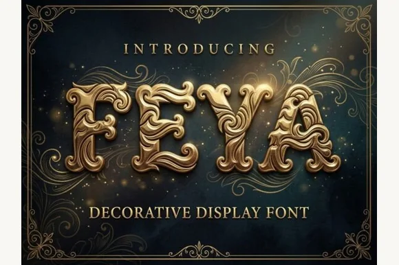
3D embossed Baroque gold acanthus-filigree ornamental font (OTF & TTF)
Feya is actually an ornate 3D-shaded Baroque acanthus-scrollwork display font—NOT a rough woodblock print or casual handwriting despite seller copy!
Ideas for this font
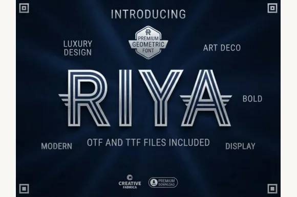
Triple-line striped geometric Art Deco labyrinth display (OTF & TTF)
Riya is an architectural geometric Art Deco display font constructed from three parallel concentric ribbon lines with wing extensions (OTF & TTF).
Ideas for this font
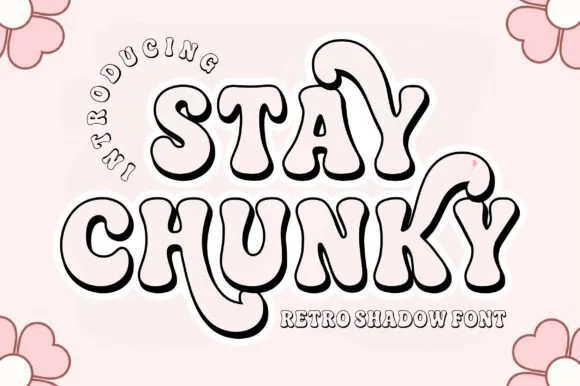
Hollow 3D-extruded 1970s groovy swash shadow display
Stay Chunky Shadow is a nostalgic 1970s groovy outline font featuring built-in 3D extruded ribbon shadows and sweeping 'Y' swashes!
Ideas for this font
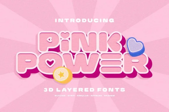
5-style 3D retro Y2K bubble sans + cute icons (Outline, Strip, Regular, Extrude, Shadow)
Pink Power is a 5-style layered 3D retro sans system (Regular, Outline, Strip, Extrude, Shadow) bundled with cute heart/star 3D icons.
Ideas for this font
Same independent foundry
Allow optional Google Analytics to measure visits and catalogue actions. Your search words and notes are not included. Privacy & storage