Neutral Sans Workhorse

Hey Chunky + Bielchon
Lets Hey Chunky own the focal silhouette while handling secondary copy, sizing and subheads cleanly.
Inspect Bielchon specimenDisclosure: MakerFileHub may earn a commission from qualifying purchases via paid links on this page. How our links work.
Swash-tailed 1970s psychedelic & groovy serif display
Hey Chunky is an expressive 1970s groovy display font kicking long, flamboyant retro swash tails off 'H', 'Y', 'C', and 'K'!
Paid link
Get this fontProject & layout blueprintsAt-a-glance maker compatibility
Weld or Unite overlapping script joins into one continuous vector path before sending to the blade.
Visual anatomy & craft review
Hey Chunky is a 1970s groovy display serif whose capitals swing long teardrop swash tails off the H, Y, C and K, with pear-shaped curves and a heavy, even weight. The tails extend far past the glyph, so the layout must reserve horizontal room on both sides, and the contrast is low enough that the face holds at 20 mm on a label. It needs roughly 25 mm before the teardrops read as drawn flourishes rather than smudges, and it is a headline face for posters, apparel and packaging.
Swash-groovy · Swooping-Y-K · 70s-editorial
Two-font hierarchy recipes
Tested contrast partners — pairing Hey Chunky with grounded secondary typography.
Hey Chunky + Bielchon
Lets Hey Chunky own the focal silhouette while handling secondary copy, sizing and subheads cleanly.
Inspect Bielchon specimen
Hey Chunky + Raffined
Grounds bold display lettering with classic typographic authority on posters, badges and apparel.
Inspect Raffined specimenPractical applications
Concrete hierarchy, scale and production guidance tailored to Hey Chunky’s stroke geometry.
Teardrop swashes read as a 1970s print ad, which is the reference a retro summer event wants. Low contrast keeps the word solid on a screen print where a high-contrast face would break.
Hierarchy & layout recipe
Poster A2, word 260 mm with 30 mm swash allowance each side, details 20/26 pt, 30 mm margins. Tee print 280 x 160 mm, word 60 mm. Card 90 x 55 mm, word 18 mm.
Pre-production check
Swash tails extend the artwork box and get cropped when a file is fitted to a page. Declare the full box to the printer, and check one printed tee for a trimmed tail before the run.
Pear-curved capitals carry a seventies music-press look that a modern sans cannot, which is what a reissue or a retro festival needs. The heavy weight survives a small flyer.
Hierarchy & layout recipe
Sleeve 312 x 312 mm plus 3 mm bleed, word 200 mm with 25 mm swash allowance each side, credits 7 pt. Flyer A5, word 120 mm, lineup 10/13 pt in two columns, 12 mm margins. Zine cover A5, header 60 mm, 20 mm margins.
Pre-production check
A flyer at A5 with a 120 mm word leaves almost no margin once tails are included. Measure the full swash width first, and reduce to 100 mm if the tails run into the trim.
Groovy tails set a decade theme in one word, which is faster than sourcing props. Thick forms cut cleanly as a topper, and the tails give a short name its silhouette.
Hierarchy & layout recipe
Invite A6, name 18 mm with 8 mm swash allowance, details 4.5 mm, 10 mm margins. Topper 150 x 120 mm, name 50 mm, 8 mm stick slot. Banner 900 x 300 mm, word 120 mm.
Pre-production check
A topper die cannot follow a long thin tail, so the tail gets cut to a stub. Either shorten the tail in the artwork or extend the die, and check one cut topper against the design before making a set.
Technical & licence verification
Confirm included OTF/TTF/WOFF formats, full glyph tables and licence coverage on the live store page before batch production.
Closest visual alternatives
Matched across letterform anatomy, stroke behaviour and craft applications.
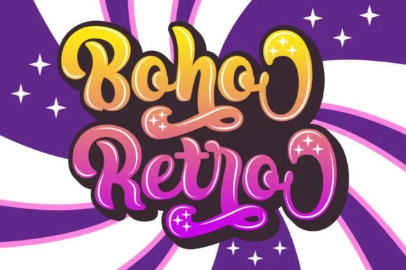
Swirled 1970s psychedelic bubble script-display
Boho Retro is a plump, heavy-looped 1970s groovy display script with curled swash caps and pillowy connected lowercase bowls.
Ideas for this font
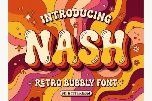
Groovy 1970s psychedelic lava-lamp bubble display (OTF & TTF)
Nash is a cheerful 1970s psychedelic bubble display font swelling bottom-heavy groovy curves for retro shirts, posters, and mugs (OTF & TTF).
Ideas for this font
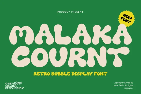
Ultra-heavy groovy pillow-bubble retro display
Malaka Cournt is an ultra-bold retro bubble display font sculpting wide, squishy 1970s letterforms with compressed teardrop counters.
Ideas for this font
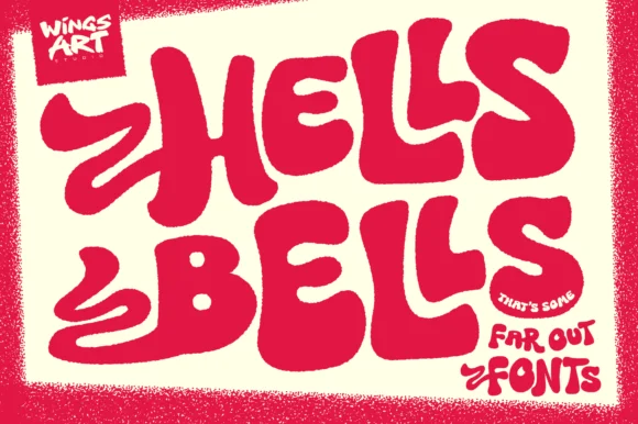
Exuberant 1970s bell-bottom & swash-flame poster display
Hells Bells is a flamboyant 1970s poster display typeface with sweeping bell-bottom curves, flame-like left swashes, and heavy disco swagger.
Ideas for this font
Same independent foundry
Allow optional Google Analytics to measure visits and catalogue actions. Your search words and notes are not included. Privacy & storage